|
You are here: Home ~ Desktop UIs ~ Table - Wizard
Table
Data organized into rows and columns.
In software development, "table" is used
in two senses: a report or textual representation
of some information; and a view of a database.
Good for:
Showing analysis results in report
or table form (Fig. 19).
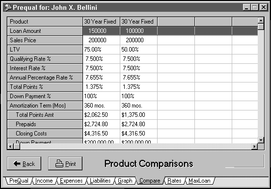
Fig.
19. A report from the
Laser Pro Mortgage application (CFI ProServices,
Inc., Portland, OR).
Showing the results of a database query
(Fig. 20).
Fig.
20. A database view from
Laser Pro Mortgage (CFI ProServices, Inc., Portland,
OR).
Not good for:
Showing overviews. Use graphs instead.

Design guidelines:
Parts of a table
The topmost row on a table contains
the table’s title (see "Table titles" below).
The left margin on a table is called the "stub." The
stub heading should be the type of item to be compared: "Bonds," "Towns," or "Diseases," for
example. The names of the items being compared—"ATT
6.0 97," "Waterbury," or "Endometriosis"—are
listed in this column. All other columns contain
the comparisons (Fig. 21).
Title |
Stub head |
Head |
Head |
Head |
Item name |
Data |
Data |
Data |
Item name |
Data |
Data |
Data |
Item name |
Data |
Data |
Data |
Fig.
21. Parts of a table.
Rules (horizontal and vertical lines)
can help readers keep their places in the row. Just
make sure that the rules aren’t overwhelming. Use
the narrowest line available to you; use gray lines
rather than black lines. For more ideas on reducing
visual clutter, see Tufte 1983.
Units of measurement
Always show the unit of measurement
in the column heading—for example, $, %, "in
thousands of ¥," "Celsius or Fahrenheit."
Failure to indicate the unit of measurement
causes dissatisfaction. Although experienced users
may be able to figure out the unit of measurement
from the context, doing so takes time away from studying
the data.
Also, if the units are in the headings,
you don’t have to repeat them for each item, thereby
reducing visual clutter.
Table titles
Make sure that the table title is distinctive—the
first few words of their titles should not always
be the same. For example, this set of titles uses
the same first few words:
Sodium
concentrations of the Mississippi River
Sodium
concentrations of the Amazon River
By switching the order, you get a more
useful set of titles:
Mississippi
River sodium concentrations
Amazon
River sodium concentrations
A user skimming through a set of tables
will be able to pick up the purpose of the table
immediately instead of after reading for a few seconds.
For marketing or sales-oriented tables,
find a way to let users put a message or point of
view in the title—let them emphasize the point of
the data. For example, "Company Sales Trend" doesn't
say as much as "Company Sales Up in Northwest" or "Sales
Down in Southeast." Provide a default title that
users can overwrite if they want.
Tables vs. graphs
Like graphs, tables usually contain ‘cooked’ data
or views of a database or spreadsheet. Unlike graphs,
tables show details, not overviews. In many applications,
graphs and tables are complementary. Whenever possible,
let users toggle between tables and graphs.
The perfect table
Developers have spent countless hours
agonizing over what columns to include, what to call
them, how to sort the data, how to organize the columns,
how to let users zoom in on a particular record,
and so on.
These are all good questions to ask.
However, the problem is that developers often agonize
alone, when they could delegate the agony to the
end-users.
In short, make the display easy to
change instead of trying to make the perfect table.
Let users reorganize tables on the fly by clicking
the column heads. For example, as shown in Fig. 22,
clicking Sender sorts the list of messages by email
addresses; clicking Subject sorts it by subject line;
and clicking Date sorts it by date.
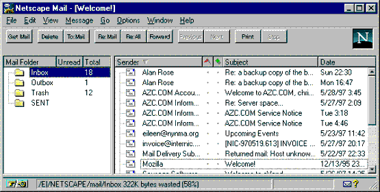
Fig.
22. Sorting a table by
clicking the Sender column head (Netscape 3).
In Fig. 22, the messages are reorganized
according to which column was clicked last. This
may not be as useful as the two-level sort shown
in Fig. 23. In this application, clicking the column
head toggles the messages between reverse or standard
order, depending on which column the user clicks
and how often. Clicking Date once, for example, would
reorganize the messages in standard chronological
order; clicking it again reorganizes the messages
in reverse chronological order.
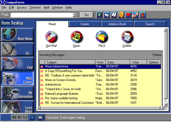
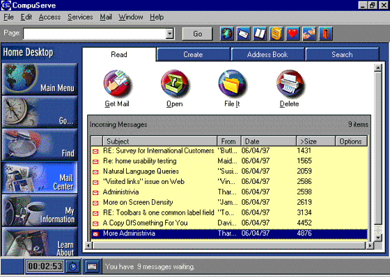
Fig. 23. A different
approach to toggling (CompuServe 3.0.1).
For more complex sort orders (by name
within date, for example), you might want to offer
a sort dialog box. Do usability testing to find out
which style of sorting is more appropriate for your
application.
Usability tests:
In low-fidelity and high-fidelity prototypes,
note areas in which users seem to looking for more
information—these areas may be good places for tables.
Use a talk-aloud protocol.
Also test for these items:
Obviousness: Are the goals of
the table apparent? Is the title too generic—can
the users recognize the use or contents of the table
from the title?
Heuristics: Do experts agree
that you’ve formatted the data correctly? Check with
people with expertise in statistics and mathematics.
Mechanical: Users often prefer
to see preformatted tables as their first experience
with a table program. Later, if they need to, they
can fine-tune the display. Have you made it easy
for the user to get an interesting table the first
time he or she uses the application (perhaps with
a wizard, if the display or data are complex)?
See also:
Graph.
Toolbar
A collection of command, action, or
function buttons. Toolbars generally appear at the
tops or edges of application windows. They may be
moveable; if they become moveable, they are called
palettes.
Good for:
Accessing often-used (Save, Cut) or
repeatedly used (bullets, numbering) functions with
the mouse.

Fig. 24. A customized
Word for Windows 6 toolbar.
Finding important functions easily.
Because toolbars make options visible, they also
remind users to do important actions—Save, for example.
Not good for:
Operations that are done more efficiently
using the keyboard.
Operations that require many parameters,
that have no defaults, or that don’t lend themselves
to shortcuts. For example, a Fax shortcut button
should simply send the document to the fax modem
using the current defaults; it shouldn’t bring up
a fax dialog box.
Design guidelines:
Global vs. local functions on toolbars
Toolbar functions should be global—in
other words, they should be usable for an entire
window or across several windows. Options that are
used in only one section of a window or in a dialog
box should appear in the section or dialog box, not
on the toolbar.
Truly global toolbars
Some environments accommodate "front
panels" (Marcus 1995, 37) or "control panels" on
the desktop. When the same functions are available
for all windows in an application (or even all applications
in the system), it might make more sense to have
a toolbar that floats on the desktop rather than
repeating the same toolbar on each individual window.
Fig. 25. A prototype
control panel for a financial analysis system.
The danger is that the floating toolbar
may get hidden. However, in the Windows 95 environment,
you can create a taskbar that is anchored to an edge
of the screen and thereby never gets lost. On Sun
or other (usually UNIX) workstations with large amounts
of screen real estate, there may enough room for
any number of floating control panels.
Location, location, location
Palettes generally float, while toolbars
are tied to the frame window, usually at an edge
of a main window or just below the menubar.
The location of toolbars and palettes
takes something from the idea of a workshop—the tension
between having a clear space to work and having all
the tools you need at hand has to be resolved (Collins
1995, 224). In a physical workshop, you put up wall
racks to store the tools you need some of the time
and put drawers in the work table for the tools you
need all the time. Really well-designed work tables
have pockets for tools and hardware around the edges.
Toolbars and palettes are like those pockets. Menus
are like the wall racks, and dialog boxes are like
the drawers.

Fig. 26. Status-bar "page
view" buttons (at the left) in Word for Windows.
Top vs. side locations
Galitz suggests putting toolbars containing
the application’s primary functions along the top
of the window. Toolbars for subtasks can go along
the sides of the window (1997, 337).
Some environments let you add toolbar
buttons to the status bar or to the scroll bar at
the bottom of the window. Windows 95 lets you create "application
desktop taskbars" (or "access bars")
that act like the Windows 95 desktop task bar. See "Application
Desktop Toolbars" in chapter 10 (Microsoft 1995,
271-272).
Changing toolbars into palettes
Microsoft Office 97 and other environments
let users drag toolbars away from the window borders,
turning them into floating palettes (Fig. 27). If
it would help users to have certain functions at
their mouse-tips, then include this functionality
in your application. However, make sure that your
training and documentation departments know about
it. Users may not notice this feature on their own.
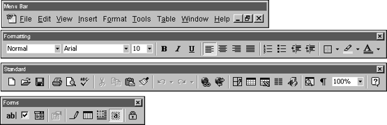
Fig.
27. Toolbars into palettes.
Changing positions
Wherever you put a toolbar, make sure
that it can be repositioned. Weinschenk and Yao have
these suggestions (1995, 84-85):
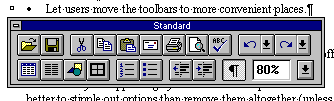
Fig. 28. Word for Windows
toolbar, dragged into the body of the document window.
-
Let users move toolbars (or palettes)
to more convenient places.
-
Let users customize the toolbar
with the options they use most often. Let them
remove buttons they don’t use.
-
Let users toggle the toolbars on
and off. Turning toolbars off makes more room
on the screen for the ‘live’ information.
Other guidelines
-
It is better to stipple out temporarily
unavailable options than to remove them altogether
(unless the options are removed based on user
IDs and need-to-know rules). If some buttons
are always
available and others are sometimes unavailable,
consider grouping the two sets separately—at
either ends of the toolbar, for example.
-
Although you may show different
sets of options on different windows, it is better,
if possible, to keep the options in the same relative
positions from toolbar to toolbar.
-
Use the same buttons for the same
functions on all toolbars in the application.
Don’t
use a piggybank on one window and a diskette
on another for Save.
Organizing buttons
Galitz offers these guidelines (1997,
336-338):
-
Order the toolbar buttons logically—for
example, by frequency of use, sequence of use,
or importance.
-
For buttons ordered left to right,
put the most frequent actions to the left. For
buttons ordered top to bottom, put the most frequent
actions at the top.
-
Keep related buttons grouped together.
However, to avoid activating potentially destructive
buttons by mistake, separate them from frequently
selected buttons. (Mouse slips are fairly common.)
Button, button, what kind of button?
Since toolbars are many functions crammed
together, the labels usually end up being small iconic
buttons. (See Iconic Label for information on designing
and testing the pictures.)
Most are pushbuttons, but some are
check boxes (on word processors, for example, the
bold, italic, and underline buttons are check boxes)
and some are radio buttons (left, right, center alignments).
Usability tests:
Ask test participants to organize the
buttons by most used to least used. Also, separately,
ask them to identify the function from the label
and vice versa. The information you are looking for
is:
-
Whether users understand the meanings
of the pictures immediately (ease of learning)
-
Whether they remember the meanings
readily, once learned (memorability)
-
Whether users can discriminate between
similar pictograms or similar ideas
Ease of learning is especially important
when you’re developing for casual or inexperienced
users. Test using a paper and pencil matching test.
Memorability is most important when
you’re writing for experienced users. If your user
group will use the product daily, you can use "nonsense" pictures
(a yellow triangle, a green square, etc.), provided
that the icons are visually distinct from one another.
Some pictures may be hard to recognize
no matter what you do to improve them. The solution
is not to beat your collective heads against the
wall, trying to find the best image. Rather, add
tooltips. Many researchers have repeatedly found
that images combined with text works better than
images alone or words alone.
See also:
Iconic Label; Tooltip.
Tooltip
A small pop-up that appears when the
user holds the pointer over a button or other screen
object for a short period of time. It contains a
short "what’s this" or "how to use
this" description of the object.
Good for:
Finding out what a screen component
does, especially when it has no text label (Fig.
29).

Fig.
29. A tooltip from Word
for Windows.
Not good for:
More than a phrase. Use online help
for detailed information.
Design guidelines:
Tooltip help is a property of buttons
and other controls. Check the documentation that
comes with your development package (or the property
box itself) for implementation information.
Timing
Tooltips appear when the user holds
the mouse over the button for a certain length of
time. Tips are then triggered automatically over
each additional button until the user clicks on an
object.
User Interface Engineering (UIE) reports
that Microsoft sets its delay at 700 milliseconds—when
they set the delay at 500 milliseconds, users complained
that they popped up too much; at 1,000 milliseconds,
users never discovered how to bring them up. However,
UIE found another problem during their own tests:
Users cruise the toolbar looking for tooltips, but
the tips never show up because the mouse hasn’t stopped.
This problem is compounded, UIE says, by a common
user response—trying to make the tips show up by
wiggling the cursor over the button. The wiggling,
of course, resets the timing so that the tips are
never triggered (User Interface Engineering 1996,
7).
How to write the text
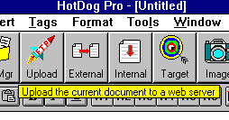
Fig.
30. A good, verbose tooltip
for Upload from HotDog Pro.
UIE reports that tooltips can be too
cryptic (see Fig. 30 for a verbose tooltip). In a
comparison between Window Access and Lotus Approach
tooltips, the researchers found that users preferred
Approach’s short phrases to Access’s terse, two-word
labels.
Microsoft’s tooltips are designed to
match menu labels—for example, "Print Preview" is
used both on the button and the menu label. Lotus’s
tooltips, on the other hand, are designed to help
users find the function they need—for example, the
tooltip for the Browse button was "Go to Browse
to review or modify data."
However, UIE points out that the users
ignored the "Go to Browse" part of the
message and saw only "modify data," the
desired function. For that reason, they suggest concentrating
on the function rather than the name (User Interface
Engineering 1996, 1).
Internationalization
If your software may be internationalized,
put the text in a separate resource file and a pointer
to the text in the component itself. For information
on expansion rates between English and most other
languages, see Label.
Usability tests:
Test that users describe the control’s
function the same way that you do. In early phases,
use a paper-and-pencil matching test. In low-fidelity
or high-fidelity prototypes, use a talk-aloud protocol
and listen for questions about button names and functions.
See also:
Online
Help, Context-Sensitive; Status
Bar
Window
The application’s container. The main
window provides a framework for the application’s
functions, commands, and data. It also provides a
top-level context for secondary windows and dialog
boxes.
Good for:
Making the application’s conceptual
model concrete (Fig. 31).
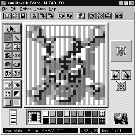
Fig.
31. Draw an icon in the
square in the middle (Icon Make-It 1.0, Moon Valley
Software).
Offering closure by giving the user
a standard starting point and, in some cases, a standard
ending point (Fig. 32). This is the "home window" idea
both on the Web and in standard GUI applications.
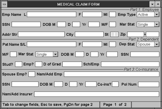
Fig.
32. A standard starting
point for a data-entry application.
Design guidelines:
Developers, usability experts, users,
and designers debate endlessly about how much to
put on a window. Some early guidelines suggested
keeping screen densities to under 25 percent—in other
words, only 25 percent of the window should actually
contain fields or displayed information (Galitz 1994,
83). NASA researchers found that densely packed screens
(70 percent full) took an average of 5 seconds to
scan, while sparsely filled screens (30 percent full)
took only 3.4 seconds. By improving the labeling,
clustering related information, using indentation
and underlining, aligning numbers, and eliminating
unnecessary characters, the researchers reduced task
time by 31 percent and errors by 28 percent for inexperienced
users. Experienced users did not improve their task
times, but they did become more accurate. A study
of telephone operators found that maintaining a 25
percent density and suppressing redundant family
names reduced search times by 0.8 seconds per search
(Schneiderman 1992, 318-319).
However, expert users (stock brokers,
air traffic controllers, and so on) prefer denser
displays because more information per screen means
fewer computer-related operations. Since these users
are familiar with the data, they can find what they
need even on a screen with 80 or 90 percent densities.
The solution to this impasse may be
the model shown in Fig. 33. This model is based on
Cooper’s analysis of applications into daemonic,
parasitic, transient, and sovereign (1995, 151-170),
Galitz’s analysis of the three types of sovereign
windows (1997, 153-163), and Spool’s separation of
applications into core and ring (1996a, 1-3). The
bars are hypothetical, supported mostly by experience
rather than by research data. However, as a hypothesis,
the model should be testable both clinically (through
experience) and experimentally (through usability
testing).
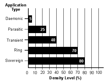
Fig.
33. Comparing application
types to screen density.
Following are definitions of the key
terms.
Daemonic applications
Applications that do not normally interact
with the user are, in Cooper’s model, "daemonic" programs.
They serve quietly and invisibly in the background
without much need for human intervention. Typical
daemonic programs are printer drivers and network
traffic analyzers. They typically have, or should
have, minimal interfaces—a small window with a few
settings. In the UNIX world (from where the term
comes), many daemons have no graphical interface
at all, just a set of command-line flags for changing
settings.
Parasitic applications
Parasitic applications are continuously
present but perform only supporting roles. For example,
a parasite may monitor the amount of system resources
available, put a clock in every program’s caption
bar, or show how much memory is free. They are physically
small and are superimposed on other applications.
A process-reporting parasite has to
be both simple and bold. Since it rides on top of
other applications, it must respect their preeminence
and move out of the way if necessary.
Transient applications
A transient application does only one
simple function. It comes when needed, does its job,
then leaves, letting the user continue with his or
her normal activity. Typical transient applications
are graphic scanners, document faxers, and e-mail
applications.
Cooper offers these design guidelines:
-
The transient application should
respect the sovereign applications by not taking
more space on screen than absolutely necessary.
-
To help users orient themselves
quickly, its icons and other components can be
larger and brighter than those of sovereign applications.
-
Skinny sliders and tiny drag-and-drop
widgets are out of place here—keep demands on the
user’s fine motor skills to a minimum.
-
Build instructions into the surface—since
the user may see the program once a month, she
will probably forget what the steps for using
it are and what the icons represent.
-
Keep a transient application to
one window—don’t force a user onto a subwindow
or dialog box to manage a main function of the
program.
Ring applications
Ring applications are designed to help
users do activities in areas with which they are
not very familiar. In Spool’s model of "core" and "ring" applications,
a core application is one that enhances the user’s
core competencies (the same as a sovereign application
in Cooper’s model). For example, an engine-analysis
system enhances a car mechanic’s core competencies.
A ring application, on the other hand, helps with
tasks outside the mechanic’s core competencies. For
example, a car-parts locator program makes it easier
for the mechanic to do his or her job, but doesn’t
add to the core competencies.
A core application should be as dense
as necessary (see "Sovereign Applications" below),
since their users will be spending a lot of time
with it and will want to have as much information
available as possible. But since users use ring applications
only occasionally, they need all the help they can
get—not just white space and careful grouping but
built-in templates and wizards to get them over the
learning hump quickly.
Sovereign applications
Cooper describes a sovereign application
as "the only one on the screen, monopolizing
the user’s attention for long periods of time… Sovereign
applications travel in royal splendor, surrounded
by their numerous courtiers. They offer a panoply
of related functions and features, and users tend
to keep them up and running continously." (1995,
152). Good examples of sovereign applications are
word processors and spreadsheets. Many vertical applications
are also sovereign applications, as they often stay
on the screen for long periods of time—hours, usually—and
interaction can be very complex and involved.
One of the most important aspects of
a sovereign application is that the users are experienced.
Although each user will spend some time learning
the application, it will be only a short period of
time compared to the amount of time she will eventually
spend using the product. Therefore, sovereign applications
should be designed for experienced users, not for
first-timeor occasional users. "Sacrificing
speed and power in favor or clumsier but easier-to-learn
idioms is out of place here," says Cooper. "Of
course, if you can offer easier idioms without compromising
the interaction for experiemced users, that is always
best" (1995, 153). He warns, however, that if
a competitor comes up with the same functionality
but an easier interface, the competitor will take
over the market. Look at WordStar vs. WordPerfect
and Microsoft Word in the 1980s or, more recently,
Ventura vs. Framemaker.
Fig.
34. Microsoft Word,
a sovereign application with extra information
and tools tucked into the bottom margins.
Other aspects of a sovereign approach
are:
-
Because the user’s interaction
with the sovereign program dominates his or her
sessions
with the computer, you should feel free to take
as much video real estate as possible.
-
Expect that the users will run
the application maximized. Maximize the window
by default—although
the application must be resizable and minimizable,
it should be optimized for maximum size. Unless
the user instructs otherwise, documents or views
inside second-level windows should also be maximized.
-
Because the user will be staring
at the window for hours at a time, mute the application’s
colors and textures. Bright colors and patterns
might be fun the first time the user sees them,
but they will start to look unreasonably garish
after a few weeks. (Users will complain about the "Mickey
Mouse" or "Fisher-Price" colors.)
-
In the same way, screen components
don’t have to be as big and obvious as they would
in transient or parasitic applications. Users
will become familiar with the locations of palettes,
menus, toolbars, and other items simply because
they see them day in and day out.
-
Enrich the interface with extra
information (Fig. 34). For example, you can add
miniature graphs, LEDs, tool icons, and hints
to the status bar, to the edges of the scroll
bars,
and to all the other "dusty corners of the
program’s visible extents" (Cooper 1995,
154).
-
Add many ways to control every aspect
of the application: keyboard shortcuts, drag and
drop, dialog boxes, mouse shortcuts, direct manipulation.
Let users find the method that suits themselves
best.
-
Minimize delays. It is acceptable
for procedures to take time, but these procedures
shouldn’t be the ones that users do all the time.
For example, if it takes more than a second to
save a document to disk, that delay will quickly
come to be viewed as unreasonable. On the other
hand, the user won’t be irritated if it takes a
few seconds to change the format of an entire document—the
user can see that it should take time and he
won’t be doing it very often.
Three types of sovereign windows
The sovereign window idea is a GUI
design breakthrough, but it doesn’t quite go far
enough. This is where Galitz’s three types of main
windows comes in. The three types are form-based
data-entry, conversational (also called "interactive"),
and inquiry ("result" and "read-only").
In a form-based data-entry window,
the user types data from a paper form (for example,
a medical insurance form) into the computer. The
typist generally looks at the paper form rather than
the monitor and, in fact, uses the field labels only
to find his or her place again after an interruption.
In a conversational window, the user
interacts with the software face to face (so to speak).
Activities that fall into this category range from
CAD/CAM, games, and automatic teller machines, in
which the user interacts only with the software,
to airline reservation and telemarketing systems,
in which the user interacts with a customer and the
software at the same time.
With inquiry windows, the user searches
for and retrieves specific information. Applications
in this category range from telephone operators'
databases to CompuServe libraries to CD-ROM encyclopedias.
The different functions require different
window layouts:
-
Conversational windows require careful
visual organization and should include complete,
unabbreviated labels and onscreen instructions.
Status and informational messages, prompts, and
context-sensitive help are useful here.
Each type of layout is described below.
Form-based data-entry windows
The most important design problem for
form-based windows is fitting all the fields in the
relatively limited space of the window. The next
most important is organizing the fields.
Fitting the data horizontally
Fig. 32 is a screen developed from
the paper form shown in Fig. 35.
PART 1: EMPLOYEE
INFORMATION |
EMPLOYEE NAME (LAST,
FIRST, MIDDLE INITIAL) PLEASE PRINT |
Active
Long-term
disability |
Retired
COBRA |
Your social security
number |
Date of Birth
MM DD yy |
Male
female |
marital status
single married
widowed divorced |
home address - street |
city |
state |
zip code |
part 2: complete
only if claim is for a dependent |
patient's name (last,
first, mi) if a dependent |
dependent status
spouse other
child |
Male
female |
marital status
single married
widowed divorced |
Date of Birth
MM DD yy |
dependent's social
security no. |
For a child 19 years
or older, is child is full-time student?
yes no |
IS the child employed?
yes no |
date of graduation: |
name and address
of school/employer:
|
part 3: Co-insurance
information |
Was your spouse
employed at the time of treatment?
YES NO |
If yes, name and
address of employer
|
social security
no. |
Date of Birth
MM DD yy |
co-insurance?
yes no |
policy number |
name and address
of co-insurer
|
Fig.
35. Paper form from which
the window was developed.
Since the source is a paper document,
the most effective window is an exact image of the
document. When the source and target match line for
line, the typist can simply type from the form, filling
in the entire screen without glancing at it or, at
most, looking at it to check for typographical errors
and to correct errors detected by software edits
(Galitz 1989, 121).
However, a paper form can have a dozen
fields on a single line. To fit the fields horizontally,
shorten the labels by using a smaller typeface or
by abbreviating. If done correctly, abbreviating
the labels won't change the usability of this type
of window.
Studies of abbreviation methods have
found that truncating words is the best method for
creating abbreviations. However, since you often
end up with the same abbreviation for more than one
word, you need back-up methods:
-
Contracting words to the first and
last letters, deleting vowels, and phonic puns—FX
for effects, XQT for
execute—are good backup methods (Schneiderman 1992,
163). However, puns rarely translate—don’t use
them if you intend to internationalize your application.
-
Using the abbreviations found in
commercial abbreviation dictionaries may help users
who move often between jobs in the same industry.
-
Creating ad hoc abbreviations doesn't
work well because people have different ideas
about the "natural" abbreviation for any one word—"meeting" might
be "mtg" or "meet," for example (Galitz 1989,
115).
When you use abbreviated labels, teach
users the full word or words first, then its abbreviation.
Novices who used full command names before being
taught two-letter abbreviations made fewer errors
than those who were taught only the abbreviations
or who made up their own abbreviations (Schneiderman
1992, 162).
It is necessary, but not sufficient,
to list all of the abbreviations in lists or combo
boxes¾ also let users
know what your abbreviations stand for. Put the definitions
online in the help system or hand out commercial
abbreviation dictionaries or your own quick-reference
guides.
Fitting the data vertically
Abbreviating labels solves the horizontal
problem, but not the vertical problem. A paper form
can have 60 or more lines on an 8½ by 11 inch sheet
of paper but a window has about 20 lines. To display
the entire form, you must use scrolling, paging,
or tabs.
Scrolling
Apple suggests that, when a user is
at the edge of the window, the application should
automatically scroll one line of text for word-processing
applications, one field for databases or spreadsheets,
and one object (if possible) for graphics programs
(Apple 1992, 167).
For form-based windows, however, you
might want to scroll by full screens. In other words,
when the user fills all of the fields on the first
window, pressing [Tab] or [Enter] on the last field
moves him to the next page. (Depending on the application,
you might want to save the entries automatically
between window changes. Multimate and Radio Shack's
Scripsit word-processing programs used to save the
users’ work whenever they changed pages, which was
a lifesaver in the days of unreliable hardware.)
Paging
You can let the user page up and down.
Although expert users do well with either paging
or scrolling, novices prefer paging since it is familiar
and less disorienting (Galitz 1989, 75-76).
Paging or scrolling by full screens
work best if you divide the set of screens into logical
sections. For example, an insurance claim form might
be divided into its standard sections—insured name
and address; claim information; information on dependents;
doctor's information; and so on.
Provide location cues. Here are some
recommendations:
-
When an application has more than
one page or screen per form, show a page or screen
number in the status bar. Use the "Page n of n" format
to give users a sense of where they stand in
the record.
-
Put the screen number on the paper
form—use an inconspicuous spot in or near the
margins.
-
If you've broken the form into logical
sections, put a subtitle in the status bar. The
subtitle should match the title of the same section
on the paper form.
Make sure that users can move backward
as well as forward through the windows. This is especially
important for applications in which corrections to
already-saved data are difficult and time-consuming—for
example, when saved data are sent by modem to a mainframe
in batch and cannot be retrieved, only overwritten.
When users can't go back to correct an error, they
will often abort the job, losing pages of work, to
start over. Consider letting users save data locally,
prior to submitting the records, at page breaks or
other checkpoints. Temporary saves allow them to
look for answers to questions, protect their work
against power outages, and take breaks without having
to finish and submit an entire form.
Tabbed windows
A relatively new option is the tabbed
window or view. Tabbed windows have the advantage
of making all pages (or at least their labels) visible
and readily accessible. Just make sure that you add
keyboard shortcuts to the tabs so that typists can
move between pages using the keyboard.
Organizing the data
Paper forms grow in unorganized ways¾ a
legal requirement changes or marketing needs more
information so another question gets added to the
end of the current form. After a few years, page
2 or 3 of the form is a hash of unrelated information.
Although data-entry clerks don't, strictly
speaking, need to understand the information on the
forms, they have no way to correct or even recognize
errors if they don't understand it. Since repairing
errors is far more expensive than doing it right
in the first place, ensuring that the forms make
sense is more cost-effective than training, job aids,
or online help.
For an understandable system, organize
the form before you try to program the window against
it. The primary organization styles are:
Sequence
Arrange information in its natural
order. An address, for example, is usually written
as street, city, state or province, and postal code.
If your systems has a built-in ZIP code lookup, you
might have the users enter the ZIP code first, so
that the system can automatically fill in the city
and state. (Make sure that they can override the
system when necessary, however¾ commercial
postal-code databases contain errors.)
Frequency
Put the most needed information at
the top. For example, since everyone who fills out
a medical claim form enters his or her name, address,
employer, and insurance ID number, this information
appears at the top.
Function
Group items according to their functions.
On federal tax forms, for example, all income appears
in one section, all exemptions in another section,
and what you owe (or are owed) in the last section.
Conversational windows
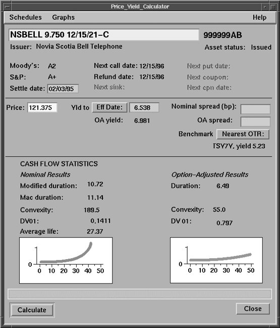
Fig.
36. Typical conversational
window.
Conversational windows include everything
from Nintendo games to desktop-publishing systems
to financial applications (Fig. 36). What makes them "conversational" is
that users look at and interact with the window itself—they
are not tied to a source document.
Since the user's attention is on the
window, more information is better than less. Field
labels should be long and detailed; adding onscreen
help and cue cards (provided that users can turn
them off) is recommended.
Conversational windows can become crowded,
however, and highly complex. Without careful design,
they can become confusing. Galitz has a simple test
for whether a conversational window is designed correctly: "Can
all screen elements (field labels, data, title, headings,
types of controls, etc.) be identified without reading
the words that make them up?" (1994, 58). For help
designing windows that pass this test, see Label.
In general:
-
Provide need-to-know information
at the top of the window or on the primary window.
If the user is looking for price relative to yield,
then show her price and yield at the top of the
window. Information about the company issuing the
stock, the number of shares outstanding, the broker
recommending the stock, and so on, can go at the
bottom of the window or in secondary windows.
-
Put nice-to-know information in
secondary windows. For instance, a lab analyst
needs to know whether a test result was positive
or negative¾ therefore,
this information goes on the primary window at
the top left. However, he might also like to
know the statistical likelihood of a false positive
using this batch of reagent, this level of humidity,
and so on. This information can go in a separate
window, tabbed view, or dialog box.
Inquiry windows
At a minimum, inquiry windows let users
search for and look at information. However, the
idea of "inquiry" goes far beyond answering simple
questions or checking a view of a database. Inquiry
can also mean answering a child's question about
dinosaurs or sending an adult on a chase from "wild
goose" to "Chinese cuisine" to "influenza epidemics."
Careful organization, easily scannable
text and instructions, and the right amount of information
per window are just as important on inquiry windows
as they are on conversational windows. However, designing
a sophisticated inquiry window—for the World Wide
Web, for example, or for a multimedia presentation—is
more like designing a magazine page than a software
window¾ shape, color,
and typography are paramount.
To create an easily understood window,
remember consistency, placement, and proportion.
The following sections are oriented around a multimedia
or Web inquiry window, but the ideas are applicable
to less complex applications as well.
Consistency
Maintaining consistency is simple—define
one or two standard layouts for the entire application
and fit all text and graphics into those layouts.
Magazine designers use the "grid system" to
define pages and simplify layout, and this system
works just as well for window design.
The first step in defining a grid system
is selecting margins and, within the margins, a number
of columns (Hurlburt 1978, 47-64). See Fig. 37.
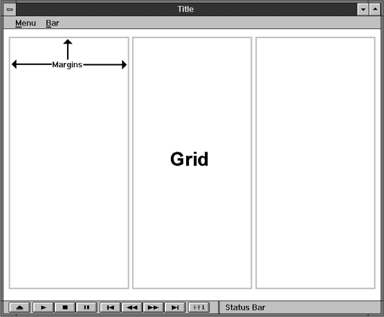
Fig.
37. A three-column grid.
The columns can contain either text
or pictures. Chunks of text and pictures can remain
within the confines of the columns or break out across
multiple columns, as shown in Fig. 38.
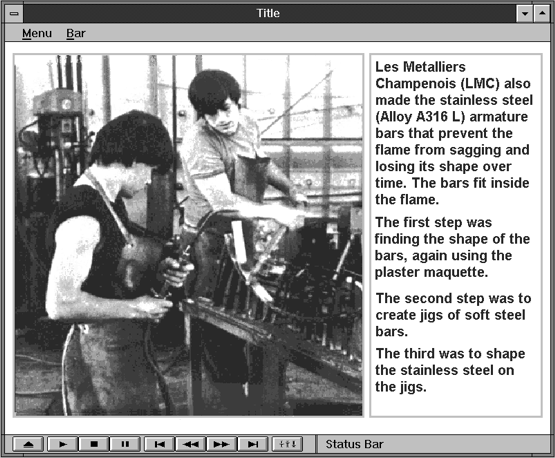
Fig.
38. Picture, text.
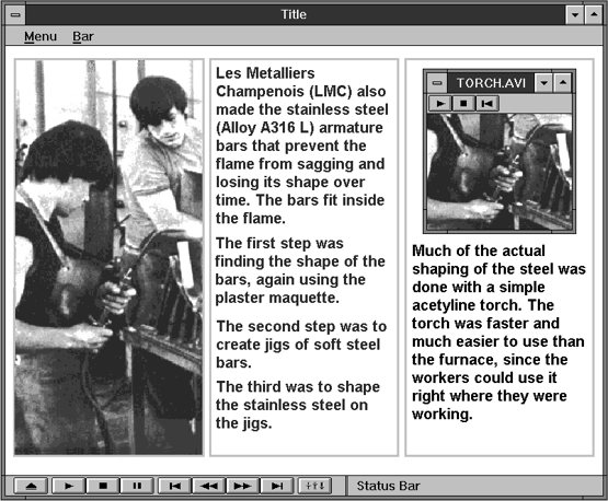
Fig.
39. Picture, text, video.
Since all window elements remain within
the grid, the windows look consistent as the user
moves from one to the next. Since the elements are
not rigidly restricted to one column, however, you
can accommodate a variety of picture shapes and sizes.
Note: The grids in Fig. 38 and Fig.
39 are visible as gray boxes around the columns.
However, the grid in the finished product can be
visible or invisible.
Placement
Can the user find what he's looking
for immediately? Or, in a marketing presentation,
does he see what you want him to see immediately?
You can satisfy either criterion by
knowing two facts: People look at pictures first,
and (in Western societies, at least) their eyes move
from the upper left-hand corner to the lower right-hand
corner. Therefore, put your most important piece
of information at the top left. In a marketing presentation
or multimedia application, put your pictures or headlines
at the top left, the text to the right. If you can,
try to have something in the picture point to the
text, as shown in Fig. 40.

Fig.
40. Point towards the
text.
Proportion
For graphic elements such as photographs
and illustrations, certain proportions are more pleasing
than others. The "golden rectangle," whose proportions
are 1 to 1.618, has intrigued Western artists, designers,
and philosophers since antiquity. If you draw a line
through the golden rectangle to create a square,
the remaining area is another golden rectangle—a
most interesting property. Another popular rectangle,
especially in Japan, is the double square (Marcus
1992, 7-8).
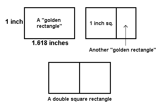
Fig. 41. A golden rectangle
and a double square.
Typography requires a good sense of
proportion as well. Luckily, there is a simple rule
of thumb for the correct relationship between line
length and type size for optimum readability:
A line of text should be about one
and a half alphabets long (39 characters, in
other words).
Most type books say 40 to 60 characters
per line is fine, depending on how wide or narrow
the letters in the typeface are (Romano 1984, 86-87).
Forty to sixty characters is about five to eight
words (an average word is eight characters long).
The easiest way to find the right size is to create
a "ruler" in your chosen face by typing 1 to 0 four
times:
1234567890123456789012345678901234567890
Change the type size of the ruler until
it fits the desired line length.
Secondary windows
In Windows 95, secondary windows are
defined as nearly anything that isn’t a main window—property
windows, property inspectors, pop-up windows, and
dialog boxes are all called "secondary windows." However,
historically, as well as on other platforms, secondary
windows are defined as supplemental windows.
Secondary windows are derived from
the main window and typically appear on top of or
inside the frame of the main window. They are resizable,
movable, and scrollable. Although structurally they
resemble a primary window, using the same controls
in their title bars, they use the main window’s menu
bar.
They are used to do supplemental tasks,
such as:
-
Holding second-level tasks—page
2 of a data-entry form, for example.
-
With the help of modes, moving users
through a task in a highly structured way. See
Dialog Box, Standard, for more on modes.
-
Showing secondary information. Secondary
windows are useful when the main window is filled
by top-level information, but users require backup
information. The backup information can appear
in secondary windows, especially tabbed secondary
windows (see Fig. 42).
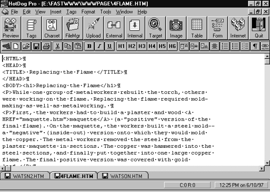
Fig.
42. A multi-document
interface using tabs (HotDog Pro version 2.057,
Sausage Software).
MDI and other multiples
-
In Windows 3.0, Microsoft defined
the "multiple document interface" (MDI)
type of window. An MDI window holds any number
of documents, in contrast to the "single document
interface" (SDI) that can display only one
document at a time. In an SDI system, users who
wished to cut and paste (for example) between
two documents would have to open two copies of
the
application. In MDI, users simply open both documents
inside one application, thereby simplifying the
interaction and using fewer system resources.
Once the multiple documents were opened, users
could
tile or cascade the set or flip between them
using a keyboard shortcut. Word for Windows is
a typical
MDI application.
In Windows 95, however, Microsoft argues
against MDI and for three other paradigms:
-
Workspace, which is a window that
holds a set of objects. It is based on the idea
of a desktop or table. Like MDI, it is used to
present multiple views of the same object or views
of multiple objects.
-
Workbook, which is a set of views
or child windows organized into a tabbed notebook.
Every page of the notebook is maximized, making
side-by-side comparisons difficult. However,
the interface is simple and easy to understand—there
are no child windows to manage. Fig. 43 is a
good example of the workbook approach.
-
Project, which is a container holding
or actually managing a set of objects. The objects
do not have to stay inside the main window frame
and can be minimized and restored separately from
the main window. Because they are separate, they
must have their own menubars and other elements.
Visual Basic is a good example of a project-style
application (Fig. 43).
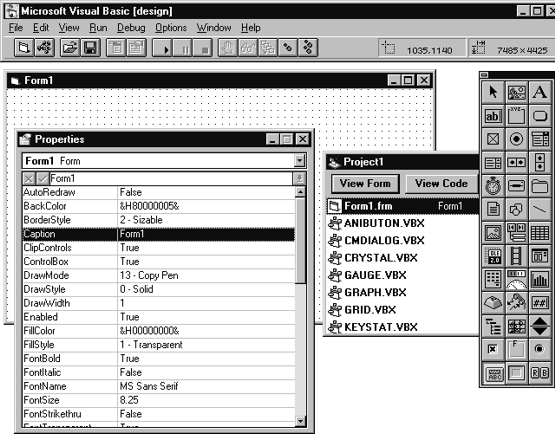
Fig.
43. Visual Basic as a
project-style application: the windows are not
restricted to a frame.
For more information about these paradigms,
see Microsoft (1995, 220-235) and Galitz (1997, 226-232).
Usability tests:
Finding the "home" or main
window is the function of conceptual modeling and
low-fidelity prototyping. See Appendix A, "Creating
a Good GUI," for more information.
See also:
Dialog
Box, Tabbed; Dialog
Box, Standard; Label; Pushbutton.
Wizard
A set of dialog boxes that automates
a task by asking users questions, usually one question
per dialog box.
Good for:
Automating infrequent tasks that users
do not need to learn—installing a software package,
for example (Fig. 44).
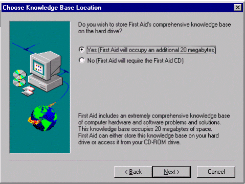
Fig.
44. A panel from an installation
wizard.
Helping new or casual users do complex
or sophisticated tasks (Fig. 45).
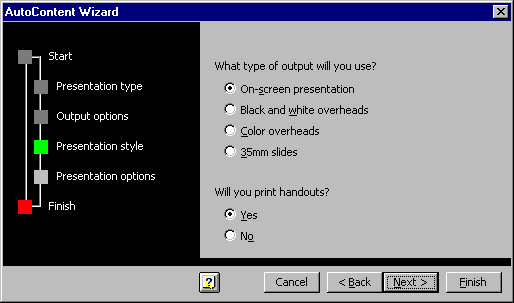
Fig.
45. A panel from AutoContent
Wizard, Microsoft PowerPoint.
By giving new users a successful first
experience with the application, encouraging them
to graduate to the regular interface.
Not good for:
Tasks that are used so frequently that
users would be expected to learn them. Experienced
users may find wizards to be too slow and not adaptable
enough.
Teaching users how to do a task. Use
printed training guides, online tutorials, or online
procedural help instead.
Design guidelines:
For one-time tasks and for getting
first-time users up and running quickly, wizards
are excellent tools. However, they have two shortcomings:
Rigidity and a slow pace.
-
Wizards are rigid because the outcomes
must be programmed in advance and the templates
restricted to a certain likely group. For example,
the Microsoft Word 7 "Letter" wizard
restricts the user to seven page designs and
three letter styles.
-
Wizards are slow simply because
they restrict the user to one choice per panel.
In a standard interface’s dialog boxes, on the
other hand, users can usually make many choices
at once (Boggan, Farkas, and Welinske 1996, 92).
The primary design guideline, therefore,
is to make sure that you really need one. As the
Microsoft guidelines put it, "Do not rely on
wizards as a solution for ineffective designs; if
the user relies on a wizard too much it may be an
indication of an overly complicated interface, not
good wizard design" (Microsoft 1995, 359).
Programming wizards
Microsoft says that you can, if you
want, define wizards as a series of secondary windows
through which the user moves. However, since all
these extra windows can lead to increased modality
and screen clutter, they recommend using a single
secondary window instead, replacing the contents
as needed (1995, 359).
Wizard screen components
Typical screen components in wizards
appear on Table 1. Panels also generally include
graphics. See "Graphic feedback for wizards" below.
Table
1.
Wizard Screen Components |
< Back button |
Lets users return to an earlier
panel and change values if necessary. Remove
or disable the button on the first panel. |
Next > button |
Lets users confirm the choices
on the current panel and move to the next panel.
Remove or disable the button on the last panel. |
Browse button |
Lets users find a particular
file, path, application, or piece of hardware. |
Cancel button |
Discards all user-supplied settings,
terminates the process, and closes the wizard.
Note: For complex tasks, you might want to
offer a save option, letting users save their
choices up to the point at which they canceled. |
Finish button |
Completes the task. May apply
user-supplied or default settings from all
panels. However, check your task analysis before
putting Finish on all panels. It might not
be advisable or possible to let users generate
a result based only on the defaults. Put Finish
to the right of the Next > button. |
Help button |
Offers background information
and advice. |
Radio buttons |
Let users select one option from
the available options. |
Text entry area |
Lets users enter text that will
appear in the end product (a title, for example)
or type a value that the wizard needs. |
Title |
Identifies the wizard’s purpose. |
Graphic feedback in wizards
Provide feedback by including a graphic
on the left side of the window (see Fig. 44 and Fig.
45). On the opening window, this graphic establishes
a reference point. It can be
-
a conceptual rendering (for hardware
set-ups, for example, show pictures of the hardware
that will be set up)
-
a snapshot of the area of the application
that will be affected, or
-
a preview of the result (Microsoft
1995, 360).
On the subsequent panels, change the
graphic to show the results of the user’s choices.
For example, if you are designing a newsletter wizard
and the user can set one, two, or three columns,
change the graphic to show the result for each choice.
So that the user can see the end product emerging
step by step, each subsequent graphic should reflect
all previous choices. For example, if the user picks
a two-column format in panel 3, make sure that panel
4 and all following panels show the newsletter in
two-column format.
If the graphic is not interactive,
make sure that it looks that way. If you illustrate
part of the interface, for example, make it larger
or smaller than its actual size or render it more
flatly (Microsoft 1995, 362).
Writing the wizard text
Following are some writing guidelines:
-
Use simple, jargon-free language.
-
Present options to users as questions: "What
style would you like for your newsletter?" or "How
many columns would you like?"
-
Provide short conceptual tips so
that users can understand the implications of
each option. "What’s This?" help tied
to the various radio buttons could be an appropriate
way
to deliver this type of information.
-
Wherever possible, suggest the
actions that the user might take after finishing
the task.
Encourage the user to customize the result using
the application’s usual interface. Point to the
most likely next task in the user’s workflow.
Provide jumps to useful help topics or tutorials
(Boggan,
Farkas, and Welinske 1996, 95).
Designing the flow
In designing the correct flow through
the wizard, you need to look for the most likely
or obvious route through the task. Once you find
it, stick with it and make sure that the user knows
what it is.
Find the obvious route
Obviousness is important for inexperienced
users. Think about giving driving directions to your
house: If your friend Sally has never been in your
town before, you try to keep her on the main or best-marked
streets. If your friend John lives the next town
over, on the other hand, you might tell him about
the shortcuts or have him go by the scenic spots
(the local golf course, the local swimming pool,
etc.). Sally is the inexperienced user; John is the
experienced user. Their needs are different and must
be met differently.
Stick with it
Stick with the obvious route by making
sure that the users can actually answer the questions
the wizard asks them. This is especially a problem
with installation wizards. For example, many installation
wizards ask for the brand name of the system’s modem.
But how many people know anything about their system’s
modem, especially if it’s internal? One solution
is to provide best-guess defaults—for example, "Hayes
compatible" should work for most personal computers.
(It might not work for such sophisticated systems
as Sun workstations and Cray supercomputers, but
these machines are tended by system administrators
who know everything about them and do all installations
by hand anyway.)
Add a roadmap
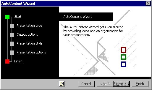
Fig.
46. Roadmap from Microsoft
PowerPoint AutoContent Wizard.
Once you have your flow, let the users
know what it is—provide a roadmap. Just putting "step
1 of 5" in the title bar isn’t enough, says
Carolyn Snyder. Several types of problems occur when
an application doesn’t have a good roadmap:
User looks in the wrong place—In
Step 4 of the Microsoft Excel Chart Wizard, one user
became frustrated when he couldn’t figure out how
to enter the chart title (which the Chart Wizard
lets you do in Step 5). He eventually gave up and
clicked Finish, never realizing that the Chart Wizard
had the functionality he wanted.
User knows the destination but can’t
determine the route—We saw this in our desktop
scanner study, whre users didn’t know if they were
supposed to scan from the scanning software, the
image editing application, their word processor,
or what?
User doesn’t know where they are—When
a user completes the Microsoft Access Form Wizard,
Access puts the user into Design mode. But users
didn’t realize Access had switched context on them,
and they looked in the menus for commands that had
been there just a minute ago, when they were still
in Browse mode. We found similar problems in PowerBuilder
3.0, which also changes its menus depending on the
state of the application. Most of the time, new users
couldn’t describe what mode they were in, what they
could do there, what mode they needed to be in or
how to get there (Snyder 1996, 8).
Roadmaps can be
Usability tests:
Test for time savings
Wizard development is often the result of
usability tests—users cannot figure out how to do
a complex task, so wizards are brought in as a solution.
When you test the wizards themselves, make sure that
you:
The solution to experienced users’ frustration
is not to add more functionality to the wizard. Rather,
the solution is to state on each panel or on the
last panel how the user can change these settings
using the standard interface.
Test whether you need help buttons
Usability and technical communication
experts disagree as to whether wizards should have
help buttons—why offer help on help? Also, since
you ask only one question per panel, there should
be plenty of room on the panel for long labels and
instructions. However, sometimes background information
can be helpful. Do usability tests of the wizard
with and without help buttons.
See also:
Online
Help, Context-Sensitive; Online
Help, Procedural
|
