|
You are here: Home ~ Desktop UIs ~ Dialog Box - Drop-down List
Dialog
Box, Expanding
A dialog box or palette that becomes
larger when the user clicks an "expand" button.
Good for:
Showing advanced or application-specific
functionality without opening another dialog box.
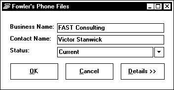
Fig. 17. An expandable dialog box.
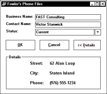
Fig. 18. The expanded version.
Showing details of system operations
in error and progress messages.
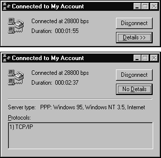
Fig. 19. Details of a communication, unexpanded and
expanded.
Not good for:
Holding primary functions. Don’t put
important functions in the expandable part of the dialog
box.
Design guidelines:
Expanding dialog boxes can make an application
look less choppy than opening secondary dialog boxes
(Weinschenk and Yao 1995, 42). However, since expanding
dialog boxes are rarely used for settings, their affordances
can be poor for this purpose. Try tabbed dialog boxes
instead.
However, if you must create an expanding
dialog box for settings:
- To indicate that the dialog box expands,
label the pushbutton with two right angle-brackets: Expand >>. To
indicate that it contracts, label it with two left
angle-brackets: << Contract.
- The primary pane should contain all
controls needed to complete the dialog box’s task.
Use the expansion area for advanced or infrequently
used options.
- Expand the dialog box down if the
workflow moves from top to bottom. Expand the dialog
box to the right if the workflow moves left to right.
(See "Where to put the pushbuttons" in Dialog Box,
Standard).
- Don't move the pushbuttons when you
expand or contract the dialog box. Keep them in the
same place, as shown in Fig. 19.
Usability tests:
Check for affordances:
- Will users recognize the meaning
of the >> button?
- If not, will they abandon the dialog
box and look through the menus for the missing functionality?
- Will users be surprised by the expansion?
- Will they even notice the >>
button?
Make sure that the users can contract
the box, once expanded.
See also:
Dialog
Box, Standard; Dialog
Box, Tabbed; Palette.

Dialog
Box, Standard
A window used to hold settings or secondary
information and to gather information from the user.
Whereas the main window contains the user’s actual task
(a what-if analysis, for example), dialog boxes let
users change how the application itself works (the currency
type used during the analysis).
Good for:
Dialog boxes have three equally important
functions:
Transactional. Gathering the
details needed to complete a command—for example, which
file to save or which file to open (Fig. 20).
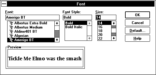 Fig. 20
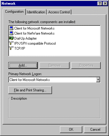
: A transactional dialog box. Tools. Holding
tools such as spelling checkers, floating toolbars,
and palettes (Fig. 21). Tools usually float on top of
main windows, are always visible, and are not confined
to any secondary window or document in a multiple-document
interface (MDI). A common subtype is the property window
or property sheet (in Windows 95), which is used to
set properties for GUI objects—for example, selecting
the default font for a spreadsheet.
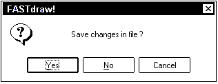
Messages. Delivering
messages and providing feedback (Fig. 22). Message boxes
are used to ask questions, confirm actions, and warn
of problems. See Message Box for details.
Not good for:
Holding top-level business information.
Dialog boxes are, by nature, hidden under pushbuttons
or menu options. They can be used to modify primary
tasks or add to primary information, but they are not
the user’s main view of the application or the data.
Design guidelines:
A dialog box:
- is usually smaller than the main
window or windows
- has no menu of its own (except for
control menus and minimize/maximize buttons in the
title bar)
The development platforms now supply
common or standard dialog boxes--for example, File Open,
File Save, Print, and a handful of others are available
in the development kits. Microsoft suggests that you
use the standard dialog boxes but, if you need to create
your own for some reason, that you model yours on the
standard dialog boxes rather than create new designs
from scratch.
Laying out dialog boxes
As Leavens says (1994, 187), "Users
will gain an understanding of what your dialog box does
and why simply by the way the controls are laid out.
Of course, if your controls are laid out badly, the
user won’t get this information."
Make groups of related items
Related items should be visually grouped.
(In fact, in the case of check boxes and radio buttons,
most development packages require that you group related
buttons inside a frame or group box.) Unrelated items
should not be grouped (because grouping always implies
a relationship).
Follow the workflow
Lay out your windows to match the user’s
workflow. Put the most common or critical information
at the top left (for language systems in which text
reads left to right, top to bottom; adjust for other
systems). Then add entry areas and buttons from top
to bottom and left to right.
Put the pushbuttons in the right place
The rules for locating pushbuttons and
other controls are:
- Pushbuttons that affect only part
of the dialog box should be located inside that part,
at the bottom or right side (in countries where text
is read from left to right).
- Whenever possible, place buttons
in this order: affirmative buttons used to save any
changes and leave the dialog box (OK); negative buttons
to cancel changes and leave the window (Cancel); buttons
unique to that window (Weinschenk and Yao 1995, 11).
- Put pushbuttons that affect the entire
dialog box (OK, Cancel) at the bottom or right side
of the dialog box.
- Whether the pushbuttons appear at
the bottom or the right depends on the flow of movement
through the dialog box. For example, if users will
move horizontally through entry areas, put the buttons
to the right. If they will move vertically, but the
buttons on the bottom. See Fig. 23 and Fig. 24. Or,
alternatively, just pick one scheme—at the right or
at the bottom—and stick with it for every dialog box
in the application.
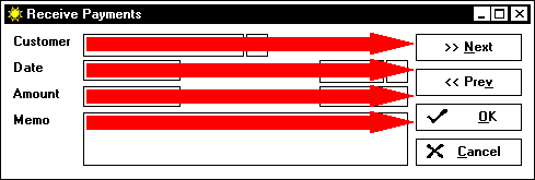
Fig. 23. When the general movement is horizontal,
put the pushbuttons to the right.
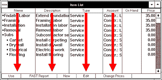
Fig. 24. When the general movement is vertical,
put the pushbuttons at the top or bottom.
Behavior guidelines
Dialog boxes must behave appropriately,
not just look right. Following are guidelines on dialog
box activities.
Always on top
If a dialog box has Always on Top set,
make sure that this behavior is restricted to your own
application (Microsoft 1995a, 181). (Overbearing "Always
on Top" settings are sometimes a problem with online
help systems.)
To minimize or not?
In Windows 95 applications, do not put
dialog boxes on the taskbar.
Dialog boxes are not officially minimizable
on any platform, although some applications do allow
users to minimize or compress palettes and toolbars
(see the CorelDraw roll-up palette in Fig. 25 and Fig.
26).
Levels
In Windows 95 (and other platforms as
well), a dialog box can contain a pushbutton that opens
another dialog box. The Microsoft guidelines say:
- If the second dialog box is independent
of the first, close the first dialog box and show
only the new window. (Do usability testing before
implementing this approach, however. For reasons you
would never think of, users may actually want to leave
all of the dialog boxes open.)
- If the intent of the second dialog
box is to get information for the original dialog
box, put the new window on top, offset to the right
and below the first.
Go no deeper than one level to avoid
"creating a cluttered cascading chain of hierarchical
windows" (Microsoft 1995a, 182).
Scrolling
Avoid horizontal scrolling of lists
in dialog boxes (Weinschenk and Yao 1995, 40-41). Instead:
- Use a larger dialog box.
- Break the information up into more
than one dialog box or view (see Dialog Box, Tabbed).
- Allow the dialog box to expand (see
Dialog Box, Expanding).
Cascade or tile?
In general, use cascading dialog boxes
unless users need to see all the information at the
same time--for example, a real-time news or stock-market
window (Weinschenk and Yao 1995, 40).
Resizing dialog boxes
Resizing the dialog box in which a list
box appears can affect the list box. If the dialog box
gets bigger, the list should get longer or wider as
well. (Why else would a user bother to make the dialog
box larger?) If the dialog box gets smaller, the number
of choices in the list box should drop to your default
minimum but no further (see List Box, Multiple-Selection
and List Box, Single-Selection). Remember to also set
a reasonable minimum size.
If you will be internationalizing your
application, size the windows to accommodate the language
with the longest terms (see Table 12). The development
toolkits have methods for dynamically resizing dialog
boxes and windows to suit whatever the current language
is. Just make sure that the buttons are positioned so
that they are always visible.
Titles of dialog boxes
Whenever possible, the name in the title
bar should match the name of the menu option or pushbutton
used to display the dialog box. Table 1 contains specific
guidelines for titles.
Table
1. Guidelines for Dialog Box Titles |
Dialog Box Type |
Title Contains |
Example |
Detail
collection, transaction |
parent
name - action name |
CLIENTDB
- Find |
Settings,
property sheet |
action
name or situation name: parameters |
Font
Spelling: English (US) |
Message |
parent
name |
Stock
Picker |
Modes in dialog boxes
The paradox of dialog boxes (and windows)
is this: Computer screens offer significantly less real
estate than the printed page. To do the same work on
a computer that one would do on paper means working
with many small pages rather than one large page. In
short, as a developer you are forced to offer the job
in chunks, sequentially, whenever you move a task to
a computer. As Dave Collins puts it, "Information that
cannot be presented all at once must be presented over
time" (1994, 218).
When you have to present a task progressively,
one strong temptation is to keep it on track with modes—in
other words, until the user finishes one chunk, she
cannot see or work on the next chunk. An equally strong
temptation, however, is to find modes too restrictive
and therefore philosophically abhorrent. As Carl Zetie
says (1995, 105), there are two well-established and
widely held principles about modes:
- Modes are fundamentally evil and
should be avoided at all costs.
- Modes provide support and guidance
and should be provided whenever possible.
With these two contradictory principles,
how do you decide when to make a dialog box modal, partially
modal, or modeless?
Again, Zetie provides some help. First,
he points out that a highly restrictive modal-dependent
system may strike a self-directed, self-confident developer
as unwarranted interference. However, it may strike
an uncertain or busy user as a safe and comfortable
route to his goal.
Secondly, Zetie says, you can use the
distinction between tool-type dialog boxes and detail-gathering
dialog boxes to pick modes.
Tool dialog boxes need to be modeless,
moveable, and perhaps even minimizable (Fig. 25 and
Fig. 26).
Fig. 25. A CorelDraw palette, full-size.
Fig. 26. The same palette, rolled up (minimized).
Picking modes for transactional dialog
boxes is more difficult because transactional dialog
boxes can affect a part or all of an application, and
thereby interfere either with the activities of some
local part of the application or the entire application.
Mode failures occur when a dialog box’s mode (its effect)
is broader than (or, more rarely, narrower than) its
sphere of influence.
For example, say that you develop an
e-mail spellchecker that checks individual messages.
If the e-mail application lets users edit more than
one message at a time, then the users should be able
to spellcheck more than one message at a time—they should
be able to switch among messages modelessly, carrying
the spellchecker with them. If they can’t jump between
messages without first closing the spellchecker, they
will probably refuse to use it. The spellchecker, in
other words, can’t be modal at the individual message
level, especially not while the more important message
editor is modal at the application level.
You can analyze message-box modes in
the same way—if the message is about a small part of
the application, then it should be model only for that
part. If the message situation affects the entire application,
then the message box should affect the entire application.
Since error messages tend to get lost
under other windows, developers sometimes make them
application-modal or even system-modal to keep them
in front of the user until the error situation is cleared
up. However, you don’t have to make them modal to solve
the visibility problem—just give them an "Always on
Top" property.
Table 2 lists modes from a technological
point of view. However, the true answer to whether a
dialog box should be modal or not is the nature of the
task or subtask. A single application may use different
types of modes in different places. Sometimes the user
may be strongly constrained; at other times he or she
may have plenty of freedom. Some tasks may be inherently
serial; others may be serial or parallel at the user’s
preference (Zetie 1995, 87).
For an excellent discussion of these
issues, see chapter 3, "Taskflow," and chapter 4, "Dialog
Design," in Zetie (1995).
Table
2. Dialog Box Modes |
Type |
Use and Behavior |
Examples |
Modeless |
Used
for tools.
Lets users make multiple changes
easily by changing the settings or entries in
the dialog box itself and by changing the selection
in the main window.
If the dialog box is used to change
visual attributes, provide a preview area inside
the dialog box that shows the effects of the user’s
changes. |
- Toolbars and palettes
- Find-and-replace panels
- Spelling checkers
- Online help
|
Semi-modal
(Windows 95), Primary modal (OSF/Motif) |
Used
for gathering details within an application.
The user can access some windows
outside the dialog box as a way of responding
to the dialog. |
In
a spreadsheet, the user might have a font dialog
box open but be able to change the range of cells.
In a database, the user might
be able to open a separate window or dialog box
to find missing information. |
|
|
|
Movable
(or Application) modal |
Used
to request input or complete a command--which
file to save, how to format text.
Lets the user switch to and work
in another application but not the current application.
The user can move the box so that it doesn't obscure
the area in which he or she is working. |
Dialog
box used to change a password.
Dialog box used to change application-wide
settings—for example, in Internet applications,
the list of local-access phone numbers. |
System
modal, Alert modal |
Used
for system-level messages and warnings.
The user must respond to the dialog
box before he or she can do anything in any application.
Microsoft says to avoid using
system modes unless your application operates
as a system-level utility and then only for severe
situations such as an impending fatal system error. |
System
warning message; alert box. |
Guidelines for using modes
Following are guidelines for using modes
in your application (adapted from Zetie 1995, 109-110):
- Use modes consistently. If one tool,
like a spell checker, is modeless, another similar
tool, like a thesaurus, should also be modeless.
- Do not initiate modes unexpectedly.
For example, don’t suddenly trap a user in a required
field.
- Make it clear to the user that she
has entered a mode. Offer feedback— for example, a
pointer change or a status-bar message.
- Make it clear how to escape from
the mode. If the user starts a database query, for
example, show him how to cancel the query with a Cancel
Query button.
- Always make it possible for the user
to escape from a mode harmlessly—at the very least,
make sure that every dialog box has a Cancel button.
Usability tests:
If you notice that users are opening
windows, dialog boxes, or other applications to get
additional information, consider redesigning the application
to pull in the information automatically with OLE (Object
Linking and Embedding) functions.
If you notice that users are moving
or canceling dialog boxes to get at "buried" information,
consider redesigning the dialog-box sequences and modes.
If users seem to get hopelessly stuck—for
example, they cancel the procedure without saving anything
or they reboot the machine to start over—then look for
feedback and mode failures:
- When feedback is poor, they may be
unable to figure out what mode they are in and how
to get out of it. Make sure that the mode change is
blatantly obvious—for example, make the pointer change
its shape.
- Overly restrictive taskflows may
force users to exit from the dialog boxes prematurely
because they cannot fill a required field or answer
a question accurately.
With cognitive walkthroughs, you can
test modes and taskflows even before you have access
to users. When you do have users, try low-fidelity prototyping
to test taskflow. See Appendix B, "Usability Tests,"
for details.
See Pushbutton for more on testing dialog-box pushbuttons.
See also:
Dialog Box,
Expanding; Dialog Box,
Tabbed; Field, Required; Palette; Toolbar; Window.
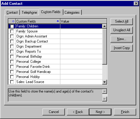
Dialog
Box, Tabbed
A dialog box in which settings are grouped
into sections. Each section has its own labeled "file"
tab. Users switch among the groups by clicking on the
tabs.
Good for:
- Grouping related application features,
attributes, or settings (Fig. 27).
- When internationalizing programs,
for handling large amounts of text and labels (Kano
1995, 27).
Not good for:
- Presenting unrelated settings or
too many settings. Don’t have more than two rows of
tabs. See "Single-level tabs" below.
- Presenting hierarchical information
(tabs within tabs). Use methods other than tabs to
select levels. See "Hierarchical tabs" below.
- Presenting sequential information.
Use wizards instead.
Design guidelines:
The following guidelines are recommended
by Chauncey Wilson, a human-computer interaction (HCI)
expert who has been designing, reviewing, and testing
standard dialog boxes for 12 years and tabbed controls
for the last six years (Wilson 1997).
Tabbed controls (dialog boxes and windows)
are based on the metaphor of dividers in filing cabinets
or ringed notebooks. The individual tabs, usually called
"pages," have textual or graphic labels that indicate
the general contents of each page. Microsoft has defined
certain types of dialog boxes—property sheets, for example—as
tabbed dialog boxes. See Fig. 28 and Fig. 29.
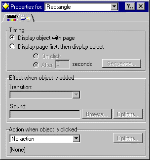
Fig. 28. The standard tabbed dialog box style.
Fig. 29. The notebook
tabbed window style (see Window for details).
Tabbed dialog boxes are convenient for
organizing product functions. Robinson (1996, 1) notes
that developers like tabbed dialog boxs because they
are a convenient method for grouping many functions.
However, tabbed dialog boxes can present a bewildering
array of choices for users. For example, the Options
tabbed dialog box in Word for Windows 6 has 12 tab pages,
each with at least 10 choices (and some with many more).
General layout guidelines
Wilson recommends using a consistent
layout for tab pages because variations in margins,
common button position, and the vertical starting point
of components can result in an annoying tachistoscopic
effect as the user moves from tab to tab (Wilson 1997).
Make sure that components’ vertical
and horizontal starting points are consistent. A common
design flaw in tabbed dialogs is to center data-entry
areas, pushbuttons, and other components, especially
when there are only a few of them. However, centering
components means that they will seem to jump around
as users flip between tabs. Left-justifying components
and putting all pushbuttons on the bottom or at the
right is visually more consistent.
To facilitate transfer of training,
use consistent GUI mechanisms for similar tasks in different
tab pages and in different tabbed dialog boxs. For example,
the mechanism for adding items (passwords, words in
a spell checker, network equipment) should be consistent
in general look and feel across all tabbed dialog boxs
and standard dialog boxes.
Don’t hide information
One of the advantages of tabs over menu
access is visibility. Don’t lose that advantage by hiding
the information, says Wilson:
- Put the most frequently used controls
or information on the first tab page that the user
sees.
- If your users want to see or compare
information on more than one tab, accommodate them
either by using two or more modeless tabbed dialog
boxes or by letting them tear the tab off (like a
tear-off menu or palette). Making users remember information
while they switch between tabs puts a serious burden
on short-term memory.
- Avoid complex interactions among
controls on different tabs. A user may not understand
that a disabled control on tab 4 can only be enabled
if the proper radio button is chosen on tab page 2.
- For the same reason, don’t put required
fields on more than one tab. Also, to reduce errors,
provide feedback about which fields are required and
which are optional. Consider grouping all required
fields together or using visual cues to differentiate
required and optional fields. See Field, Entry and
Field, Required for more information.
Help buttons
Help buttons on tabbed dialog boxes
should provide help on the current tab page, Wilson
says, rather than on the dialog box as a whole. Tab-sensitive
help buttons speeds up access to help.
Rows of tabs
Tabs can be arranged in rows on a single
level (see Fig. 28) or in hierarchical ranks (see Fig.
32). The problems of the two styles differ.
Single-level tabs
Once you move beyond two rows of tabs,
you place a cognitive burden on the user, says Wilson.
Put tabs on only one edge and use at most two levels
of tabs, five to seven tabs per edge. If you think you
need more than two levels, you probably have too much
information going into each set. Try re-categorizing
the tabs into smaller sets.
If you must have more than one row of
tabs, don’t compound the problem by moving them around
when the user selects a tab. For example, the tabs in
Fig. 30 and Fig. 31 are confusing to most users.
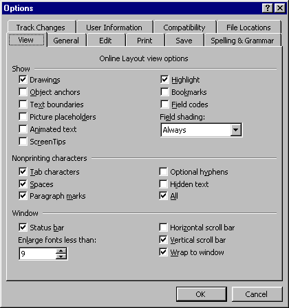
Fig. 30. The set of rows before the user selects
the File Locations tab.
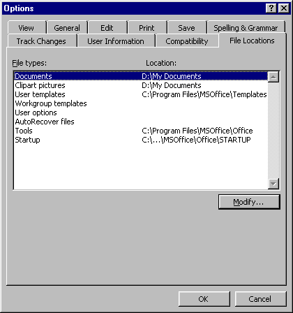
Fig. 31. The set of rows after the user selects
the File Locations tab.
Experienced users explore the interface
to learn how to use the program, generally by starting
at the top-left tab (in Western languages) and moving
to the bottom-right tab. If the tabs move by themselves,
however, the user may never get through all the tabs.
She may decide, in fact, that the dialog box is unreliable
and avoid it whenever possible.
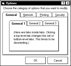
Hierarchical tabs
For property-type dialog boxes, avoid
hierarchical sets of tabs—tabs in which one set of tabs
is secondary to another (Fig. 32). Instead, try combining
list boxes with tabs (Fig. 33) when a set of properties
can be applied to more than one object, as per Microsoft
(1995a, 189). In this type of design, the user first
chooses a type of control or data view from a drop-down
list, then chooses the desired attributes tab from a
group of related tabs. Although this approach is like
having tabs within tabs, the use of the drop-down list
reduces the visual complexity.
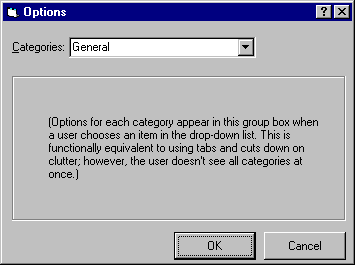
Fig. 33. Combining list boxes with tabs.
The same approach can be used in other
circumstances as well, especially in tabbed windows.
See Window for examples.
Labels on tabs
A set of tabs is functionally equivalent
to a set of menu items. The important difference is
layout: Unlike menus, the structure is always visible
as a row of tab labels.
Fig. 34. Show which tab is selected by changing
the label from normal to bold.
Make sure that the user can identify
the current tab page—use good cues (Wilson 1997). Common
cues include changing the font of the label from normal
to bold (Fig. 34) and changing the background color
of the tab. The use of multiple cues (bold text plus
a white background) is also effective (Fig. 35).
Fig. 35. Excel tabs change the background and
turn the text bold.
Scrolling labels
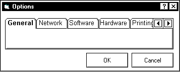
Fig. 36. A scrolling set of tabs means that functionality
is hidden.
Some development packages will automatically
create scrolling tabs (Fig. 36) if the labels become
too long to fit in the dialog box (as they might when
translated). Other packages will add new rows. If you
plan to localize your product, translate a sample of
your tab pages to determine the impact of text expansion.
Text can expand from 30 to 200 percent and create major
labeling and layout problems. (See Labels for more information
on expanding text.)
Keyboard access
Provide a method for accessing tab pages
through the keyboard. Access can be through accelerator
keys like Ctrl+Tab (common in Windows 95) or mnemonics
for individual tab pages (for example, Alt+G might display
the "Gridlines" tab page).
Stacked labels
Avoid stacked text in labels. Stacked
text is very hard to read because we recognize the shapes
of the words, not individual letters. This explains
why full words turned sideways are easier to read than
stacked words. The best option, however, is to run your
tab labels horizontally if you can (Fig. 38).
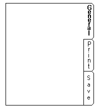
Fig. 37. Don’t stack the letters.
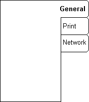 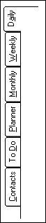
Fig. 38. If you want vertical labels, use either
of these styles.
Pushbuttons on tabbed dialog boxes
Usability experts have noticed that
users are often unclear about when changes to settings
in a tabbed dialog box take effect (Robinson 1996, 1).
For example:
- Do the changes take effect when you
move from tab to tab, when you click OK, the next
time you start the program, when you click Apply,
or when you close the tabbed dialog box?
- If you take some action on particular
page, such as adding a group of users to a network,
are the new users saved when you click the Add button
or are they saved when you click OK?
Use a consistent method for saving changes
to the settings in all tabbed dialog boxs in a product.
Avoid doing an auto-save in one tab dialog (changes
in one tab are saved when you click on another tab)
and manual save (clicking on the OK button) in others.
Also, researchers find that users are
most satisfied with explicit information about effects.
For example, adding an explicit Apply Settings button
means that users no longer have to guess that clicking
OK or switching tabs applies their changes. Although
the Apply button might add an extra interaction, it
eliminates unnecessary cognition. The idea, as ever,
is to let users think about their tasks, not
yours.
Saving the page versus the dialog box
Fig. 39. The pushbuttons are placed outside the
tabs to
indicate that they affect the entire dialog box.
Another source of confusion is what
OK, Cancel, or Apply actually affect--the entire dialog
box or just the current page? Make effects obvious by
positioning your pushbuttons inside or outside the page
as needed:
- Place pushbuttons that affect all
the pages outside the margins of the tab page (Fig.
39).
- Place pushbuttons that affect only
the page inside the page margins (Wilson, 1997).
Restore the defaults
Tabbed dialog boxs are often used for
complex system configuration tasks with many settings.
Provide a mechanism for restoring the settings on the
current tab page or on all tab pages, Wilson says. This
could be a Restore Defaults button placed inside a tab
page (which would affect only the settings on the page)
or with the main pushbuttons (which would affect the
settings on all tab pages). Just make sure that the
user is clear about what the Restore Defaults button
will do. See Pushbuttons for more information.
What the tabbed dialog box replaced
The tabbed dialog box has become a popular
method for combining many individual "preferences" or
"properties" dialog boxes into a compact package (Wilson
1997). Before the tabbed dialog box was invented, a
GUI designer would create a separate dialog box for
each set of related features or attributes, or else
use radio buttons, drop-down lists, list boxes, or pushbuttons
to display dialog boxes within dialog boxes. Fig. 40,
Fig. 41, Fig. 42, and Fig. 43 show some of the methods
that tabbed dialog boxes replace.
Fig. 40. A drop-down list instead of tabs.
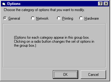
Fig. 41. Radio buttons instead of tabs.
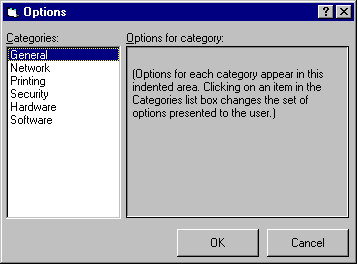
Fig. 42. Single-select list box instead of tabs.
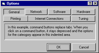
Fig. 43. Pushbuttons instead of tabs.
Other methods include:
- creating separate menu items for
each dialog box, which increases menu complexity
- opening multiple levels of dialog
boxes from the parent dialog box
- expanding dialog boxes to show second-level
information
- using a tree control on the left
Although expanding dialog boxes and
opening multiple dialog boxes from one dialog box still
appear occasionally, most of them are also being replaced
with tabbed dialog boxes.
When to use a tabbed dialog box
Tabbed dialog boxs are most appropriate
for random access to features, attributes, or task objects.
Tabbed dialog boxes cue users that they can visit as
many or as few of the tab pages as they think are relevant,
in any order.
However, the tab metaphor does not suggest
that users must visit each page in order. Thus,
avoid tabbed dialog boxs for sequential tasks (in which
each tab represents a step in a process). Instead, consider
using a wizard to guide users through sequential tasks
(Zetie 1995, 148).
If you must use tabbed dialog boxes
for sequential tasks, provide clear feedback on:
- how the user can change things in
previous steps
- whether steps can be skipped
- what is required within each step
- when the subtasks for each step are
actually accomplished or saved—as each subtask ends
or only at the end of all subtasks?
There is a recent trend to integrate
tabbed dialogs into wizard designs (Fig. 44). This approach,
which lets users make many choices at each step, might
be due to users complaining that the wizards are not
flexible enough. However, adding multiple tabs to each
wizard dialog box imposes an extra--and probably unexpected--cognitive
load on the user. Wizards are supposed to take the simplest
or default route through the task, not the most complicated
one.
If you find yourself in this situation,
check whether the "expert route" is missing. Your experienced
users may be trying, unsuccessfully, to find out how
to do the task more more quickly—i.e., without
the wizard. Tell them somewhere in the wizard or in
help how to make the change directly. Also see if you
have a wider diversity in user needs than you expected.
Multiple wizards might be an appropriate response. See
Wizard for more information.
Usability tests:
Test whether users can locate functions
inside tabbed dialog boxs. For example, with a paper
and pencil test, ask participants to match functions
to tab names. You can test this with a low-fidelity
prototype as well.
Test the labels. Ask the participants
to find an item and see whether they pick the right
tab. For unsuccessful choices, ask them what label they
would use. Change the labels between tests until most
users pick the right tab.
Test for information overload—in other
words, too many sets of tabs and too many unrelated
dialog boxes in the same set. If participants have trouble
matching functions and labels, try breaking the entire
set of pages into smaller sets, then test again.
By direct questioning, see if participants
know when their changes have taken effect.
See also:
Dialog
Box, Standard; Window.
Drop-Down
List
A data-entry tool that lets users pick
items from a list rather than type entries.
Good for:
Limiting choices to the items on the
list.
When available space is limited (on
a toolbar, for example) and when the mouse is the primary
interaction device (as opposed to the combo box, which
is more keyboard-oriented). See Fig. 45.
Not good for:
- Letting users add new items. Use
a drop-down combo box instead.
- Letting users select more than one
item. Use a multiple-select list box instead.
Design guidelines:
In Visual Basic and some other development
packages, a drop-down list box is a type of combo box.
In other words, to create one, you select the combo
box control, then change the Style property to "dropdown
list."
Note that users cannot add new items
to a drop-down list as they can with simple or drop-down
combo boxes. They can, however, search the list by typing
the first letter of the desired item when the list has
focus. See "Searching" in Combo Box.
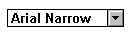
In Windows 3.x, the drop-down list box
may be visually distinguished from the drop-down combo
box by the lack of a space between the entry
area and the down arrow (Fig. 45).
Weinschenk and Yao (1995, 22) make these
recommendations:
- Since drop-down lists hide all but
the first item, use a drop-down list if most users
will select the first item.
- Display a default value in the entry
area if users will pick it more than half the time.
For example, on a medical insurance form, "Self" is
probably the most likely answer to "Relationship to
Patient?" and would be a good default value. If there
is no clear default, use alphabetical order or some
other logical order (see Table 3. "Organization Styles
for Lists" in List Box, Multiple-Selection).
- Do not use a drop-down list if users
need to see all options all the time. (To find out,
check your specifications and do usability testing.)
- Consider using filters when there
are more than 40 items on the list. (Scrolling through
long lists is difficult because there is a tendency
for the mouse to slip off the scroll bar.) You can
divide the list up alphabetically (for example, users
click an M button to get the list of chart types starting
with M) or by category (users click "Laser" to get
the list of laser printers, "Bubble Jet" for bubble-jet
printers, and so on).
Usability tests:
Make sure that users know they can search
the list. If half or more users don’t notice the search
option, consider adding an instructional label or tooltip
such as "Type item or click the down arrow." You can
also flag the issue for your online help, documentation,
and training teams.
See also:
Combo Box; List Box, Single-Selection.
|