|
You are here: Home ~ Desktop UIs ~ Menubar - Message Box
Menubar
On main and secondary windows, the area
containing the labels of the drop-down menus.
Good for:
Showing the high-level structure of the
application (Fig. 1).

Fig. 1. Sample menubar.
Design guidelines:
The rules for menubars are:
-
Don’t put pushbuttons on menubars.
Menubar labels should go to menus, not activities
or dialog boxes.
-
Don’t put pushbuttons in a row at
the top of a window, especially on Web pages,
which do not yet have clear conventions about
what goes
where. A row of buttons at the top of a frame
may look like a menu and thoroughly confuse users.
-
Menubar names (the titles of the drop-down
menus, in other words) should be no more than one
word. The reason is that the titles aren't visually
separated enough. Until you actually select a menu
title, you can't see the edges of the underlying
widget. Therefore, a title of two words looks like
two menus.
Do you need the File menu?
Note that the platform guidelines recommend¾ sometimes
insist¾ on specific
sets of top-level menus. However, some applications
don't need every menu. The rules are
-
Provide the platform’s recommended
menus, in the order shown, if your application
provides any of the choices listed in the platform
guidelines pull-down menus. However, most usability
experts advise against one-item menus and suggest
adding single items to the next most logical
top-level menu.
-
If your application contains options
that don't fit on any of the standard menus, add
application-specific top-level menus to the left
of the Help menu.
-
Help is the last (or on the Macintosh,
next to last) item on every menubar.
The File, Edit, Format, and other
menus are meaningless for applications without user
files¾ for example,
a game, a collection of financial calculators, a
set of telecommunications analyses. In these cases,
put the list of the most important options in the
first position. For example, if the application is
a set of calculators, then the first menu is Calculators and
the drop-down options are the names of the calculators.
Variations and exceptions
Instead of one top-level menubar, OS/2
has two bars on each window¾ the
top bar contains the system menu and window-sizing
buttons, and the second contains a standard set of
menus.
Taskbar
Windows 95 has a moveable and reconfigurable
taskbar that appears on the desktop. Since it is
always visible, it lets users switch quickly from
one open application to another. Another visibility
advantage is that minimized applications become buttons
on the taskbar rather than icons lost behind other
windows.
Note that, because the taskbar is shared
across applications, Microsoft asks that you carefully
follow their guidelines and conventions when you
set up your application to use it (Microsoft 1995a,
25).
Window control menus
Windows 3.x applications have window
control menus (indicated with a space-bar or hyphen
icon). The window control menu in a Windows 95 application
is indicated with an icon (Fig. 2) that represents
either the application or the type of data the application
saves or uses (for example, a document icon for a
word processor). If the user clicks on the icon,
the window’s shortcut menu appears (Microsoft 1995a,
96-98).

Fig. 2. Windows 95 title-bar
control-menu icon for Corel Photo-Paint.
Apple has its environment-control "Apple" menu
as the left-most item on the menubar. The Apple icon
brings up the list of all items that users put in
their Apple Menu Items folder¾ usually
cross-application tools like alarm clocks, network
access, and games (Apple 1992, 98).
Menubar layout
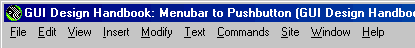
Fig. 3. Spacing on menubars.
Use three spaces between titles. Leave
one space in front of the first title and at least
one space behind the last title. Note: Your development
environment probably does this for you automatically.
Hide the menubar?
Drawing, desktop publishing, and other
visually oriented applications should let the user
remove the menubar temporarily so that she can use
or see the entire screen.
Other applications (games and CD-ROMs)
should not show the menubar unless the user asks
for it.
The usual method for hiding the menubar
is to put a "hide" option on the View menu,
and when the user hides the menubar, having the application
accept Escape to show the menubar again.
However, some users may stumble on this
method of operation only by mistake—in other words,
the menu disappears and the panicky user hits every
key on the keyboard until one finally works. Leaving
a cue on the window—a little button at the lower
right corner, perhaps?—is much friendlier.
Usability tests:
Test that the menu labels match the user’s
conceptual model. Use a paper and pencil test.
Hidden menubar functionality
If the user can remove the menubar from
the screen, can she get it back again? If the menubar
does not appear by default, can the user figure out
how to access it? See if the users can hide and recall
the menubar
Share the results with your training
and documentation departments.
An invisible menubar should be nice
to have, not necessary to have. Make
sure that this is true.
See also:
Menu, Drop-Down.

Menu, Drop-Down
A list of application-related activities
and settings that opens downward and, if there are
submenus, usually to the right and down (cascades),
when accessed with the mouse or from the keyboard.
Good for:
Accessing secondary tasks. (In a drawing
application, drawing is the primary task; saving
the drawing, although very important, is a secondary
task.)
Selecting settings that affect the entire
application or window. See Fig. 4.
Fig. 4. New, Open, Close, Save, and Save As (and most of the other items)
are secondary tasks.
Page Setup, however, is a settings option.
Not good for:
-
Tasks or settings that are more naturally
handled using a mouse (picking a drawing tool,
for example).
-
Situations in which the user might
want to pick more than one option at a time (for
example, setting text both bold and italic).
Drop-down menus close up as soon as the user either
selects the desired option or moves off the menu,
which means that the user has to keep reopening
the menu for every option she wants to use.
-
Situations in which the user might
want to interact with other parts of the application
while a menu is open. Since menus are modal,
users can’t do anything when a menu is open except select
an option or cancel the menu. For alternatives,
see "Tear-off menus" below.
Design guidelines:
Fig. 5. Correct drop-down menu design.
To design drop-down menus correctly:
-
Make sure that the width of the menu
is the width of the longest label on the menu,
not the title of the menu on the menubar (titles
are usually very short).
-
Leave three spaces in front of all
menu labels. The first space separates the label
from the left edge of the menu, the second contains
checkmarks, checkbuttons, or radio buttons when
needed, and the third separates the occasional
checkmark or button from the label itself.
-
Remember to designate a keyboard shortcut
for each option. See Keyboard Shortcuts: Mnemonic
and Accelerator for more information.
-
Accelerator key names are flush-left
on the first tab after the name of the
longest option label. Don't use spaces to align
accelerators¾ spacing
is irregular in proportional typefaces (Microsoft
1992, 87). See Keyboard Shortcuts: Mnemonic and
Accelerator for more information.
-
For accelerators, use the key name
as it is printed on its key cap. For example,
use "Ctrl," not
^. Keyboards, unfortunately, vary. For example,
some keyboards say "Del," others say "Delete," and
some say both. Keyboards attached to Unix workstations
often have both [Return] and [Enter] keys, which
sometimes do different things and sometimes don't.
If this variability causes a problem, find the
most standard or the newest computer in the office
and standardize on that one.
-
The ellipsis indicator (for panels
or dialog boxes) follows the label. Do not add
spaces between the label and the ellipsis. Also,
don't add spaces between the periods in the ellipsis
(this is often done in typesetting).
-
The triangle indicator (for submenus)
is always flush right. Leave one space between
the triangle and the right edge of the menu.
-
Don't show a submenu immediately¾ incorporate
a brief pause. This pause keeps the submenu from
flashing open and closed when a user runs the
cursor over the submenu option (Microsoft 1992,
86).
-
Use reverse video to indicate that
an option is selected.
-
If your system
has dynamic menus, note that users learn
the positions of items on menus very quickly,
sometimes within one session. Although individual
items may not always be accessible, their positions
should remain constant¾ graying
them out is better than deleting them and closing
up the list. Maintain absolute positions, not
just relative positions (Norman 1991, 140,
169-170).
-
When your system has a variety of
security levels, do remove unavailable options
from menus. In other words, if a user doesn't
have access to particular options, don't show
them on
her copy of the menu. (For some people, a grayed-out "Top
Secret Files" option is a challenge, not a restriction.)
Note: Your development
environment probably takes care of many of these
design issues for you.
Menu option types
Drop-down menus contain options of various
types (listed below), plus type indicators and keyboard
shortcuts. The main types of options are:
Action: A command; an option that
does something without asking for additional user
input. Save is a common action.
Dialog box or palette: A collection
of settings organized in a dialog box.
Settings or toggles: Individual
settings and toggles. Use when there are too few
settings to make a dialog box worthwhile.
Submenu: A second or third level
on a drop-down menu. For example, a Fonts option
on a Format menu might lead to a submenu of typefaces
and sizes. Submenus are also referred to as "cascades" and "hierarchical
menus."
Other, less common, types of menu items
are:
Files: A list of the last four
to six files opened, usually accessed from the File
menu if there is one.
Graphics: Pictures of selectable
patterns or drawing tools.
Windows: A list of all open windows,
usually numbered.
Indicating
option types
Each of these types of menu options¾ command,
dialog box or panel, setting, and submenu¾ has
its own symbol (provided that you consider null a
symbol). See Table n, Option Type Indicators.
Table
1. Option Type Indicators |
Option
Type |
Symbol |
Sample |
Actions (commands) |
none |

|
Dialog boxes (requests for more
input) |
. . . immediately after option
name (use 3 dots, not ellipsis character) |

|
Settings (checkbuttons) |
pushed-in button, checkmarks |

|
Submenus (cascades) |
right-pointing triangle, flush
right |

|
Indicator for applications running
in background (Macintosh only) |
diamond (can also use alert box
and sound) |
|
Indicator of mixed case or partial
setting¾ for
example, part of the text is italic, part is
roman. |
dash on Macintosh, grayed or blanked
sample on Windows 3.x and Windows 95 |
|
Labels for menu options
Once you've defined the menu bar, you
can define the names of the options on the drop-downs.
Here are the main issues:
Creating unambiguous labels
Using the option-type symbols (triangle,
ellipsis, and so on as shown on Table 1) is necessary
but not sufficient, since many users neither know
the symbols nor care about them. However, you can
reinforce the symbol with the right type of
word (noun or verb) or phrase (see Table 2). Correct
wording helps users know what to expect when they
choose a new option.
Here are some helpful hints:
- If the option opens a window, match the window’s
name
- Whenever a menu option opens a window
or dialog box, make sure that the menu label matches
the window or dialog box label. For example, if the
dialog box says "Open Radio Station," the
menu label should say "Open Radio Station..."
- Note: This is such a natural, completely
obvious rule that it hardly requires mentioning.
However, one sees mismatches all the time. The problem
is design drift compounded by proofreading failures.
The menu and window labels probably did match in
the beginning, but the names of the dialog boxes
and windows changed over time, and no one proofread
the interface to look for mismatches.
- If the software is object-oriented,
make the labels object-oriented too
- Try to maintain an object-action paradigm
by assuming that an object is selected, then showing
the relevant actions as verbs on the pull-down menus.
- Don't repeat the menu title in the menu options. For example, on a Report menu,
you don't need to say Format Report, Generate
Report, Print Report, and so on. Format, Generate, and Print are
enough.
Table
2. Matching Word Types to Option Types |
Actions |
Use verbs (Save, Copy) or
verb phrases (Find File). The commands
should fit into a sentence like "Save my file" or "Copy
the data" (Apple Computer 1992, 58). |
Dialog
Boxes |
If the purpose of the option is
an action, and a dialog box or panel exists
only to set parameters for the action (for
example, Save As or Find), follow
the Actions rule--use
a verb or verb phrase.
If the purpose of the option is
to bring up a panel, then name the option after
the panel--for
example, Spelling to bring up the spelling
panel (NeXT Computer 1992, 108). |
Submenus |
If a submenu brings up a menu of
actions, use the target of the actions as the
label of the submenu. For example, a text-editing
submenu might be called Document and
the submenu options might be Open, New, and Save.
The options can then be read as Open Document,
New Document, Save Document (NeXT Computer
1992, 109). |
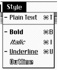
Settings |
Use an adjective or adjectival
phrase--for
example, Bold, Italic, Underlined. The
action is implied. Setting labels should fit
into a sentence like "Change this text to bold" (Apple
Computer 1992, 58). |
Take advantage of the menus' titles
Try creating phrases or sentences by
putting the title and options together as sentences.
For example, on an Insert menu, you could
have Insert Picture, Insert Box, Insert Text.
Or you can use a verb and an adverb: the
options on a Sort menu might be Alphabetically,
Numerically, In Reverse Order. The resulting
sentences would be Sort Alphabetically, Sort Numerically, and Sort
In Reverse Order (NeXT 1993, 130-131).
Use parallel construction
Here are non-parallel labels: Print,
Execute a Program, Disk Eject. Here are parallel
labels: Print a File, Execute a Program, Eject
a Disk. The non-parallel version isn't terribly
wrong, but it gives a bad impression¾ it
looks as if the developer just threw the menu together
and didn't take the time to neaten it up (Norman
1991, 142).
Don't be too consistent
A large publishing firm had just suffered
the delivery of an expensive accounting system from
a large and famous auditing firm. On the main menu
were "Name Maintenance," "Title Maintenance," "Account
Maintenance," and so on. The woman who demonstrated
the system said, exasperated, "These don't lead to
maintenance! Most of the submenus let you add, inquire, and maintain.
And some of them only let you search." The consistency
in the text hid major (and legitimate) differences
between modules. The neatness was confusing because
the system itself wasn't.
If the label contains a phrase, put the key word
first
The key word is usually a verb¾ in
other words, the command itself. Open File is
easier to grasp than File Open; Show Ruler is
easier than Turn Ruler On (Norman 1991, 142).
Don't abbreviate or truncate menu labels
The reasons are:
-
Some users won't recognize the abbreviation.
Or they may recognize it, but assign the wrong
meaning. For example, on Wall Street, the abbreviation "MTG" means "mortgage," not "meeting." "Tick" cannot
be truncated and used to stand for "ticker" because "tick" is
a word with its own meaning ("the smallest unit
used in trading a stock or a bond").
-
Some abbreviations don't translate,
even from one form of English to another. For
example, a menu option called "EZ Add" reads nicely as "Easy
Add" in the U.S., but as "Ee-ZED Add" in the
U.K.
-
GUIs are expandable. You don't have to
abbreviate.
Use the singular, not the plural
Default to the singular unless the word
you need for the label is a plural¾ for
example, "Graphics" or "Telecommunications."
Put menu labels in resource files
Use resource files for ease of translating
and for ease of rewriting. It's far too much work
to find and change each menu label imbedded in the
interface code.
Repeat labels when uniqueness is not a virtue
The platform guidelines agree: Do not
repeat options on more than one top-level menu. If
you want to give users more than one way to access
a particular function, create pop-up menus or toolbars.
In a system with only one menu bar and
one set of menus, this is a reasonable rule. However,
some applications have more than one menu bar (for
the "Create" part of the application and the "Runtime" part,
say). In cases like these, use the same labels for
the same functions. For example, the printing option
should be called "Print" and should use the same
mnemonic no matter where it appears.
Capitalizing labels
You can use either of two methods, provided
that you use the chosen method consistently. However,
the headline style is more common. Only the IBM OS/2
guidelines show sentence-style labels.
Sentence style: Capitalize only the first letter of each
label (unless a proper noun¾ a
product name or person's name¾ appears
in the label). For example, Save as.
Headline style: Capitalize every word in the label except
articles (a, an, the); coordinating conjunctions
(and, but, or, for, nor,); and prepositions (at,
by, in, to, from, with) unless they are the first
or last words in the label (Chicago 1993, 282-283).
For example, Save As.
Here are the rules for capitalizing hyphenated
(compound) words in headline style:
-
The first part of a compound word
is always capitalized.
-
The second (or third or fourth) part
is capitalized unless it is an article, a preposition,
or a coordinating conjunction¾ for
example, Run-in Text. There is one exception:
If the compound comes at the end of the label,
its final section is always capitalized, no matter
what part of speech it is: Text Run-In.
-
If the compound word is actually a
prefix plus word, the second (or subsequent) part
is never capitalized: Re-save, Re-map (Chicago
1993, 283).
Proofreading for cross-menu
consistency
Make sure that menus are consistent.
It is easy enough, during one of the interstices
of the programming day (while the network is down
or the designers are off arguing about something)
to check the menus against one another. If you make
a print-out of each one as you finish it, you won't
need access to the computer. .
Also, the technical writers and editors
may be willing to accept this task. Eliminating inconsistency
on a dozen menus, say, can add a few hours to a writer's
schedule. Documenting the inconsistencies, on the
other hand, can add days. Ergo, justification
for asking for a writer's help.
How to group options
All of the platform guidelines suggest
organizing categorical items into logical groups,
and then separating the groups into sets of no more
than four or five items each (Fig. 6). Separate the
groups with lines (each environment provides some
sort of separator line).
Recommendations for lines:
-
Don't use a line as a first or last
component on the menu.
-
Make sure that there are at least
two options in each group (in other words, don't
put lines above and below a single option).
-
Use lines to separate lists of checkbuttons
or radio buttons from the rest of the menu options.
-
Don't separate groups with subtitles
(by using a dimmed items, for example)¾ people
might mistake them for commands (Apple Computer
1992, 63).
Fig. 6. Breaking long lists into shorter lists.
Default options
Pick the most commonly used option, unless
it is dangerous (defined below), as the menu’s default
option. In most environments, the first option on
a drop-down menu is a default option¾ if
the user opens a menu and presses [Enter], she automatically
selects the first option simply because the first
option is automatically highlighted. In Windows 95,
the default option is shown in bold text (Microsoft
1995a, 138).
Destructive options
Options like Quit, Exit, Close Connection, and Delete
All, even when easily reversible, should never
be default choices. They should never be first
on drop-down menus, either, because if no other
default has been defined, the first option on a
menu becomes the de facto default option.
Depth and breadth
Menu search is a problem because target
items are in a sense, hidden under successive layers
of vague clues. Consequently, the user has to spend
a lot of time peeking under the shells to find the
pea. Large memory demands are placed on the user
to remember where things are buried in the menu structure.
Breadth, however, allows the system to lay the cards
on the table, so to speak. —Kent Norman in The
Psychology of Menu Selection, 1991, p. 223.
In 1982, J.W. Tombaugh and S.A. McEwen
found that when users were searching for information,
they were very likely to choose menu items that didn't
lead to the desired information and, on a high proportion
of searches, tended to give up without locating it
(Norman 1991, 204). In reaction to this sorry state
of affairs, researchers asked this question: Does
the depth to which menus are nested affect users'
ability to use a program? The answer was yes, it
does.
A study by Kiger (described in Norman
1991, 203) found that a menu hierarchy (or tree)
with no more than two levels and no more than eight
items on each submenu (called 82) was rated highest
for speed, accuracy, and subject preference (Fig.
7). A four-level menu with three items per submenu
(43) was the next best style. A deep, narrow tree
of six levels with two items on each (called 26)
was the slowest, least accurate, and least preferred
version (Fig. 8). Other studies confirmed that a
low number of levels (two to three) and an intermediate
level of choices (four to eight) resulted in faster,
more accurate performance (Norman 1991, 213).
Fig.
7. 8x2 menu
Fig.
8. 2x6 menu
Nevertheless, the issue may not be so
simple. "For lists of linearly organized arrays,
such as numbers, alphabetized lists, letters of the
alphabet, and months of the year, one should increase
breadth to the maximum practical level," says Norman.
In other words, users can easily find a month or
a font size in an ordered list. Distributing months
across Winter, Spring, Summer, and Fall submenus,
just to fulfill the depth rule, would irritate users
very much.
However, Norman goes on to say, "it may
very well be that the depth versus breadth tradeoff
issue is really misplaced, and that the transcending
issue is that of effectively revealing menu organization
to users, while reducing the number of frames and
responses required to locate target items" (1991,
213).
In other words, offer as many drop-down menus at the
top and as many items at the bottom of each drop-down
or submenu as possible. A wide number of the choices at the top helps the user guess where he might
find an item. Once he knows he's on the right track,
more choices at the bottom is better--now he
can just scan the list to find the one he wants.
File as the first menu?
Although all of the platform style guides
show File as the first menu, Edit as the second menu,
View as the third, and so on, you don’t have to follow
the standard if your application has none of those
things. In fact, the style guides say that you don’t
have to use File, Edit, and so on, if they don’t
make sense for your application.
Then how do you decide what your menus
are? The key is: Put the most important or most often
used choices in the first menu, then the next most
important choices in the second menu, and so on.
The Help menu is the one exception, since it always
goes at the end, either because it’s unimportant
(because your application is so well built) or because
users can find it there easily.
Another useful approach may be to list
all actions that affect the window and/or primary
object as a whole on the first menu ("Open," "New," and "Save" affect
the primary object; "Close" affects the
window). Then put all the actions that affect pieces
of the primary object on the second menu (for example,
changing various parameters or text editing).
Tear-off menus
Drop-down menus generally disappear as
soon as the user selects an option or clicks outside
the menu. However, sometimes menus are more useful
if they stay around.
Some environments have methods for turning
menus into temporary panels, called "tear-off" menus
or "pushpin" menus¾ when
you push the pin in, the menu stays posted (Sun Microsystems
1990, 287-289). Tear-off menus typically contain
tools, patterns, colors, and other items that users
select repeatedly.
Advantages of tear-offs over permanent
toolbars and palettes are:
-
Relative impermanence¾ you
post them when you want them posted, remove them
when you don't.
-
No real estate. Since you don't have
to reserve space for a permanent palette, you can
create a larger workspace. (The tear-off panel
floats on top of the graphic or document wherever
the user drops it.)
On Macintosh systems, a user can detach
a tear-off menu from the menu bar by putting the
cursor on the menu's title, pressing the mouse button,
then dragging the menu three pixels away from the
menu bar (Apple 1992, 92-95). There is nothing to
indicate whether a menu can be torn off or not.
In Motif systems, the tear-off point
is a button that looks like a dashed line: -----------
This button appears on the menu itself, just above
the part of the menu that can be torn off. The user
can post the menu where it is, just below the menu
bar, or drag the menu to another spot on the window
(OSF 1993, 9-126- 9-127).
The Microsoft Windows 3.x and 95 guidelines
say nothing about tear-offs or other menu-panel hybrids,
but clever developers can create them nevertheless.
Difference between character-based
and GUI menus
In character-based systems, the main
menu was used to select either primary applications
(Word Processor, Database, Spreadsheet) or
different modes within a primary application (for
example, Inquire, Update, Add New).
In GUIs, however, menus let users modify the
current application—open a different file, switch
between drawing and text modes, change settings,
cut and paste within the current file, and so on.
To select primary applications, users now use desktop
icons.
Audio menus
Audio menus are usually associated with
phone systems, but software designers are beginning
to create virtual phones on the desktop. Microsoft
released a Windows Telephony Software Development
Toolkit (TAPI SDK) in November 1993.
Also, keep in mind that many software
developers are using audio tools to make sure that
their menus are accessible to blind and partially-sighted
users, as well as for other users whose eyes must
be elsewhere than on a video screen.
The guidelines for creating audio menus
are:
- Use delimiters
- Use the # symbol to delimit data entry
when the entry may have an indeterminate
end-point¾ for
example, when the system is asking
for a check number or personal identification
number.
(A
time-out can
also be used as a delimiter.)
- If the data entry has a known end-point
(when the caller enters a Social Security number,
for example), don't ask for the # delimiter.
However, don't penalize a caller for pressing # when
he or
she doesn't have to.
- Allow interrupts
- Let the caller end or interrupt the current
activity and skip to the next activity by pressing
# or the number of an item on the next menu (allow
type-ahead, in other words).
- Be sensitive to callers lacking high-tech vocabularies
When you write your messages, keep in
mind that some customers won't know the name of the
# key. Also, the name changes from country to country.
In the U.S. and Canada, it is usually called "pound," but
it may also be called "hash" or "sharp" (the musical
sharp). In Sweden, it is called "brädstapel," meaning "pile
of sticks" (ISO 1993, 40).
Another problem is that, although anyone
who uses a computer is comfortable with the idea
of "entering" a number, the millions of people who
don't use computers won't know what you are talking
about (Gardner-Bonneau 1992, 223).
Note that there is consensus on the name of the * key--it's
called the "star" key (Schumacher 1992, 1053).
Keep menus short
Since sound does not persist, audio menus
are constrained by short-term memory. (You can't
go backwards on an audio menu unless you repeat the
recording.) For this reason, menus should contain
no more than four items at a time.
Keep options short
State options in language short enough
to suit expert users but clear enough for novice
users. Finding the right mix requires usability testing.
Use "goal-action" format for messages
Put the goal first and the action second.
In other words, say "To forward a call, press 6," not "Press
6 to forward a call." The caller is listening intently
for the thing she wants to do, not for the meaning
of a particular button (Schumacher 1992, 1053).
Web and multimedia menus
If you need information about the Okefenokee
Swamp, why not look for it on a map? If you need
to set the time, why not use a clock?
Kent Norman (1991) says that nonlinear
menus (menus that aren't lists, in other words) have
two advantages. First is that visual recognition
and spatial memory are powerful tools for locating
items. Graphical representations such as maps, color
wheels, and the periodic table of the elements are
already well tested and well understood in the noncomputer
world, so you might as well use them in the computerized
version.
The second advantage is that nonlinear
menus (especially round ones) can speed up selection
time by reducing mouse travel (Norman 1991, 309-310).
Selecting a color from a color wheel, for example,
can be a tiny movement from the center point to the
desired color.
On multimedia systems, the main
menu may be a picture that is a collection of hotspots
(also called "anchors" or "triggers"). When you touch
a point on the picture, you go to a section of an
online book (hypertext), a photo, an audio clip,
or a video clip. For example, Fig. 9 shows the opening
window for a CD-ROM book about the Statue of Liberty.
When the standard arrow cursor moves over a hotspot,
the cursor changes shape and an outline appears.
If the user clicks anywhere inside the outline, she
goes to the part of the book containing information
about that part of the restoration.
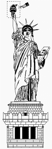
Fig.
9. Statue of Liberty mega-icon or picture menu.
When the trigger is part of the visual
object, you normally have to indicate that it's a
trigger. One possibility is to distinguish the triggers
visually from the rest of the drawing. For example,
you can use a deeper shade of the drawing's main
color to indicate the trigger. Or you might render
triggerable mechanical parts in three dimensions,
leaving the untriggered parts of the drawing in two
dimensions. Or you can put dotted lines around trigger
areas, as in Fig. 9.
Another common method of indicating triggers
is to change the cursor shape. For example, you can
change the cursor from an arrow to an ear to indicate "audio
output here," or a video-camera shape to indicate "video
here" (IBM 1992,16-17).
In games and educational programs, however, there may
be no trigger indicator--the user must find the triggers
by exploring. For example, in Brøderbund's Arthur's
Teacher Trouble and Grandma and Me, many
items in each panel are "live." When you click the cursor
on a starfish in Grandma and Me, the starfish
jumps up and leads nearby shells in calisthenics. In Arthur's Teacher Trouble, when you click on the
science lab's door, a green puddle leaks out from underneath
the door, goes "bloop, bloop," then goes back inside.
There are no predefined paths, nothing is highlighted;
everything is a surprise--a perfect learning tool.
Usability tests:
To make sure that you’re using the user’s
terminology for tasks, do a paper-and-pencil test
on the menus. For example, you can easily test menu
options with a simple paper and pencil quiz. If your
test participants don't make the right connections,
then you know you have more work to do on the design.
To find out how users would group functions,
do a sorting test. See Appendix B for details.
See also:
Keyboard Shortcuts; Menubar; Menu, Pop-Up; Pushbutton.
For more on organizing lists, see "How to Organize
Lists" in List Box, Multiple-Selection.
Adaptive Technologies, Audio
For information about audio technologies
for computer hardware and software, contact the National
Technology Center, American Foundation for the
Blind; 11 Pennsylvania Plaza, Suite 300, New
York, NY 10001; 212/502-7600.
The Trace Research and Development
Center at the University of Wisconsin offers
software, telephone communication devices, and
computer-access software. Contact: Trace Research & Development
Center, University of Wisconsin-Madison, Room S-151
Waisman Center, 1500 Highland Ave., Madison WI
53705; voice 608/263-2309; TDD 608/263-5408.
Librarians and teachers will find Ruth
A. Velleman's Meeting the Needs of People with
Disabilities: A Guide for Librarians, Educators,
and Other Service Professionals useful (1990,
ISBN 0-89774-521-3). The book is available from The
Oryx Press, 4041 N. Central Ave., Suite 700, Phoenix,
AZ, 85012-3397.
Voice Messaging and
Telecommunications
The Microsoft Telephone Software Development
Kit (TAPI SDK) is available from the Internet. Download
the file via remote ftp: on the browser’s "Go
To" command line, type ftp://ftp.microsoft.com/developr/TAPI/.
For contents, see README.TXT.
The Human Factors and Ergonomics Society
has a Communications Technical Group, which
consists of approximately 350 people working in telecommunications
firms, universities, consulting firms, and manufacturers.
For more information, contact the Human Factors and
Ergonomics Society, P.O. Box 1369, Santa Monica,
CA 90406-1369; voice: 310/394-1811.
Two controlled-circulation periodicals
from the same publisher contain information about
voice messaging:
-
Computer Telephony describes the world of
phone-computer hybrids--phone and fax boards in
computers, computerized voice processing applications,
speech recognition and text-to-speech applications,
voice processing standards, and so on.
-
Teleconnect, which publishes
articles on automated attendants, call and voice
processing systems, telephony applications, and
hardware of all kinds.
Contact Teleconnect and Computer
Telephony at 12 West 21st St., New York, NY
10010; voice: 212/691-8215.
For international voice-messaging specifications,
see ISO/IEC 13714:1995, "Information technology—Document
processing and related communication—User interface
to telephone-based services—Voice messaging applications." The
Internet address for ISO is www.iso.ch.
Menu, Pop-Up
A context-sensitive menu accessed by
pressing the secondary mouse button.
Good for:
Expert computer users who want shortcuts
(Fig. 10).
Accessing properties of selected objects.
Minimizing mouse travel by making options
available at the current pointer or cursor location.
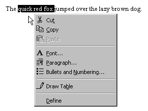
Fig.
10. Word processor pop-up menu.
Not good for:
Design guidelines:
Pop-up menus appear when the user moves
the cursor over a hotspot or hot area (defined by
the developer) and presses the secondary mouse
button (usually the right button). Although a cursor
change can be used to indicate that a pop-up exists,
the development guidelines are silent about whether
an indicator is required or not.
Rules for pop-up menus vary among platforms.
Following are the areas of agreement and disagreement.
Titles
The Motif guidelines call for a title
placed at the top of the menu and separated from
the menu elements by a standard separator (OSF 1993,
6-41). The Windows 3.x and Windows 95 guidelines,
on the other hand, do not show titles on pop-up menus
(Microsoft 1992, 76, 79; Microsoft 1995a, 126-131).
Recommended menu options
The IBM OS/2 guidelines suggest three
groups of items on a typical pop-up: Help and Open as
the first group, clipboard choices as the second
group, and application-specific choices as the third
group. The third group can also contain choices such
as Undo, Print, and Clear (IBM 1992,
192-193).
Motif recommends that you put options
such as Properties (set properties), Cut,
Copy, Paste, Undo, Select All, and Deselect
All on your pop-ups (OSF 1993, 6-27- 6-30).
The Windows 3.x guidelines have no recommended
list of options, although Undo and Properties options
are mentioned as typical (Microsoft 1992, 77).
The Windows 95 guidelines say that the
contents of a pop-up menu are supplied by the object,
container, or any combination of the two. For example,
they say that the pop-up menu for a file in a folder
can include transfer commands (Cut, Copy, Paste,
and other specialized Paste commands). Transfer commands
are properties of the container rather than the file
itself (Microsoft 1995a, 127).
Order of options
The Windows 95 guidelines suggest the
following:
-
Put the object’s primary commands
first (for example, Open, Play, Print), other commands
supported by the object or its context, and the
What’s This? command (if supported).
-
Put the transfer commands next.
-
Put the Properties command, if available,
last (Microsoft 1995a, 127).
Accelerators and mnemonics
If the development environment doesn't
offer keyboard access for pop-ups, show neither mnemonics
nor accelerators. In environments with keyboard access,
show the same accelerators and mnemonics on a pop-up
menu as you use in the top-level drop-down menus.
However, keep in mind that accelerators
defined for the primary menus will work anyway, whether
or not they appear on the pop-up menu. Probably for
this reason, the Windows 95 guidelines suggest that
you simplify the interface and not include the accelerator
labels ("Ctrl+S") on the pop-up options
(Microsoft 1995a, 129).
Submenus
In general, adding more than one level
of submenus defeats the purpose of a pop-up, which
is supposed to be an easy-to-manipulate mouse-based
shortcut. The Windows 3.x guidelines say that one
level of submenus is acceptable, but two or more
are not (Microsoft 1992, 77).
Invisibility is a problem
Make sure that
-
The options on the pop-up are high-frequency
functions
-
The users know the menu is available
-
The options also exist on the main
menus or on other more visible components—since
some users may never notice the pop-up menus,
they may never find these additional options.
Usability tests:
Observe carefully to see whether users
are likely to find the pop-up menus:
Share the results with your training
and documentation departments.
See also:
Menu, Drop-Down.
Message Box
A specialized, often modal, usually moveable,
type of dialog box used to present information or
warnings and ask questions.
Good for:
Asking for a user response.
Explaining an error.
Confirming a potentially dangerous choice.
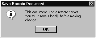
Fig.
11. Information message box.
Not good for:
Messages for which no response is needed.
If the application doesn’t require a response, use
a status-bar message instead.
Design guidelines:
Many error messages say things like, "Invalid
input. User must type xxxx." Why can’t the program,
if it knows what the user must type, just enter xxxx
by itself and save the user the tongue lashing? Instead
of demanding that the user find a file on disk, introducing
the chance that the user will select the wrong file,
have the program remember which files it has accessed
in the past and allow a selection from that list....
Undoubtedly, [these solutions] will cause
more work for programmers. This doesn’t bother me
a bit.... It is the programmer’s job to satisfy the
user and not vice versa. If the programmer thinks
of the user as just another input device, it is easy
to forget the proper pecking order in the world of
software design. —Alan Cooper, About Face: The
Essentials of User Interface Design, p. 432.
The most important guideline for messages
and message boxes is, Try to design them out of
the software. If you, as the developer, can figure
out what has to be done at some point in the program,
then have the software do it. If the users can cope
with uncertainty in particular fields ("I don’t
have the invoice number but I can fill it in later
before we ship"), then the software should accommodate
uncertainty as well.
Also, Cooper points out that too often
the software stops dead so that a message box can
report normalcy. If something has happened that was
supposed to have happened, he says, never report
this with a message box. Instead, put the message
in the status bar. Save message boxes for events
that are outside the normal course of events (1995,
144).
Pick the right type of message
According to Microsoft, there are three
types of messages: information, warning, and critical.
An information message (Fig. 11):
A warning message (Fig. 12):
-
Alerts the user to a condition or
situation that requires a decision and input from
the user.
-
Lets the user back out of an irreversible
action (a "chicken switch").
-
Can be written as a question.
-
Uses the exclamation-point icon.
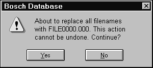
Fig.
12. A warning message.
A critical message tells the user about
a serious problem requiring intervention or correction
before work can continue (Microsoft 1995a, 210-212).
Windows 95 uses a red X icon (Fig. 13); Windows 3.x
and other platforms use a stop-sign icon.
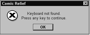
Fig.
13. A critical message.
However, the lines between information,
warning, and critical tend to blur as soon as you
sit down with a list of real messages. Many developers
find themselves splitting their lists between information
messages and error messages.
Error messages can, theoretically, be
either warning (semi-modal—the user might be able
to work around it) or critical (modal—all work stops
until the problem is resolved). However, except in
situations where failure has extremely high costs
(like space missions), your application should never
take itself so seriously that it stops the application
dead. Oh, the printer is offline? Well, then, let
the user know and switch to the next printer in the
queue. No printers in the queue? Let the user know
about it and retreat into the background until a
printer comes back online.
In short, you can expect to use the information
message (with its "i" icon) and the warning
message (with its exclamation-point icon) most often,
and the critical message rarely.
-
Use the information message when
you need simple user confirmations—"OK,
gotcha."
-
Use the warning message when you
need a more complex response—"Yes, No, Cancel
the Search."
-
Use the critical message when hardware
is broken or missing—"Error code 0: Computer
not on. OK."
What goes in the title bar
The platform standards agree: At a minimum,
put the application name in the title bar of the
message box. If the message is generated from a particular
document, spreadsheet, record, or other item, include
that item’s name as well.
The reason is that the application or
situation that generated the message may not be visible—it
may be minimized, it may have come from the network
or from a background process, it may be hidden behind
other windows or documents, and so on.
However, do not put the word "Warning," "Critical," "Information," or "Message" in
the title bar. The icon is used to indicate the type
of message; that it is a message box should be self-evident
because of its size, shape, and contents.
The message itself should be the first
line inside the message box. See "Write Messages
Right" below for details.
Use resource files
Put all messages in resource files. Don't
embed text in the dialog boxes themselves. The reason
for resource files is that they make changing text
relatively easy. But why would you change text? There
are at least three reasons:
Changes in corporate terminology. The
name of the software will probably change between
alpha and release; approved names of objects may
change; even the company name may change.
Corrections. Usability tests often
lead to changes in terminology. Changing embedded
text requires opening every affected file, finding
the text, changing it, recompiling, retesting¾ in
other words, time and money. If the text is in resource
files, however, human-factors personnel, technical
writers, and entry-level programmers can change it
without inadvertently damaging underlying code.
Internationalization and localization. As
soon as you translate an interface in which all text
is embedded, you have two versions of the program
to support, one of them in a language you may not
know. See the next section for more information.
Make sure that you can
internationalize
In addition to keeping messages in resource
files, internationalization has other requirements,
as follows.
Be careful of negatives
Native English speakers find sentences
like this difficult to understand (non-native speakers
find them impossible):
Wrong: Are
you sure that you don't want to save the file?
How are you supposed to answer this?
By reversing the sense: Yes, I don't want to save
the file. No, I do want to save the file.
Right: Do
you want to discard the file?
The answer is then either "No, I
don’t want to discard the file" (this should
be the default "safe" answer) or "Yes,
I do want to discard the file."
Also, English questions phrased in the
negative may be answered in unexpected ways in other
languages. For example, a positive response to a
negative question in French is not "oui" but "si":
«Vous
n’êtes pas malade?» «Si, je suis malade.»
("You’re not sick?" "Yes,
I am sick.")
Avoid concatenated strings
A common method for creating customized
messages is to embed variables in strings of text
(Kano 1995, 46-47). For example, instead of writing, "The
hard disk drive has crashed," "The scanner has become
disconnected," "The floppy disk drive has crashed," "The
hard disk drive has a boot error," and so on, you
might write:
MSG=The
%1 has %2.
where the first variable could be "hard
disk drive," "scanner," or "floppy disk drive," and
the second variable could be "crashed," "become disconnected," or "a
boot error."
But this message becomes difficult to
translate because the %2 variables are different
parts of speech. In English, you can use "has" as
-
an indicator of a not-so-distant past
tense
-
a past-tense indicator and part of
a verb phrase
-
meaning "owns" ("the drive owns or
suffers an error")
However, there is no reason to believe
that a similar substitution would be possible in
any other language.
Here is another straightforward string
substitution (as long as you stick with English):
Your
mission is to shoot down this bomber before it reaches
our %t and destroys it. You will start near the %t.
Engage the %b bomber when it approaches.
If, however, you were to translate this
phrase into a language with different word forms
for different genders, you would have to substitute
more than locations (%t) and bomber names (%b). As
Steve VanDevender says in The (Much-Requested)
Translation Manifesto, "Where in English we have
one accusative possessive article 'our,' German has
'unseren' used with masculine nouns, 'unsere' used
with feminine nouns, and 'unser' used with neuter
nouns [as well as] separate articles used with different
grammatical cases--like
'der/die/das' used where we would use 'the' before
a subject [and] 'des/der/des' used where we would
use 'of the'" (VanDevender 1993, 3).
In the sample above, then, the our and
each the would have to be tested and set to
the correct form, or the substitutions would have
to include the correct our or the.
Instead of before it reaches our %t, the phrase
would be before it reaches %t.
Also, don't construct messages from parts of
words or phrases. For example, concatenating Mon,
Tues, Wednes, and so on, to day works
well in English, but not in French--lundi,
mardi, mercredi, jeudi, vendredi, samedi, and dimanche--or
German--Montag, Dienstag,
Mittwoch, Donnerstag, Freitag, Samstag, and Sonntag
(National Language Technical Center 1991, 2-8).
Use message numbers
There are at least five reasons to show
message numbers or identifiers:
-
If the system gets completely fouled
up, the number may be the only information that
appears on the screen. As long as the documentation
lists the numbers with the messages, users will
at least be able to find the message by number.
-
The text of messages for two or more
different problems may be similar or the same,
especially when translated into other natural languages.
-
Messages written for end users often
lack the level of detail that professional troubleshooters
need. Without the number, a customer service
representative may have difficulty communicating
exactly what
the problem is to the developer. With the number,
on the other hand, the developer can figure out
almost immediately what "flavor" of
error this is.
-
If your application will be internationalized,
the numbers help translators track messages and
panels throughout the translation process. The
online messages are often translated a year or
two earlier than the documentation. Once the
documentation is ready to be translated, the
translators can
simply copy the original translation of the message
into the documentation, provided that they can
tell which message is which¾ ergo,
the message numbers.
-
Customer support can use the numbers
to provide help to international users. A U.S.
service representative may know the English version
but be unable to read French or German. The number,
however, crosses language boundaries (Uren, Howard,
and Perinotti 1993, 20-21).
Use the right buttons
Here are guidelines for user-response
pushbuttons. See Pushbutton for more on pushbuttons.
-
If the message is informational only
(the user simply has to acknowledge that he or
she has seen it), use OK or Continue.
-
If the message is a question, use
Yes and No, not OK and Cancel.
-
If the question has a third option
(an "if, then, else" structure), use
Yes, No, and Cancel (or other appropriate button).
However, be specific about what you’re canceling.
In a message like, "Do you want to exit without
saving this formula?" Cancel would mean "cancel
this message box" or "don’t exit"—but
then what? It would be better to use Yes, No,
and Return to Formula rather than Yes, No, and
Cancel.
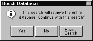
Fig. 14. Offer guidance
by being explicit.
For error messages, include a help button
or, in Windows 95, additional details. For what to
put in help or a details panel, see "Do error
messages in three parts" below.
For alignment (left, right, center),
follow your platform guidelines.
Write messages right
Messages must be both informative and
provide a solution to any identified problem. Beyond
those two criteria, there are a handful of other
standards and suggestions, as follows.
Be polite
Politeness means letting the software
take the blame rather than throwing the blame back
at the user. For example, Fig. 15 shows a typical "impolite" message.
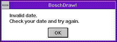
Fig.
15. A standard impolite message.
Fig. 16 shows the same message, rewritten
to shift the blame to the software.
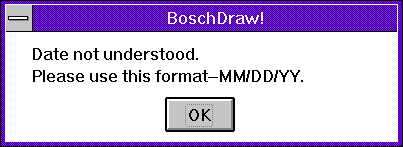
Fig.
16. The corrected (and more specific) message.
Politeness is important because it is
emotionally neutral. In other words, since the user
doesn’t feel blamed, she is neither intimidated nor
angered by the problem and just carries on. The more
emotionally neutral business software is—the more
that the software fades into the background—the more
satisfying it is to users. (This also explains why
humor and personalizing the computer fail to appeal
to business users—anything that draws attention to
itself shoves the task into the background and makes
users lose track of where they are in the task.)
An interesting side effect: Putting more
thought into the style of a message seems to force
developers to be more specific about the cause of
the problem. The result is a more useful message.
Clear messages automatically
Remove the message automatically whenever
your application can determine that the error has
been corrected. For example, if the printer sent
an "out of paper" message to your application but
now sends a notice that the paper tray has been refilled,
remove the alert message. Don't wait for the user
to do it.
Use the "goal-action" format
Put the problem or goal first and the
action second—see Fig. 17 and Fig. 18.
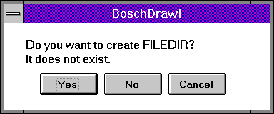
Fig 17 . Wrong: Action and problem are reversed.
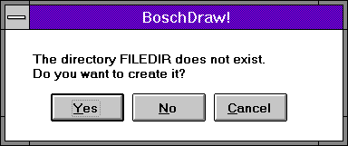
Fig. 18. Right: Problem first, action second.
If you have to write hazard or caution
warnings, always put the nature of the hazard first
and the consequences of ignoring the hazard second.
Then state how to avoid the hazard (Fowler and Stanwick
1995, 145-150). The "See Also" section
below contains more information on hazard messages.
Use chronological order
If the user has to do first one thing,
then another, write the message in chronological
order—see Fig. 19 and Fig. 20.
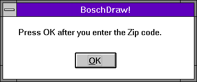
Fig. 19 . Wrong way to write a message. Some users
will press OK before entering the ZIP code.
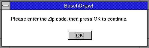
Fig.
20. Right way to write the message.
Align the text correctly
Put the information or warning icon leftmost
in the box, then start the text about a quarter inch
to the right of the icon. Left-align the message
text. Do not indent the first line of the message,
paragraph style—see Fig. 21 and Fig. 22.
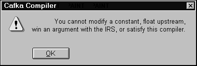
Fig.
21. Wrong alignment—text should not be indented.
According
to the Windows 95 guidelines,
the OK button should be centered.
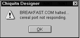
Fig.
22. Correct alignment.
The buttons go at the bottom, aligned
as per your platform’s guidelines.
Do error messages in three parts
Use the three-part diagnostic style:
-
Message: Make sure that the
message describes the problem in terms the user
can understand (for nontechnical audiences, avoid
jargon) and in terms that actually describe what
the problem is. Some corporate standards require
error-message numbers as well.
-
Explanation: The most likely
explanation of the problem, followed by the next
most likely explanation, and so on through all
possible explanations. (IBM’s hardware diagnostics
include actual "likelihood" percentages
based on the service representatives' experiences
in the field.)
-
User Response: Suggested actions
or user responses, again ranked by likelihood.
The error message and ID number, plus
the most likely explanation and suggested action,
should appear in the error-message dialog box. The
additional explanations and details can go into a "Details" panel,
online help, or printed documentation.
Avoid inadvertent destruction
Once you’ve rewritten your messages to
the standards described above, here is one more:
People often do not read the messages, at least not
more than once. Rather, they recognize the message
(and the problem) from the shape of the words and,
based on a mere glance, just clear it.
If two messages look very much the same,
the user may end up clearing the wrong message. Therefore,
after you’ve considered everything else, try to make
dissimilar messages look different, especially when
the results of mistaking one for another could be
catastrophic.
Also check the default response carefully.
Note that, in Fig. 23, the destructive "delete" message
has "No" as the default choice while the "archive" message
(Fig. 24) has "Yes" as the default.
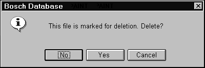
Fig.
23. Although this message looks very similar
to the one in the next figure...
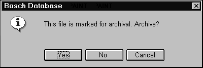
Fig.
24. Users are protected from error by the different
default buttons.
Usability tests:
Ask a technical writer or editor to review
messages for
-
consistent terminology—for example,
Yes and No instead of OK and Cancel if that’s
what you agreed upon
-
syntax—see "Write Messages Right" above
-
layout—for example, make sure that
all messages are left-aligned if that is what
your style guide calls for
-
grammatical and spelling errors
Don’t overdo confirmation and acknowledgment
messages, especially modal ones. If possible, test
your messaging strategy on experienced users as well
as new users using low-fidelity or high-fidelity
prototypes.
If your software will be used in countries
other than the one in which you are writing the software,
try to test in these countries. If you can’t afford
it, at least ask interested parties (your sales force,
for example) to look at your messages. Even when
two countries use the same language, there can be
misunderstandings. For example, in Great Britain, "billion" generally
means one thousand million. In the U.S., it means
one hundred million. (Note, however, that international
financial corporations often standardize on the U.S.
style.)
See also:
Online Help, Procedural, Status Bar.
For information on designing warning
sounds, see chapter 4, "Messages," in Fowler
and Stanwick (1995, 150-153).
For information on hazard messages and
signs, see Fowler and Stanwick (1995, 145-150). Also
(in the U.S.) see the American National Standards
Institute (ANSI) publications on hazard and safety
signs:
-
Safety Color Code, ANSI Z535.1-1991
($35.00)
-
Environmental and
Facility Safety Signs, ANSI Z535.2-1991 ($35.00)
-
Criteria for Safety
Symbols, ANSI Z535.3-1991 ($35.00)
-
Product Safety Signs
and Labels, ANSI Z535.4-1991 ($35.00)
For more information or to order these
publications, contact American National Standards
Institute, Attn: Customer Service, ANSI, 11 West
42nd St., 13th Floor, New York, NY 10036;
voice 212/642-4900; http://www.ansi.com.
|