|
You are here: Home ~ Desktop UIs ~ Keyboard Shortcut - List Box
Keyboard
Shortcuts: Mnemonic, Accelerator
A mnemonic is a programmer-defined keyboard
shortcut consisting of the Alt key and one character.
A mnemonic must be visible before the user can invoke
it. Mnemonics are indicated with underlines in the labels
of the menu options, pushbuttons, and other GUI components
for which they are defined.
An accelerator is a function key (F1,
F2, etc.), a [Ctrl] key or z key sequence, or a keyboard key marked with a function
name (for example, Help or Delete). Accelerator keys
are always available¾ unlike mnemonics, they don't have to be visible to be
used.
Good for:
Users with disabilities that make mouse
use difficult.
Accessing commands and operations quickly,
by bypassing the graphical (mouse-oriented) user interface
(Fig. 17).
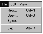
Fig. 17. N, O, and e are mnemonics. Ctrl+N and Ctrl+O
are accelerators.
When a mouse is unavailable—for example,
on trading floors and in manufacturing clean rooms—or
too irritating to use—for example, on laptop computers.
Not good for:
Novice computer users. (Graphical interfaces,
by making important options and activities visible,
are better for users who have never used a computer
before.) Mnemonics and accelerators are, relatively
speaking, hidden functionality.
Design guidelines:
Define mnemonics
and accelerators for users who work faster without the
mouse: power users, users of earlier command-line systems,
touch-typists, and laptop users who don’t want to use
the built-in trackball or touch-pad.
Defining mnemonics
Keyboard shortcuts take advantage of "body"
or kinesthetic memory, which comes into play when you
learn to type, ride a bicycle, or drive a car. This
kinesthetic memory is the reason that touch-typists
dislike interfaces in which too much functionality is
tied to the mouse¾you can't memorize the mouse's location the way you
can memorize keyboard positions. Keys are always in
the same place. The mouse pointer rarely is.
Platform guidelines require mnemonics
(or the equivalent) for all menu options. Some mnemonics
are already defined in the platform specifications.
Most guidelines also suggest adding mnemonics to pushbuttons.
Fig. 18. Mnemonics on pushbuttons.
The rules for defining mnemonics are as
follows (IBM 1992, 344-349; Microsoft 1995a, 33-34;
OSF 1993, 5-3- 5-4):
- Mnemonics are combinations of Alt
and single characters.
- The program accepting the mnemonic
must be case-insensitive.
- When focus is on the menu or menubar,
the user just presses the mnemonic letter or number.
If focus is anywhere else, he or she must press the
special key (in Windows, for example, Alt) plus the
mnemonic.
- The label must contain the character
to be used as the mnemonic unless there are
no characters in the label (pictures can be used as
labels) or the labels will change (on lists of open
windows, for example). In either of these situations,
number the labels and use the numbers as the mnemonics.
- As long as the label does contain
characters, the mnemonic character must be underlined,
except in language environments in which underlining
is unavailable. There are two exceptions: OK and Cancel.
OK, when it appears, is always the default button
and always uses Enter as its accelerator. Cancel always
uses Esc as its accelerator.
- For all systems except OSF/Motif:
When a mnemonic is not part of the label but instead
is a number or other code, put the number or code
flush left in front of the label (at the fourth space)
and underline it. Do not include parentheses or periods.
For Motif, put a letter mnemonic in parentheses after the label (OSF 1993, 5-3). Numbers go in front of
the label.
- Avoid using the same letter more
than once on any individual pulldown menu. (The problem
with using the same mnemonic twice is that the user
has to stop to think about which one she wants.) If,
nevertheless, you reuse a letter, the first keypress
goes to the first item on the menu; when you press
it again, it goes to the second. Note: This
does not currently work in Java applications.
- You can use the same letter more than
once on different pulldown menus or on a menu
and a submenu. In other words, you can use F for File on one menu, and F for Film Stars on another.
The items are differentiated from one another by the
titles of the menus themselves¾ say, [Alt]-[F] for File menu plus [F] for File versus [Alt]-[T] for Talent plus [F] for Film
Stars.
- All duplicate menu items should use
the same mnemonic. For example, if Save shows
up on two menus on two windows in the same application,
both Saves should use the same mnemonic.
Table 1 is a decision tree for selecting
letters. In addition, there are two high-level rules:
- Find the five to seven most important
options in the entire menu system and assign their
mnemonics first. (These five to seven options will
also get accelerators.) The reason for this is the
chunking rule: You can remember only five items at
a time, plus or minus two. Since users are likely
to memorize only five to seven mnemonics (or only
five to seven at a time), it is best to make the most
important options the most memorable.
- If the option has a traditional mnemonic,
use it.
You might also let users redefine the
mnemonics to suit themselves¾ for example, typists who memorized the old Wordstar
keys (in international markets where Wordstar is still
popular) might want to redefine your keys to match.
Table
1. Picking Mnemonics |
Default: Use
the first letter in the word or phrase. |
If |
Then |
That letter is already
used. |
Use the
first consonant or the most interesting consonant. |
If |
Then |
The first or most
interesting consonant is already used. |
Use the
first letter of the second or third word in the
phrase. |
If |
Then |
There is only one
word. |
Use any
available (non-conflicting) letter. |
If |
Then |
The label contains
no letters or the letters will change. |
Use numbers
in front of the label. Start with 1 and end with
9. |
If |
Then |
The label uses a
non-Roman writing scheme (Kanji, for example)
but a Roman keyboard. |
Prefix
the label with a Roman number or letter and use
that character as the mnemonic. |
Certain key combinations are reserved
for system-wide accelerators¾ [Ctrl]-[C], for example, has come to mean "copy" in
nearly every environment. Users automatically have access
to the system accelerators unless your program prevents
it. Defining new accelerators for important application
functions is encouraged but not required.
The rules are:
- Accelerators are function keys, Ctrl
or z key combinations, or named keys on the keyboard. Note: The IBM guidelines say, "Use the Alt key only to provide
access to mnemonics," then list a number of nonmnemonic
uses for the [Alt] key (IBM 1992, 315). However, that
stricture seems to be a "guideline" rather than a
"requirement." Just something else to keep in mind.
- Don't use the accelerators that are
already defined in the environment for application-specific
operations. In other words, don't use [F1] or the
[Help] key to open a tutorial.
- Define accelerators only for high-frequency
functions. Find the five to seven most often-used
options in the entire menu system and assign accelerators
to them (if there isn’t a system-defined accelerator
already).
- On option labels, use a plus sign (+)
between the key names to indicate that a user must
press two or more keys at once¾ for example, use Ctrl+F4, not Ctrl-F4.
- Remember that function-key shortcuts
are easier to localize than modifier-plus-letter shortcuts.
Since no name or letter is associated with a key,
no translation is required.
- Avoid using punctuation character
keys in accelerators if you expect to internationalize
your application. International keyboards have different
punctuation characters. Also, if you select a letter
primarily because of its mnemonic association (for
example, Ctrl+B for bold), you may have to change
it to fit a particular language. (Microsoft 1995a,
418).
For the standard accelerators on your
platform, refer to the guidelines for your current environment.
Usability tests:
To decide which accelerators to define,
find the five to seven options used most often. Test
experienced users, not novices.
For the most accurate results, use a
usage or keystroke-capture program. Do the analysis
by playing back the sessions and counting the number
of accesses.
Note that accelerators, although shown on menus, do not work on menus. For example,
pressing Ctrl+P while the File menu is open doesn’t
let users access the Print dialog box. Users new to
GUIs may have trouble with this idea—"It’s right there
on the menu! Why won’t it work?"
See also:
Command Line; Menu, Pop-Up.

Label
A description, usually text but sometimes
pictorial, of fields, buttons, and areas of windows
or dialog boxes.
Good for:
Indicating expected content for fields
(Fig. 19).
Indicating the purpose of a button or
other control.
Fig. 19. Typical field and button labels. Not good for:
Showing detailed instructions. Offer
instructions using tooltips, status-bar messages, or
context-sensitive online help.
Design guidelines:
Following are some general guidelines
on window and dialog-box layout. Labels, although not
as important as the fields and buttons themselves, are
nevertheless the most visible items on most windows.
Make labels match tasks
In "The Cognitive Walkthrough Method"
(1994, 112), Nielsen and Mack suggest that users often
follow a "label-following" strategy. They will select
an action if the label matches the description they
have in mind for the task. For instance, a user who
wants to print a document might select an action with
the label "Print" or "Document" (or an icon that shows
a printer or document).
Reduce complexity
Reduce complexity not necessarily by
eliminating information but by organizing it. Following
are some guidelines.
Organize the information
Put the most often entered or referenced
information at the top, and the least often used information
at the bottom or in dialog boxes.
Create functional groups of information
Create groups of information by putting,
for example, names and addresses at the top, billing
information in the middle, sales data at the bottom.
Break up the groups by putting them in boxes or by separating
them with blank lines or rules. If there are no functional
breaks, then break the screen every five to seven rows
(Galitz 1994, 78). See Fig. 20 and Fig. 21 for a demonstration.
Note that you might want to group all
required fields at the top of the window or dialog box,
even though this might break up your functional groups.
See Fields, Required, for more information.
Align field
labels
Fig. 20 and Fig. 21 contain exactly
the same fields, but Fig. 20 looks much more complicated.
Minimizing the number of columns and rows—the number
of alignment points, in other words—is one of the best
ways to reduce window complexity. Fig. 21, the revised
version, is about 50 percent simpler.
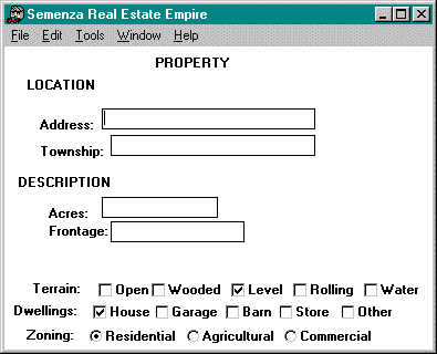
Fig. 20. Unaligned fields on a window makes the
window look complicated.
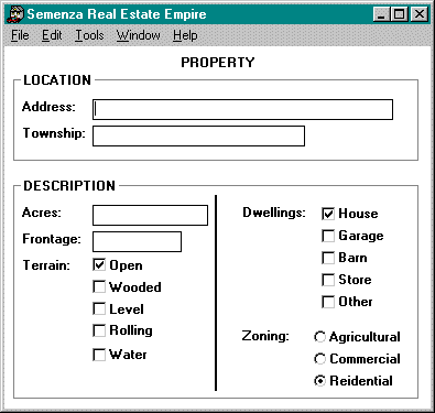
Fig. 21. Aligned and grouped fields make the same
window look simpler.
Provide only need-to-know information
If the user is looking for price relative
to yield, then show her price and yield at the top of
the window. Information about the company issuing the
stock, the number of shares outstanding, the broker
recommending the stock, and so on, can go at the bottom
of the window.
Put nice-to-know information in dialog boxes
When space is tight, separate need-to-know
from nice-to-know information. For instance, a lab analyst
needs to know whether a test result was positive or
negative¾ therefore, this information goes on the main window
at the top left. However, he might also like to know
the statistical likelihood of a false positive using
this batch of reagent, this level of humidity, and so
on. This information can go in a separate dialog box.
Position buttons correctly
Put buttons related to the entire window
at the bottom of the window. Put buttons related to
sections of the windows inside those sections.
How dense is too
dense?
Some early guidelines suggested keeping
screen densities to under 25 percent—in other words,
only 25 percent of the window should actually contain
fields or displayed information (Galitz 1994, 83). Studies
support these recommended densities. For example, NASA
researchers found that densely packed screens (70 percent
full) took an average of 5 seconds to scan, while sparsely
filled screens (30 percent full) took only 3.4 seconds.
By improving the labeling, clustering related information,
using indentation and underlining, aligning numbers,
and eliminating unnecessary characters, the researchers
reduced task time by 31 percent and errors by 28 percent
for inexperienced users. Experienced users did not improve
their task times, but they did become more accurate.
A study of telephone operators found that maintaining
a 25 percent density and suppressing redundant family
names reduced search times by 0.8 seconds per search
(Schneiderman 1992, 318-319).
However, expert users (stock brokers,
air traffic controllers, and so on) prefer denser displays
because more information per screen means fewer computer-related
operations. Since these users are familiar with the
data, they can find what they need even on a screen
with 80 or 90 percent densities.
The key to the density mystery may be
Jared Spool’s breakdown of applications into "core"
and "ring": A core application enhances the user’s core
competencies. For example, an engine analysis system
enhances a car mechanic’s core competencies. A ring
application—for example, a parts locator program—helps
with tasks outside the mechanic’s core competencies.
A core application can and should be as dense as necessary,
since their users will be spending a lot of time with
it and will want to have as much information available
as possible. Since, on the other hand, users will use
ring applications only occasionally, they will need
all the help they can get—not just white space and careful
grouping but built-in templates and wizards to get them
over the learning hump quickly (Spool 1996a, 1-3).
See also Cooper’s breakdown of applications
into sovereign, transient, daemonic, and parasitic (1995,
151-170).
Conclusion? On core applications, concentrate
on reducing overall complexity rather than density.
On ring applications, reduce both density and complexity.
Note: You can measure density by counting
the total number of characters on the window and dividing
by the total number of characters available on the window.
This number was easier to calculate on character-based
screens, which were always 80 characters across and
26 lines deep (minus a few lines for status bars and
other screen apparatus). However, you can count the
number of characters on the window by typing "1234567890123..."
across the top and down the side. For the total, multiply
the horizontal and vertical counts (Galitz 1994, 72-73).
Use abbreviations carefully
If you have to create a visually tight
window (a form-based data-entry window, for example),
you may need to abbreviate.
Studies of abbreviation methods have
found that truncating words is the best method for creating
abbreviations. Unless a standard and well-known abbreviation
exists—for example, DOB for date of birth, SSN for Social
Security number—truncate words.
Avoid making up abbreviations, because
people have different ideas about the "natural" abbreviation
for any one word—"meeting" might be "mtg" or "meet,"
for example (Galitz 1989, 115).
Keep in mind, however, that you can
end up with the same abbreviation for more than one
word. Here are two more methods for shortening terms:
- Contract words to the first and last
letters, delete vowels, and use phonic puns—for example, FX for "effects," XQT for "execute." (If you are going to internationalize
your application, note that puns in one language rarely
translate well to another. Sometimes puns don’t translate
between two versions of English—E-Z Add reads as "easy
add" in American English but "ee-zed add" in British
English.)
- Use the abbreviations in commercial
abbreviation dictionaries. This strategy may help
users who move often between jobs in the same industry.
What labels should
look like
Field labels should be a word or phrase
followed by a colon and a space:
Label: Data
Microsoft says to put a colon at the
end of the text: "Not only does this help communicate
that the text represents the label for a control, it
is also used by screen review utilities" (Microsoft
1995, 162).
Where to put labels
Put labels for columns above the column.
For example:
| |
Names: |
Birthdays: |
| |
Lucy |
10/06/53 |
| |
Sally |
11/03/51 |
| |
Mud |
12/05/58 |
Put labels for individual fields in
front of the fields. For example:
Price: 123.45
Yield: 6.78
Don't put labels above individual
fields¾ as well as using two lines per field instead of one,
the labels tend to become visually detached from their
fields:
Price: Yield:
123.45 6.78
Spread: Benchmark
10 bp TSY10Y
Justification
Labels should be as close as possible
to their fields, yet line up vertically in unobtrusive
but organized columns. The best way to fulfill both
requirements is to justify the labels and the fields
separately.
In general:
- Left-justify the labels.
- Left-justify alphanumeric data.
- Align decimal numbers on the decimal
point.
- Right-justify whole numbers (since
there is no decimal point).
To figure out the spacing for labels,
find the longest label and add one space between it
and its field or other component. Left-align the rest
of the fields with that first field.
How to write labels
Labels can't just look good—they should
read good, too. Recommendations:
- Use symbols—$, #, %—only if all users
will understand them. Remember that "all users" may
include international users. Some symbols will not
be on all keyboards.
- Try to use short, familiar words—"Cut"
instead of "Reduce," for example. As well as being
more readily understood, short words tend to be more
punchy and authoritative. However, keep in mind that
a long, familiar word is better than a short, unfamiliar
one (Galitz 1989, 74-75).
- Try to use positive terms, which
are generally easier to understand than negative terms.
For example, use "Growing" instead of "Not Shrinking."
- When comparing objects, use the "more"
rather than the "less" dimension if you have a choice—"longer"
instead of "shorter," "bigger" instead of "smaller"
(Galitz 1989, 74).
- Don't stack letters to label a column
or a table:
C
o
l
u
m
n
Since most readers read words whole,
not one letter at a time, the stacked style is difficult
to read. Instead, put the label above the column or
table or turn the entire word sideways.
- For better readability, don't break
words between lines.
- Show abbreviations, mnemonics, and
acronyms without punctuation. Periods and other punctuation
marks take up valuable window real estate without
adding anything to readability.
How
to capitalize labels
The Windows 3.1 style guide calls for
headline-style capitalization for labels of more than
one word. The Windows 95 and OS/2 guidelines call for
sentence-style capitalization for labels. Note that,
for menus, pushbuttons, and tabs, Windows 95 requires
headline-style capitalization (Microsoft 1995, 387-388).
Sentence style: Capitalize only
the first letter of each label. For example, Save
as. Exception: Capitalize any proper noun that appears
in the label. For example, About BoschDraw.
Headline style: Capitalize every
word in the label except articles (a, an, the); coordinating
conjunctions (and, but, or, for, nor); and prepositions
(at, by, in, to, from, with) unless they are the first
or last words in the label (Chicago 1993, 282-283).
For example, Save As.
Avoid using all capital letters in titles.
All-uppercase text causes problems. First of all, uppercase
letters take up more room than lowercase letters. A
title that breaks into two lines when it is all uppercase
will often fit on a single line when it is in upper-
and lowercase.
Secondly, all uppercase is hard for
non-programmers to read. Reading studies indicate that:
- People get their cues from the tops
of letters
- Capital letters give them fewer cues
than lowercase letters
See which of these two samples you can
read more easily:
Expansion rates between English and other
languages
If you intend to internationalize your
software, expect labels and other text to require more
room in the new language. For example, "Apply" in English
is "Appliquer" in French. See Table 2.
Note that, the shorter the text, the
more room you may need (National Language Technical
Center 1991, 2-4).
To accommodate internationalization
and localization, put all label text in resource files.
See the "See also" section below for some good reference
books. .
Table
2. Expansion Rates Between English and Other Languages |
Number of characters
in English |
Extra space required
for other languages |
Field labels, menu
options |
up to 10 characters |
100-200% (20 to 30
characters) |
11 to 20 characters |
80-100% (31 to 40
characters) |
Messages, onscreen
instructions |
21 to 30 characters |
60-80% (34 to 54
characters) |
31 to 50 characters |
40-60% (43 to 80
characters) |
Online help, documentation |
51 to 70 characters |
30-40% (66 to 98
characters) |
over 70 characters |
30% |
Usability tests:
To test labels, ask the test participants
to find an item and see whether they pick the right
field. For unsuccessful choices, ask them what label
they would use. Change the labels between tests until
most users pick the right field.
You might also test the time required
to find information. Develop a set of "reasonable" timings,
then give participants a list of items to find. Time
them with a stopwatch. Revise the order and groupings
until most participants can find the items within your
reasonable timeframes.
Note that experienced and inexperienced
users will have very different times. If your application
is a core application, use experienced participants.
If a ring application, use occasional or novice participants.
See also:
Field,
Entry; Field,
Protected.
For an overview of the internationalization
of GUIs, see Fowler and Stanwick, The GUI Style Guide (1995). For help with internationalization programming,
see Nadine Kano, Developing International Software
for Windows 95 and Windows NT (1995); Ken Lunde, Understanding Japanese Information Processing (1993);
the National Language Technical Center (IBM) National
Language Support Reference Manual, vol. 2 (1992);
Bill Tuthill, Solaris International Developer’s Guide
(1993); and Apple Computer’s Guide to Macintosh Software
Localization (1992).
As well as programming structures and
hints, these books also contain information on sorting
orders, cultural differences, differences in calendars,
money, weights and measures, and so on, from one country
to another. If you’re serious about internationalization,
it is worth your while to get them all, whether they
match your development platform or not.
List
Box, Multiple-Selection
A scrollable list from which users can
select more than one item.
Good for:
As an alternative to check boxes, especially
if the options will change often or be translated.
Letting users select more than one item
from a long and possibly dynamic list.
Fig.
22. A multiple-selection list box.
Showing multiple selections (especially
when using a selection summary box, as shown in Fig.
23).
Fig. 23. A selection summary box. Not good for:
Situations in which space is limited.
You may need to rethink the function. See "Design guidelines"
below.
Situations in which users may need to
enter new items. Use a combo box instead (but combo
boxes are single-select components) or add data-entry
functionality to the list box.
Situations that could be done better
graphically. For example, if users need to select states
or provinces, it might be better to let them select
them from a map rather than a list.
Design guidelines:
The more items you can display at the
same time, the faster users will be able to select the
right item. This is the advantage of multiple-selection
lists. However, because multiple-selection lists take
up so much room, it is best to restrict their use to
large or system-wide functions (like opening files)
where obviousness is a virtue; and to keep them in dialog
boxes rather than on main windows. You wouldn’t usually
want a multiple-selection list as a data-entry component
in most database applications, for example. Combo boxes
are usually better choices in data-entry applications.
Behavioral guidelines
Leavens suggests the following (1994,
286-288):
- Make sure that users can make discontiguous
selections, not just contiguous. In other words, make
sure that they can select items that are separated
from one another.
- Make sure that all items can be viewed
horizontally. Too often one sees a list box that isn’t
wide enough for the complete path and file name. Test
the widths of your lists in the field, not
just in your office.
- Before you specify or start to develop
a long list box, make sure you know the limits of
your development package. If the built-in multiple-selection
list accepts only 200 items, say, you can’t use it
(at least not without modification) for a list of
ZIP or postal codes.
Make the user’s choices obvious
After users select more than one item,
how do they know what they’ve selected? If the entire
list appears on the screen—if there is no scrolling,
in other words—all the selections appear as well. No
problem. But when the list is longer than the list container,
then the user needs better feedback.
Two options are the selection summary
box (see Fig. 23) and check-box/list box component (Fig.
24). Not only do the check boxes indicate the selections,
but they also show users that multiple selection is
possible.
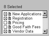
Fig. 24. Check boxes in a multiple-selection list
box. Helpful hint: On a scrolled list, because
some selections will not be visible, add a label that
says how many items were selected.
Make the multiple-selection option obvious
Developers often assume that users will
know how to select more than one item (generally with
the Shift and Control keys or with sweep-select). This
is not necessarily a good assumption, especially with
inexperienced users. If your user profile shows that
users aren’t familiar with windowing systems or the
application and that training may be spotty or
nonexistent, add an obvious selection indicator or a
tooltip. Note the hint in the title bar in Fig. 22.
(It would, however, be better to have the hint just
above or next to "File Name.") Also see Fig. 24.
How
to organize lists
Once you have a list, how do you organize
it so that users can find the items they want? According
to Kent Norman (1991, 133-134), there are eight ways
to organize information, as described in Table 3. These styles are not mutually exclusive--you
can use all of them in a single application.
Table
3. Organization Styles for Lists |
Organization Type |
Explanation |
Examples |
Random |
Not recommended,
although random order (or what appears to be random
to an uninitiated observer) is sometimes unavoidable. |
Icons on a desktop. |
Alphabetic |
Use when the items
can be meaningfully alphabetized and scanned.
Also use alphabetical order when no other type
of organization springs to mind. |
A list of typefaces: Arial, Helvetica, Times Roman. |
Numeric |
Use for items that
are associated with numbers. |
Baud rates, type
sizes, numbers of copies, and so on. |
Chronological |
Use for items that
are most effectively organized by date or time.
You can sort by age or in standard cognitive order. |
Age: E-mail messages
from newest to oldest, articles in a news service
from oldest to newest.
Cognitive order: January through December. |
Sequential processing |
List items according
to their likely order in a process or according
to a cognitive ordering of items. |
Process order: Open
Picture, Modify Picture, Save Picture, Close Picture. Cognitive order, from large to small: Galaxy,
Cluster, Star, Planet, Moon. |
Semantic similarity |
Order items in terms
of some semantic dimension, such as impact, reversibility,
potency, and so on. Items that are most similar
are next to each other on the list. |
Emphasis styles ordered
by impact: Normal, Underlined, Italic, Bold. |
Frequency of use |
Okay for "last n
used" or "last n saved" lists. Can be problematic
for other situations since frequencies change
- when users become more expert, and
- in data-entry tasks, when demographics change.
If frequency order is the only suitable order,
then log usage to find actual frequencies. Or
let users change the default themselves. |
The four most recently
used files on File menus. |
Standard or custom |
The platform guidelines
suggest certain menu options in certain orders.
Although all of these suggestions may not be suitable
for your application, use them when you can.
Standardization reduces the number of decisions
during development and helps users cross program
boundaries more easily. |
File, Edit, View, and Help menus. |
The list of organization styles (with
the exception of random) falls into two parts--alphabetic,
numeric, and chronological orders versus frequency,
sequence, and semantic orders. If we call the division
"alphanumeric versus categorical," is there any advantage
of one over the other?
It seems that when users are looking
for an exact word or label, alphanumeric order
is fastest. For example, if you ask a test participant
to find "Shiitake mushrooms," she'll find it quickly
on an alphabetized list of foods, like the one in Fig.
25.
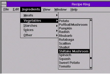
Fig.
25. Searching an alphabetized list.
However, when users are looking for
an answer to a question (or a command leading
to a particular outcome), categorical order is fastest,
followed by alphabetical order, then random order (Norman
1991, 135-137). If you ask a test participant to find
"mushrooms, Japanese," he'll find "Shiitake mushrooms"
faster on a categorical list (Fig. 26).
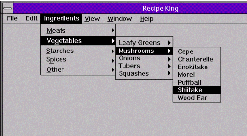
Fig.
26. Searching a categorized list.
As users’ needs change, however, let
them rearrange the list or columns so that this moment's
most important information is at the top. This is usually
done by turning column headings into sort toggle buttons.
See Fig. 27 for example.
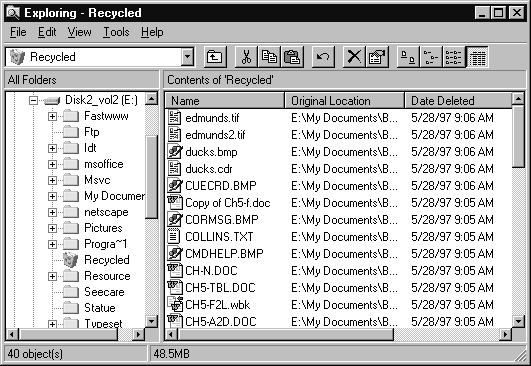
Fig. 27. Clicking a column heading ("Date Deleted,"
for example) toggles the list
between ascending and
descending order. Searching lists electronically
In addition to developing reasonable
orders for the application’s list, you might want to
let users search them electronically. Try using:
- filters such as alphabetical buttons—if
the user clicks R, the list jumps to the R items
- search fields—the user types in a
match or partial match and the application jumps to
the closest match (Fig. 28)
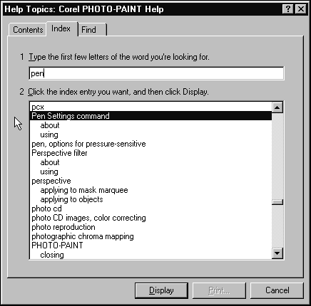
Fig. 28. Search option for a multiple-selection
list (in this case, a help index). Sorting order for multiple columns
When you have a long list of items broken
into two or more columns (type styles and sizes, for
example), sort the list up and down, not side to side
across the columns.
International sorting schemes
Your alphabetical lists will stop being
alphabetical as soon as you localize your software,
not just because the words change but also because sort
orders, especially for accented letters, vary dramatically
between one language and the next. Also, ideographic
languages such as Chinese don't have alphabetical orders
(they don't have alphabets). If your software will be
sold internationally, don't depend heavily on alphabetical
order.
Usability tests:
Check affordances: Make
sure that the test participant knows he or she can select
more than one item at a time.
Check sort orders: Do the test
participants seem to spend a lot of time scrolling up
and down the lists? Make a set of expected timings before
you start the test, then time the participants. If they
don’t meet your time expectations, you may need to add
a dynamic "change sort" option, perhaps by turning the
column headings into sort toggle buttons.
Find out whether you need a search
option or filter: Do your lists contain hundreds
rather than dozens of items? Do the participants spend
a lot of time scrolling up and down the lists? Again,
check actual task times against your expected times
and revise the interface until most of the participants
hit the time expections.
See also:
Check Box; Combo Box; Drop-Down
List; List Box, Single-Selection.
List
Box, Single-Selection
A scrollable list from which users can
select only one item.
Good for:
Making the user select one item from
a list of six or more items (Fig. 29).
Can be used as an alternative to radio
buttons.
 Fig. 29. A single-selection list box. Not good for:
Situations in which the list is not
yet complete or well-defined. Use a combo box instead,
since combo boxes let users enter new items when necessary.
Situations in which space is limited.
Use a drop-down list box instead.
Design guidelines:
Since single-selection and multiple-selection
list boxes look very much alike, provide some clue that
users can select only one item from the list at a time.
For example, put something like "Select one of [these
items]" in the label.
Leavens suggests the following (1994,
286-288):
- Make sure that all items can be viewed
horizontally. Too often one sees a list box that isn’t
wide enough for the complete path and file name. Test
the widths of your lists in the field, not
just in your office.
- Before you specify or start to develop
a long list box, make sure you know the limits of
your development package. If the built-in multiple-selection
list accepts only 200 items, say, you can’t use it
(at least not without modification) for a list of
ZIP or postal codes.
Usability tests:
Make sure that users never have to add
items. Ask experienced users for advice before designing
the list box and watch test participants carefully for
signs that items are missing from the list.
See also:
List Box, Multiple-Selection; Radio Button.
|
