|
You are here: Home ~ Color & Pattern
Color and
Pattern
Adapted from The GUI Style Guide by Susan Fowler
and Victor Stanwick, 1995, Academic Press.
Introduction: Why Use Color?
Color is more interesting
than black and white. The advertising industry
confirms that color is strikingly successful. According
to Starch Tested Copy, a newsletter of the market-research
firm Starch INRA Hooper, the average one-page full-color
ad in a business publication earned "noticed" scores
45 percent higher than the average one-page black and
white ad (Starch 1992).
Color can alert users to problems
or to changes in system states quickly. Network
troubleshooting software often uses red for overloads
and crashes, yellow for problem spots, and green for
normal situations. (The hotter, brighter colors are
used for the most important information.) A system monitoring
pH levels might use yellow for acidic solutions, dark
blue for alkaline solutions, and shades of green for
the ranges in between.
Color coding shows relationships
quickly. Assigning "false" colors to particular
types of information adds extra dimensions to the underlying
picture. Pseudocolors are used to indicate temperatures
and types of reflected light (including invisible infrared)
in satellite images and weather maps; to indicate hot
and cold spots in medical CAT and MRI scans; and to
separate layers--plumbing, electrical, indoor surfaces,
outdoor surfaces--in architectural drawings (Banks 1992,
144).
However, even in mundane situations, color can be used
to link information. For example, accounting systems
often show overdrafts and negative amounts in red, making
it easy to spot all of the problem points at the same
time.
Color coding shows differences
quickly. In the same way that color-coding
helps users see relationships, colors help users separate
the unrelated items.
When searching, for example, a user can scan for the
hits (the found text) much more quickly if they appear
in a different color from the normal text. (Note that
you should reverse the video rather than simply adding
color because colored text is harder to read than black
or white text.)
However, before you color-code your software, note
that there are four coding rules (Banks 1992, 146-147):
-
Color coding is useful only if the user knows the
code. Red for port (left) and green for starboard
(right) will make sense to boat owners and airplane
pilots, but not to car drivers.
-
The advantage of color increases as clutter increases.
In an uncluttered display, color adds nothing to
performance. In a complicated, high-density display
(60 items), however, color can reduce search time
by 90 percent.
-
Average search time increases linearly as the number
of items using the same color increases (by 0.13
seconds per extra three items). In other words,
you lose some of your color advantage if too many
items have the same color.
-
If you're looking for something of a particular
color, having items with other colors on the same
display has no effect on search time if the other
colors are sufficiently different from the target
color. In other words, since red is very different
from yellow, no user will pick a yellow triangle
when she's looking for a red triangle. However,
she might mistake an orange triangle for a red one
since orange and red are too close, especially for
red-blind individuals (see Color
Confusion).
Why Use Pattern?
"If you generate a cash-flow graph for [security]
FH 1080, it is difficult to delineate the PACs. Even
worse, when you print it out, it looks like three
black cows on a dark night." Neill Reilly, director
of sales, EJV Partners, New York.
Despite color's appeal, color is not enough. In fact,
color should be used second, pattern first. There are
three reasons, all having to do with hardware (human
or machine):
-
Not everyone has a color printer. Say that
you have designed a lovely chart with four or five
colored lines for your stock valuation tracker.
When you print it on a black and white laser printer,
what do you get? A lovely chart with four or five
undifferentiated black lines.
-
Personal digital assistants and web phones. Many web pages are being sent to personal digital
assistants (PDAs) and web-enabled cell phones. Eventually
the manufacturers will sell color displays, but
they're not available right now.
-
Color blindness, which is better described
as "color confusion" or
"color weakness."
Color Confusions
Approximately 8 percent of all males and 0.5 percent
of all females have a color blindness (Hackman 1992,
653). Color blindness or weakness has four basic varieties:
-
green blindness--individuals confuse greens, yellows,
and reds (6.39 percent)
-
red blindness--individuals confuse various shades
of red (2.04 percent)
-
blue blindness--individuals confuse blues (0.003
percent)
-
total color blindness, which affects no more than
0.005 percent of both sexes.
"Color blindness" is actually a misnomer, since color-blind
individuals see all of the colors in the spectrum, not
just black and white or shades of grey. Color-blind
individuals simply confuse certain colors. For example,
a person with a red confusion might label a pale-green
item as tan or orange. A person with a green confusion
might label dark blue as purple or yellow as bright
red (Milhaven 1989, VC16-19).
If you have standard color vision, you can reproduce
the effect, although not the actual confusion, by looking
around through a pair of deeply saturated colored sunglasses,
a colored filter or theater-light gel, or half of a
pair of 3-D glasses (close one eye). If you're looking
through a red filter, for example, everything red looks
white, and everything blue or green looks black. The
reason is that only red light can pass through the red
filter. Since pure blue and pure green contain no red
light, they don't get through the filter: "no light"
equals "black."
Hint: If you offer 3-D glasses with your
software, use polarized glasses or red and blue instead of red and green. Red and green glasses don't
work for people with red/green confusions, who are the
majority of those affected.

Background Color & Pattern
With the stumbling blocks of black and white displays
and printers and color-blind users, how do you pick
the right colors?
The answer is that you don't. Don't pick the colors
first--pick contrast and pattern first, then pick colors.
The next few sections explain how.
Start with Black and White
The development platform guidelines recommend that
you design the objects in your application in black
and white, and then add color. This guarantees, they
say, that the icons and windows will work just as well
in black and white as in color.
Un-Design for Clarity
Today the competition is at the user interface.... Skillful visual design of computer screens--with care
given to color, typography, layout, icons, graphics,
and coherency--substantially contributes to quality
and usability. Poor screen design can destroy underlying
excellence in software and hardware. Graphic design
details are not cosmetic matters or decorative touches.
In fact, careful attention to visual craft is a distinguishing
characteristic of nearly all excellent user interfaces
now in the marketplace. Edward Tufte, in introduction
to Visual Design of the User Interface, written
for IBM (Tufte 1989, 1)
All of the development-platform guidelines recommend
against overusing color. Edward Tufte, in a report he
prepared for the IBM Design Program (Tufte 1989) and
in his own books (Tufte 1983, 1990), points out that
less is more.
"In the simplest case, when we draw two black lines
on a white surface, a third visual effect results, an
active white stripe between the two lines," he writes.
"Nearly all the time, such surplus visual activity is
disinformation, clutter, noise. This two-step logic--recognition
of 1 + 1 = 3 effects and the consideration that such
effects clutter information displays--provides a powerful
tool for editing and refining user interface designs."

Figure 1. 1 + 1 = 3
Any first version of a window or an icon will contain
a lot of noise. But by studiously eliminating extra
patterns, using gray instead of black lines, or eliminating
lines altogether, you can reduce the noise and bring
information forward. For example, see the three iterations
of the chart in Figure 2.
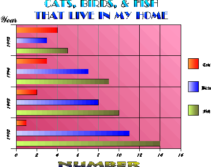
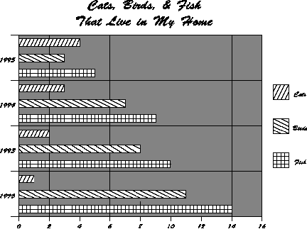
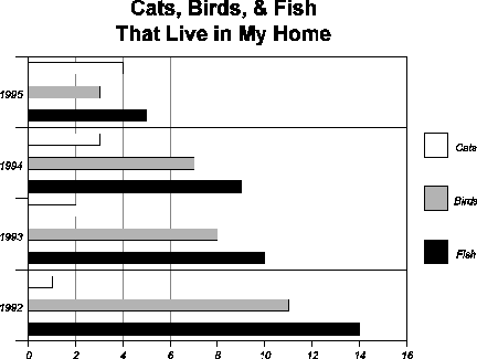
Figure 2. Three steps to uncluttering
a window
Pick the Background First
Some designers try very hard to come up with imaginative
ideas in an attempt to design attractive furniture
for offices. They visualize pitch-black office machines
on a bright table or dark furniture neighboring bright
walls. Such designers don't care about ergonomic principles
or balanced surface luminances. Etienne Grandjean
in Ergonomics in Computerized Offices (Grandjean
1987, 46).
There are two types of background:
If you know anything about your typical user's workplace,
you can easily design your program's backgrounds and
foregrounds to accommodate your users' visual situation.
If not, you can still pick a range of contrasts that
reduce users' discomfort while they're looking at your
windows.
Environmental
contrast
Etienne Grandjean is one of the inventors of ergonomics
and human factors. From 1950 to 1983, he was director
of the Institute for Hygiene and Work Physiology at
the Swiss Federal Institute of Technology in Zurich.
From 1961 to 1970, he was general secretary to the International
Ergonomics Association.
In Ergonomics in Computerized Offices, Grandjean
describes the ill effects of high illumination levels
on computer users. Although glare, reflections, and
deep shadows on the monitor are often extremely irritating,
an unrecognized eye-strain culprit, he concludes, is
too much contrast between the foreground (computer monitor)
and the background (everything else--desktops, walls,
curtains, windows, and so on).
Figure 3. Why office-mates fight
over the light switch
The human eye adapts so well to shifts in light and
dark that we can see nearly as well in moonlight as
in the brightest sunlight, even though the illumination
level differs by more than 100,000 times. However, dark
adaptation takes a relatively long time--25 minutes
to reach 80 percent adaptation, an hour for full adaptation.
Light adaptation is quicker than darkness adaptation--a
reduction in light sensitivity by several powers of
ten in a few tenths of a second. However, light adaptation
involves the entire retina.
Whenever a bright image falls on any part of the retina,
reduced sensitivity to light spreads to all parts of
the retina. Since this adaptation includes the fovea,
visual acuity for reading or fine details drops (Grandjean
1987, 23-24).
Since office designers usually recommend lighting levels
of over 1,000 lux, luminance readings in typical modern
offices can cause severe acuity problems (leading to
eyestrain, headaches, squinting, wrinkled brows, and
so on). A thousand lux is a lot of light: The range
of light in a typical living room is 50-200 lux. Bright
sunlight is 50,000-100,000 lux and a well-lit street
at night is 10-20 lux. Reflected light is about 60 percent
of the original brightness, so overhead light of 1,000
lux reflected off an office wall could be as much as
600 lux (Millerson 1991, 11).
Research indicates that the ratio in brightness between
the video screen and a document from which the user
is typing should be no more than one to ten (1:10);
the ratio between the video screen and the immediate
background (walls, desktop, and so on) should be no
more than 1:20; and the ratio between the video screen
and the entire room should be no more than 1:40. The
reality is much different. Researchers who surveyed
109 VDT workstations found a ratio of 1:10 to 1: 81
(average 1:21) between the screen and source documents,
and a ratio of 1:87 to 1:1450 (average 1:300) between
the screen and nearby office windows (Grandjean 1987,
43).
In short, to avoid dazzling and prevent eyestrain (your
own or your users), try to keep all surfaces at the
same brightness by matching the overall brightness or
dimness of your screens to the office environment. If
users typically use your software in brightly lit offices
or if they type from bright source documents, use light
or off-white backgrounds. If your software is used in
dim or dark areas (air traffic control towers, for example),
use dark backgrounds. If you can't find out what the
background will be, you might want to include two backgrounds,
one light and one dark, with your program.
Note: If you design for a dim background, keep
in mind that some color-blind users, who have no trouble
distinguishing red from green or red from orange in
bright light, cannot distinguish between the two colors
in dim light (Kunz 1987, 315).
Contrast and focus
As Figure 4 shows, the area on which you can focus
is about one inch at 20 inches (1° angle of view). You
are aware of text or images within a circle about a
foot in diameter (1° to 40° ), but can perceive only
movement outside that circle (41° to 70° ).
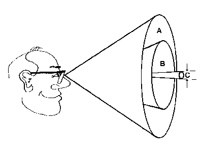
Figure 4. Visual field: cone A is
an angle of about 70°, cone B is about 40°, and cone
C is about 1°
The rules for contrast on the screen, or between the
screen and its immediate surrounding, take into account
the size of the visual field as well as the dazzle effect
described in Environmental
contrast (Grandjean 1987, 41):
-
Surfaces in the middle of the visual field (around
C in Figure 4) should not have a brightness contrast
of more than 1:3.
-
Contrasts between the central and marginal areas
(between A and B in Figure 4) should not exceed
1:10.
-
The working area should be brighter in the middle
and darker in the surrounding field.
-
Excessive contrasts are more troublesome at the
sides than at the top of the visual field.
Color inside the eye of the beholder
Once you've picked the overall background for your
program, you're ready to pick the color scheme for the
windows, buttons, and icons in your software. However,
colors have some odd characteristics, due to interactions
between the physiology of the eye and the physics of
light. In short, different wavelengths of color come
into focus at different points in the eye.
Since yellow and green wavelengths come into focus
at the retina, they require the least accommodation
from the eye (this is the reason for so many yellow
and green monochrome monitors a few years ago). Red
wavelengths, on the other hand, come into focus a little
behind the retina and therefore seem to "pop out" of
the background. Since blue wavelengths come into focus
in front of the retina, blues seem to fade into the
background.
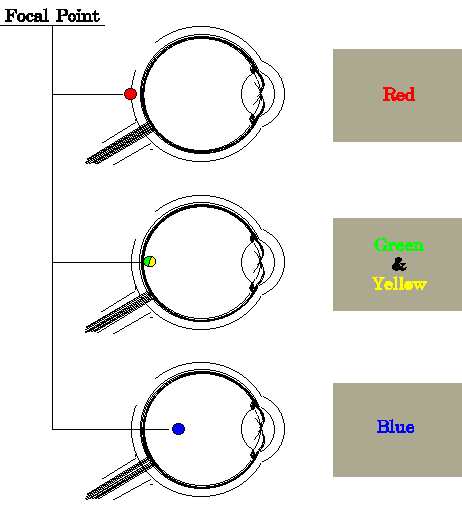
Figure 5. Wavelengths focused hither
and yon
So, when you choose colors, remember that:
-
Your eyes cannot focus clearly on blue, which is
why it is such a good background color and such
a bad foreground color.
-
Nor can your eyes focus well on red, but red has
the advantage (if you need it) of "moving forward"
in the visual field.
-
Yellow and green are just as visible in the periphery
as they are as in the center of the visual field.
-
Black and white are equally visible throughout
the visual field (Horton 1991, 228).
Other interesting effects include (Horton 1991, 227-228):
-
For most colors, hue seems to change as luminance
increases or decreases. However, saturated blue,
green, and yellow remain constant throughout the
range of luminance. Use them when constancy is important.
-
Staring at a large patch of a saturated color for
a long time shifts color perception towards its
complement. For example, when you look up after
working on a bright red figure, everything will
look greenish. Called the "McCullough effect."
-
In bright light, red seems brighter than blue.
In dim light, however, blue appears lighter but
colorless, while red appears nearly black. In low-light
situations, avoid reds. Called the "Purkinje effect."
Variation: Backgrounds and foregrounds for presentations
Use dark backgrounds and light foregrounds (text, lines,
and so on) for long-distance, low ambient-lighting situations
like slide shows or projected computer presentations.
If you're creating a video presentation (live action
or cartoon), use colors with low saturation (Marcus
1992, 84). Red, especially, blooms and bleeds all over
the pictures in which it appears, especially after you've
copied the video tape once or twice.
Use light backgrounds and dark foregrounds for situations
with high ambient light--for example, when you're using
an overhead projector (Marcus 1992, 84).
Foreground Color and
Pattern
Color in the foreground parts of an application--charts,
icons, toolbars, and so on--must contrast with the
muted background of the application. However, bright
colors bring up these issues:
Hint:
When you start to create icons and the rest of the
foreground objects, avoid temptation. Don't work directly
on the computer with all its multitudes of colors and
brightnesses. Instead, start by sketching your pictures
on a paper napkin, a cafeteria placemat, the back of
an envelope--anything that keeps you working on the shape of
the picture rather than its colors. Put the picture
into the computer only after you're satisfied it that
stands on its own (by testing it on your colleagues,
friends, relations, and clients, for example).
Pick meaningful colors
Although picking culturally correct colors for the
overall interface is useful (cool gray for an accounting
system, hot pink for a Post-Modern game), selecting
meaningful colors for the signals inside your
windows is even more important. There are four issues:
Chunking: People can remember the significance
of only seven colors, plus or minus two. In other words,
don't create line charts with nine differently colored
lines (unless the entire pattern of lines is
the significant picture--for example, to indicate a
noise level or a confusion level, as in Figure 6).
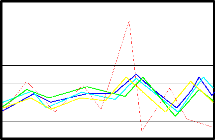
Figure 6. Intentional noise and confusion--chaos
is normal, so the one out-of-range point shows up
dramatically
Actual or spurious relationships: Since people
automatically assume that items colored the same are
related (Galitz 1993, 429), you must color related
things the same, unrelated things differently. Don't
just add color, in other words. Aesthetics are not
as important as sense.
But you can take advantage of this automatic-association
facility: For example, if your application has many
charts, each of which contain the same types of data,
color-code the data types. In a loan-analysis program,
say, you could use green for principal payments, blue
for interest payments, red for defaults, and so on.
As well as simplifying the situation for your clients,
the programming staff won't have to reinvent the color
wheel every time a new chart is added to the program.
Task domain expectations: Find out how color
(or pattern) is used in the area for which you're designing
the program. "The designer needs to speak to operators
to determine what color codes are applied in the task
domain. From automobile-driving experience, red is
commonly considered to indicate stop or danger, yellow
is a warning, and green is go. In investment circles,
red is a financial loss and black is a gain. For chemical
engineers, red is hot and blue is cold. For map makers,
blue means water, green means forests, and yellow means
deserts" (Schneiderman 1992, 327).
Hint: When you ask about color, ask
about relative position as well. For example, color-blind
individuals in the U.S. use the mnemonic "Stop on top,
go below" for stoplights. If you design a dashboard
with red, yellow, and green lights in the wrong order
or organize them horizontally, at least eight percent
of your audience will get the lights wrong. See Color
Confusions for details.
Cross-cultural differences: Colors mean different
things in different cultures. For example:
Green and orange |
politically suggestive in Eire and Northern
Ireland |
Red |
suggests death in many African cultures |
Red, white, and blue |
suggests colonialism in some countries |
White |
suggests death or mourning in some Oriental
cultures (Apple Computer 1992a, 219) |
Use pattern for significance,
color for reinforcement
If you always use pattern with color, you avoid most
problems (except the problem of visual clutter). For
example, on a line chart with one significant line,
and two or three other lines, you can use a bright
color with a solid line for the most important data,
then dotted and dashed lines for the less important
data.
Pick contrasting colors
Visual acuity is worse for color than for brightness
(Gregory 1987, 151). If you stripped away the hue and
left only the gray scale, would you still be able to
separate items visually? Picking gray-scale values
in addition to hue may solve the problems caused by
color confusions, black and white print-outs, and low
light or low contrast settings on users' computers.
The rule is: To create enough contrast between type,
lines, or other small items, and the background, make
sure that the colors' gray-scale values differ by at
least 20 to 30 percent (White 1990, 73).
How to tell if your selected colors have enough contrast
To check your colors, create a gray-scale ruler:
-
Pick a program with a color or palette editor.
Open the editor and either find or create a set
of nine grays and one black separated by 10 percent
differences in darkness. Use white for the background.
The values for each gray are:
Gray |
RGB Values |
HSV Values |
HEX Values |
| 100% (black) |
0,0,0 |
0, 0%, 0% |
000000 |
90% |
26, 26, 26 |
0, 0%, 10% |
1A1A1A |
80% |
51, 51, 51, |
0, 0%, 20% |
333333 |
70% |
79, 79, 79 |
0, 0%, 30% |
4F4F4F |
60% |
102, 102, 102 |
0, 0%, 40% |
666666 |
50% |
128, 128, 128 |
0, 0%, 50% |
808080 |
40% |
153, 153, 153 |
0, 0%, 60% |
999999 |
30% |
181, 181, 181 |
0, 0%, 70% |
B5B5B5 |
20% |
204, 204, 204 |
0, 0%, 80% |
CCCCCC |
10% |
232, 232, 232 |
0, 0%, 90% |
E8E8E8 |
0% (white) |
255, 255, 255 |
0, 0%, 100% |
FFFFFF |
-
Draw a set of gray boxes on a white background,
one color of gray per box, ranging from 10 percent
to 100 percent (black).
-
Draw diamonds of all the colors you want to test.
-
Drag each color sample over the gray scale, squinting
as you drag it. When the color and a gray box seem
to match, you've found its gray-scale value.
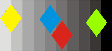
Figure 7. Gray-scale ruler
-
Save the colors that are either 20 or 30 percent
apart (separated by two or three boxes) and discard
the rest.
Note: Some colors, because of their
brightness, maintain high contrast no matter where
you put them on the gray scale. However, check the
size. Small areas of yellow disappear against white.
Red, if used for something small (dots) or thin (lines),
shrinks away to nothing against a dark background.
Avoiding Problems with
Adjacent Colors
Most computer illustrations come in full color nowadays,
so the question of what colors to use is either irrelevant
("It's a picture of a face! The colors are face colors!")
or too complicated to talk about here ("Remove that
green cast in her face before sending the file to the
color separator").
However, some colors, when used in blocks, do odd
things in the presence of other colors. For example,
bright colors like red look bigger than dark colors
like black (White 1990, 15-18). In Figure 8, notice
that the inner red square looks larger than the inner
black square:
r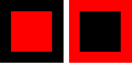
Figure 8. Which center square is bigger? Neither.
Problem: Comparing widely separated colors
Since color perception is sharp only near the fovea,
color coding is effective only within 10 to 15 degrees
of the central area of vision. Widely separated colors
are hard to compare, in other words, unless you lean
back or step back from the computer (Horton 1991, 226).
Problem: Hues change
in proximity to one another
If you want a color to look like itself and stay that
way, don't put it next to a complementary
color (White 1990, 16-18).
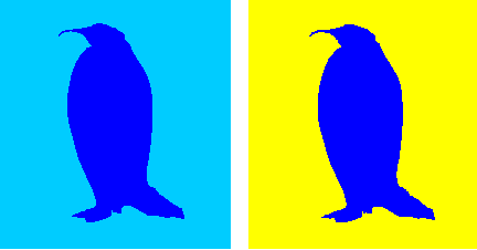
Figure 9. Against a shade of itself vs. its complement
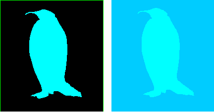
Figure 10. Same color looks light, then dark
Problem: Complementary colors flicker
Putting blocks of saturated complementary
colors next to one another causes eyestrain.
Because the cones in your eyes cannot see both colors
at the same time, your focus shifts back and forth
rapidly without being able to settle on either color:
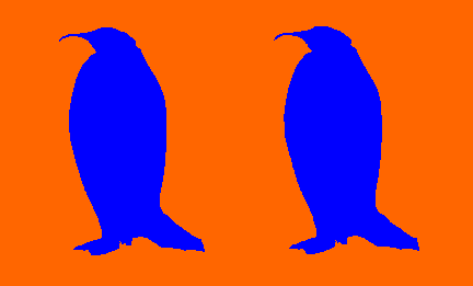
Figure 11. Flicker in complementary colors
Figure 11 shows you what happens with orange and blue.
Red and blue-green, yellow and dark blue, and purple
and chartreuse (yellow-green) are also complementary
colors.
Problem: Contrasting colors
create intense edges
The edge between two
bright contrasting
colors can be very intense and often distracting.
To avoid this effect, you can either lighten or darken
one of the colors or separate the two colored areas
with a white or black line.

Figure 12. Too much color contrast in the first
penguin, not so bad in the second
Problem: Color does not make type stand out
Do not fall in the trap of thinking that color is
as strong as black because it looks brighter, more
cheerful, more vibrant, and so more fun to look at.
It is not. You have to compensate for its weakness,
to make color as visible as black. There just has
to be more of it, so you have to use fatter lines,
bolder type, or larger type to overcome the problem. Jan
White in Color for the Electronic Age (White
1990, 24).
When you switch from black text or lines to light-
or bright-colored text or lines (red, orange, gold),
double the width of the lines and use either bold or
a larger type size. One to two points larger should
be enough for 8- to 12-point type, two to four points
larger for 14- to 24-point type. However, check visibility
by squinting at the text. Too-light type will recede
or even disappear.
The reason for color's poor showing is physiological.
Colored letters and numbers can only be read when they
are quite close to the eye's focal point, although
color itself can be seen far from the focal point. "This
indicates that color is a useful aid for visual search
but actual reading takes place in a restricted visual
reading field. If a reader is familiar with the significance
of colors, then colors will help to locate the required
information quickly, but the recognition of a word
or symbol itself depends on the legibility of characters
and not on their color" (Grandjean 1987, 30-31).
References
Apple Computer, Inc., Guide to Macintosh Software
Localization, Addison-Wesley Publishing Co.,
Reading, MA, 1992a.
Apple Computer, Inc., Macintosh Human Interface
Guidelines, Addison-Wesley Publishing Co., Reading,
MA, 1992b.
William W. Banks, Jr., Jon Weimer, Effective Computer
Display Design, Prentice-Hall, Englewood Cliffs,
NJ, 1992.
Robert K. Barnhart, Hammond Barnhart Dictionary
of Science, Hammond, Maplewood, NJ, 1986.
Hideaki Chijiiwa, Color Harmony: A Guide to Creative
Color Combinations, Rockport Publishers, Rockport,
MA, 1991.
Susan L. Fowler, "Banking on a New Interface," I.D., September/October
1993, 70-72.
Wilbert O. Galitz, User-Interface Screen Design, QED
Publishing Group, Boston, MA, 1993.
Etienne Grandjean, Ergonomics in Computerized Offices,
Taylor & Francis, New York, 1987.
Richard L. Gregory, ed., Oxford Companion to the
Mind, Oxford University Press, New York, 1987.
LCdr. Richard J. Hackman, Capt. Garry L. Holtzman,
Lt. Penny E. Walter, "Color Vision Testing for the
U.S. Naval Academy," Military Medicine, Vol.
157, Dec. 1992.
William Horton, Illustrating Computer Documentation,
John Wiley & Sons, New York, 1991.
Shiz Kobara, Visual Design with OSF/Motif,
Hewlett-Packard/Addison-Wesley Publishing Co., Reading,
MA, 1991.
Les Krantz, What the Odds Are, HarperPerennial,
NY, 1992.
Jeffrey R.M. Kunz, Asher J. Finkel, The American
Medical Association Family Medical Guide, Random
House, New York, 1987.
Aaron Marcus, Graphic Design for Electronic Documents
and User Interfaces, ACM Press/Addison-Wesley
Publishing Co., Reading, MA, 1992.
Kathleen R. Milhaven, "Visual Communication and
Color Blindness," Proceedings, 36th International
Technical Communications Conference, 1989.
Gerard Millerson, Lighting for Video, 3rd ed.,
Focal Press (imprint of Butterworth-Heinemann, Ltd.),
Oxford, U.K., 1991.
Adrian Nye, Tim O'Reilly, X Toolkit Intrinsics,
O'Reilly & Associates, Inc., Sebastopol, CA 1990.
Winn L. Rosch, The Winn Rosch Hardware Bible, Brady,
New York, 1989.
Philip W. Sawyer, ed., "45 Questions to Test Your
Ad IQ," Starch Tested Copy, Vol. 4, No. 10,
November 1992, pp. 1-4
Philip W. Sawyer, ed., "Quiz Answers," Starch Tested
Copy, Vol. 4, No. 10, December 1992, p. 4.
Peter Slatin, "Darkness Made Visible," I.D., September/October
1993, 81-82.
Edward R. Tufte, Envisioning Information, Graphics
Press, Cheshire, CT, 1990.
Edward R. Tufte, Visual Design of the User Interface, IBM
Corporation, Armonk, NY, 1989.
Edward R. Tufte, The Visual Display of Quantitative
Information, Graphics Press, Cheshire, CT, 1983.
Jan V. White, Color for the Electronic Age, Watson-Guptill
Publications, New York, 1990.
Resources
Color and Light
Leslie Stroebel, Photographic Filters: A Programmed
Instruction Handbook, Morgan & Morgan, Inc.,
145 Palisade St., Dobbs Ferry, NY 10522, 1974. This
book teaches you, in the best pedagogical fashion,
exactly how filters work with colors. It has an extensive
bibliography, a glossary, and plastic filters in
a pouch in the back (used for some of the exercises).
Robb Smith, Amphoto Guide to Filters, American
Photographic Book Publishing Co., Inc., Garden City,
New York, NY 11530, 1979. An excellent reference for
types of filters and the effects you can get.
Color, Pattern, and Design
Hideaki Chijiiwa, Color Harmony: A Guide to Creative
Color Combinations, Rockport Publishers, Rockport,
MA, 1991. Distributed through North Light Books,
1507 Dana Ave., Cincinnati, OH 45209. Pages and pages
of color swatches, in combination, plus a lucid description
of color theory. This book is also available in the
U.K., Phillippines, Thailand, Canada, Singapore,
and Turkey.
Edward R. Tufte, Visual Explanations : Images and
Quantities, Evidence and Narrative, Graphics
Press, Cheshire, CT, 1997, Envisioning Information, Graphics
Press, Cheshire, CT, 1990, and The Visual Display
of Quantitative Information, Graphics Press,
Cheshire, CT, 1983. How the pros do design. Once
you've mastered the basics, go here.
Jan V. White, Color for the Electronic Age, Watson-Guptill
Publications, New York, 1990. Not about interface design
at all, but clear and practical about color in general.
Also includes an appendix that compares color specification
systems (Munsell, Pantone, Natural, and CIE Notation).
Color Standards
ANSI offers
these color coding standards:
- Color Coding of Discrete Semiconductor Devices, ANSI/EIA
236 Revision C.
- Colors for Identification and Coding (includes
1988 supplement, 359-A-1) ANSI/EIA 359-A.
- Safety Color Code, ANSI Z535.1-1991
For more information or to order these publications,
contact American National Standards Institute, Attn:
Customer Service, ANSI, 11 West 42nd St., New York,
NY 10036; voice 212/642-4900; fax 212/302-1286.
Outside the U.S.:
American Technical Publishers, Ltd., 27/29 Knowl Piece,
Wilbury Way, Hertfordshire, SG4 0SX, England
Japanese Standards Association, 1-24, Akasaka, Minato-ku,
Tokyo 107, Japan
Standards Council of Canada, 45 O'Connor Street, Suite
1200, Ottawa K1P 6N7, Ontario, Canada
Visual Impairment and Adaptive Technology
For an excellent site on color confusions, see Color
Vision, Color Deficiency by Diane Wilson.
American
Foundation for the Blind runs the National
Technology Program, a resource for visually impaired
people and their families, rehabilitation professionals,
educators, researchers, manufacturers, and employers.
-
The National Technology Program conducts objective
evaluations of products and equipment used by visually
impaired persons. These evaluations are modeled
after "Consumer Reports," are published in the
Journal of Visual Impairment & Blindness (JVIB),
and are available from AFB's Information Center.
-
The National Technology Program also provides
information on assistive technology used by blind
and visually impaired people.
-
The Careers and Technology Information Bank (CTIB)
features data from over 1,900 blind or visually
impaired people who use adaptive equipment in a
variety of jobs, including many non-traditional
fields. Individuals listed in the CTIB may serve
as resource people for consumers and professionals
in the field.
As well as offering rehabilitative services to partially
and legally blind individuals, the Center
for the Partially Sighted prescribes and offers
training in visual aids. The Center helped Citibank
reprogram its original touch-screen automatic teller machine
so that blind and partially-sighted customers could
use it (this system was subsequently revamped)..
Definitions
Parts of the eye
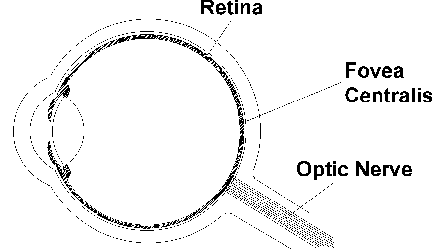
Figure 1. Diagram of the eye
A human eye can be divided into two parts: a pupil,
cornea, and lens for focusing light, and a retina for
gathering light. The retina itself has these parts:
-
Rods: Visual cells embedded in the retina
that are sensitive to light and dark, not to color.
There are about 130 million per eye.
-
Cones: Visual cells that are sensitive
to color, not to light and dark. There are about
7 million per eye.
-
Fovea centralis: An area covering 1° of
arc at the back of the eye. The fovea has the highest
density of cones (about 10,000 per square millimeter)
and the most direct connections to the optic nerve--each
foveal cone has its own nerve fiber. (Rods and
cones in the rest of the eye are connected in groups
to nerves.) The high density and direct connections
give the fovea the highest resolving power of any
part of the retina. Since vision is most acute
here, you instinctively move your eyes until the
image you want to look at falls on the fovea.
-
Blind spot, which is the interface between
the retina and the optic nerve. There are no rods
or cones on the nerve, so no light is gathered
at that point. However, you are never aware of
the blind spot because the brain closes the visual
field across the blank area automatically. Indeed,
you can't find your own blind spot without specialized
testing equipment (see Figure 2).
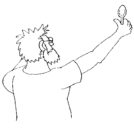
Figure 2. Find your blind spot: Cover one eye and
stare straight ahead at a blank wall, while holding
a spoon at arm's length. Move the spoon slowly back
and forth, an eighth of an inch at a time, until
the bowl of the spoon disappears.
- Achromatic color:
-
Black, white, or grey--colors without saturation or hue.
- Chroma:
-
A synonym for "saturation."
- Complementary
colors:
-
On the standard color wheel, complementary colors
lie directly opposite one another. They are called
complementary because, between them, they contain
all the colors of the spectrum, not because they
get along well. The standard complementary pairs
are: red and blue-green, orange and blue, yellow
and blue-violet, chartreuse (yellow-green) and
violet, green and red-violet.
- Contrast:
-
The greater the contrast, the better the visibility.
Black on white has the strongest contrast. However,
contrasting colors (colors with three hues between
them on the color wheel) can cause optical illusions
along the edges where they meet. Common pairs of
contrasting colors are red and green, red and blue,
orange and blue-green, yellow and blue, and violet
and green.
- Dithering:
-
Also called "texture mapping." A type of optical
illusion. If you put pixels of two or more colors
next to one another, the human eye automatically
combines them into a third color. If you look closely
at color pictures in magazines, you will see that
only four colors of dots in various combinations
make up the entire full-color picture. The four
colors are cyan (light blue), yellow, magenta (pinkish
red), and black. Dithering is also used to simulate intermediate
colors on a restricted palette or gray scale
when you only have black and white pixels to work
with.
- Gray scale:
-
A system in which all of the hues are replaced
with various shades or brightnesses of gray. Not
the same as monochrome.
- HSV:
-
Hue, saturation, value (in some programs, HSL--hue, saturation,
lightness--or HSB--hue, saturation, brightness).
A system available on some palette editors as an
alternative to the RGB color-definition system.
Matches the widely used Munsell method of color
notation.
- Hue:
-
What is normally called "color." Hues are designated
by such names as red, green, yellow, blue, and
so on. Hue is a function of wavelength.
- Luminance:
-
The degree of lightness or darkness in colors
created by mixing lights.
- Monochrome:
-
Black and white, period. No grays except those
created by dithering. However, also used to refer
to monitors with one color (usually amber, green,
or orange) on a black background (or vice versa).
- RGB:
-
Red, green, blue. Three wavelengths of light--red,
green, and blue--create all of the hues visible
to primates such as ourselves. Computer monitors
use light, not pigment, to create colors. By adjusting
the amounts of red, green, and blue light, you
can create any of the dozens to millions of colors
available on your or your clients' monitors.
When you paint with light, red, green, and blue together make white.
When you paint with pigments, however, red, green, and blue
make black (or actually, a dark muddy brown that is familiar to most
of us from grade school). There are other differences as well. Red
light and green light make yellow light, whereas red pigment and
green pigment make brown pigment.
Each of the three scales (R, G, and B) has 256 points (usually shown
as 0 to 255). Winn Rosch explains why there are 256: "The digital-to-analog
converter chip used by the VGA system does more than just convert
digital signals to analog. It's actually three DACs in one--one for
each color. In addition, it contains the color look-up table for
the color mapping process which assigns one of the 262,144 colors
[2 to the 18th power] possible under the VGA system to each of the
256 values that can be stored in memory in the VGA 320x200 color-graphics
mode. The look-up table values are stored in 256 registers inside
the DAC chip itself" (Rosch 1989, 318). In other words, whenever
you change a red, green, or blue scale, you are changing a value
in one of three 256-cell tables.
- Saturation:
-
Also "purity" or "chroma." The intensity or vividness
of a color. Red is more saturated than pink, navy
blue is more saturated than sky blue. The more
saturated a hue is, the more visible it is at a
distance. The less saturated it is, the more difficult
it is to see.
- Spectrum:
-
The band of visible colors produced when sunlight
is passed through a prism--red, orange, yellow,
green, blue, indigo, violet. (Just remember Mr. Roy
G Biv.)
- Value:
-
Also "lightness" or "brightness." The
amount of white or black mixed into the hue. Some
hues are inherently lighter or darker than others--yellow,
for instance, is very light while violet is very
dark. The word "shade" usually describes a darkened
hue, produced by removing light. The word "tint" describes
a light hue, produced by adding light.
|
