|
You are here: Home ~ Our Colleagues
The 14-Step Drill-Down Method
For GUI Design
This page contains a quick approach to designing desktop software or web applications. Please feel free to write to us if you've found this page helpful, unhelpful, or want to add your experiences.
1. Pick a Team
Teams are made up of functional roles
(easy to fill) and team roles, which
are not so easy to fill (unless you know the secret). Team roles were defined by Cambridge researcher Meredith Belbin's work--see What Are Belbin Team Roles? for more information.
Functional Roles
| Artist or graphic designer |
Can
visualize the correct visual style.
Can create sensible graphics.
Can cut the writer's and developer's dependence
on words. |
 |
| Customer
(internal or external) |
Has
the business acumen.
Knows the application's function.
Involving
the customer in the design phase is an old but
underused custom. This is also referred to as
Joint Application Design (JAD) or participatory
design. |
 |
| Developer,
system engineer |
Knows
what's possible.
Good stand-in for expert users. |
 |
| Marketing
or sales rep |
Knows
what will sell the software.
Knows what the point of the whole thing
is. |
 |
| Quality
assurance expert, tester |
Knows
what will make an application easy to support
and maintain.
Knows what will pass an outside audit. |
 |
| Technical
writer |
Knows
how to analyze functionality from a user's point
of view.
Good stand-in for novice users.
Very conscious of internationalization. |
 |
| Trainer |
Knows,
at first hand, what angers or confuses users.
May notice that users are changing the ways
they use an application. |
 |
| Usability
engineer |
Knows
how perception works.
Has expertise in task analyses, usability
testing, and GUI design techniques.
Jakob
Nielsen, a usability engineer who worked at
Telcordia (Bellcore), and then at Sun Microsystems,
and is now on his own, found that a team of
5 or 6 expert usability engineers could identify
about 95 percent of the interface mistakes.
However,
they can't find mistakes in the conceptual
model, especially in business domains that
they don't know very well. You need to
work with users for that. |
 |
Team
Roles
People
usually have more than one role or talent.
Therefore, you don't have to have nine-person
teams. In fact, research has shown the five- or six-member teams seem to work best.
| |
Role |
Strength |
Weakness |
Mahatma Gandhi

|
Completer
This
person might also act as your recorder, provided
he or she can be kept from recording too much.
Typical
completers are editors, accountants, and
technical writers. |
Painstaking,
conscientious, anxious.
Searches out errors and omissions.
Delivers on time.
|
Inclined
to worry too much.
Reluctant to delegate.
Can be a nit-picker. |
Eleanor Roosevelt  |
Coordinator
This
is a good role for team facilitator. Studies
show that "delegating well" goes
beyond merely assigning jobs to other people.
There are two other aspects:
-
Make sure that other team members get
to fulfill their roles--he or she doesn't
hog all the roles.
-
Steps up to the nasty or unpleasant
jobs that no one else wants to do, such
as firing people.
|
Mature,
confident, a good chairperson.
Clarifies goals, promotes decision-making,
delegates well.
|
Can
be seen as manipulative.
Delegates personal work. |
Douglas MacArthur  |
Implementer
This person would be a good recorder, because he or
she will do the notes, add action items, distribute
them, and follow up on the action items. |
Disciplined, reliable,
conservative, and efficient.
Turns ideas into practical actions. |
Somewhat inflexible.
Slow to respond to new possibilities. |
Alan Greenspan  |
Monitor Evaluator |
Sober, strategic, and
discerning.
Sees all options.
Judges accurately. |
Lacks drive and the
ability to inspire others.
Overly critical. |
Albert Einstein
|
Plant
There's a story about a truck that got jammed under
a bridge. All the experts were standing around
racking their brains trying to figure out how
they were going to get the truck out of there.
A little boy came over and casually asked, "Why
don't you let the air out of the tires?" In
many cases, unconventional (or "out of the
box") thinking may carry the day. |
Creative, imaginative,
unorthodox.
Solves difficult problems. |
Is not interested in
or ignores details.
Usually too preoccupied to communicate effectively. |
Madeline Albright  |
Resource investigator
Stanley Milgram started the 6 degrees of separation
craze in the 1960s. He gave letters to 160 people
in Omaha, Nebraska, and asked each one to send
the letter to a friend or aquaitance who might
know a particular stockbroker in Cambridge, Massachusetts.
The letters got to the stockbroker in an average
of 5 or 6 steps.
However, not all degrees are equal. Fully
half of all the letters went through the hands
of the same three people. Those three people
were obviously resource investigators. |
Extrovert, enthusiastic,
communicative.
Explores opportunities.
Develops contacts. |
May be overly optimistic.
Loses interest once the initial enthusiasm
has passed. |
Frederick Douglass 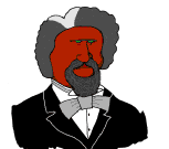 |
Shaper
This is the entrepreneur, the one who gets the ball
rolling. Good to have around when things have
gotten stagnant--when there has been too much
success, for example. |
Challenging, dynamic,
thrives on pressure.
Has the drive and courage to overcome obstacles. |
May provoke others.
Can hurt other people's feelings. |
Marie Curie

|
Specialist |
Single-minded, self-starting,
dedicated.
Provides knowledge and skills that are in
short supply. |
Contributes only on
a narrow front.
Dwells on technicalities.
Overlooks the big picture. |
Augusta Ada King Lovelace

|
Team worker |
Cooperative, mild, receptive,
diplomatic.
Listens, builds, averts friction, calms the
waters. |
May be unassertive.
May be too timid to present own ideas, no
matter how good they may be. |

2.
Do a task & user analysis...
Task
analysis:
Find
out what users actually think about this project
as well as what they do. The joint application design
(JAD) or participatory design approach works best.
Task
analysis methods:
-
Bridge
(Dayton, McFarland, Kramer, 1997)
-
Use
Cases (Constantine 1995)
-
Task
Scenarios (Lewis and Reiman 1993)
User
Analysis:
Rubin
(1994) and Dumas and Redish (1994)
A
notation system:
Hix
and Hartson (1993)
Re-engineer
the job:
Straighten
out the forms and the process.
Figure
out how you can use the software to add value--for
example, graphics programs have pens, brushes,
typefaces, and also they
let you do separations yourself and deliver them
over modems to the print shop.
There
are different approaches to the work. For example,
online banking is a step-by-step approach (task-oriented),
whereas a program such as PaintShop is exploratory,
or non-linear.
3.
Find a good conceptual model...
Characteristics
of conceptual models:
-
They
are always formed. No one is going to come to
your application with no expectations.
-
Once
formed, conceptual models are sticky--they're
hard to break, just like habits.
-
They
have a primary effect on usability.
If
the application's conceptual model matches the user's
mental model, then the application will be easier to
use and learn. If not, the user will have trouble learning
the application, and once learned, getting beyond the
novice level.
Use
a brainstorming session to come up with the conceptual
models. The obvious models will show up early in
the session; the oddball models, which tend to
be richer and more provocative, usually appear
only after the team is ready to give up.
Once
you have a dozen or so ideas, eliminate and consolidate
until you have two or three good possibilities.
Pick them based on:
-
How
well they can be extended
For example, a "fireplace" model
for a creative writing application is fine
for the contemplative aspects of creativity
but not for the
editing activities.
-
Whether
they will be readily understood by the target
audience
For example, a toaster icon to indicate "new bank account" will
amuse older employees who remember when banks offered irons and toasters
to draw new customers, but will probably bewilder younger employees.
Once
you have two or three good conceptual models, test
them.
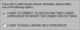
4. Define the home window...
The home (main) window should:
- Embody the conceptual model.
For example, if the conceptual model is "telephone," the
main window should look or act like a telephone.
- Act as the user's starting point
and (possibly) the ending point.
The home window is the window on which the users start doing real
work; they may end their task on the same window as well.
Like Internet home windows, a good
application home window provides users with the first
rungs on the ladder--it makes it easy for the users
to start.
For example, the "Document1" blank
page in Microsoft™ Word for Windows provides an obvious
starting point--a writer can simply start typing on
the screen.
A ladder with a few missing rungs would
be a word processor that offers a gray background with
no insertion point at startup.
Having an obvious ending point is useful
as well, since it provides closure.
There are two types of windows:
- Transient, impermanent, irregular, like the WinZip or SnagIt windows.
Use brighter colors, bigger icons, obvious navigation--users don't
come here often, so they need more help.
- Sovereign, permanent, regular, like the Word for Windows opening window.
Use muted colors, smaller icons, sophisticated
navigation--users are here every day and eventually
they'll see everything, no matter how small.
Color choices:
Choose
the color scheme for an application carefully. Colors can sometimes
convey a meaning on their own without any other clues
(such as using red to indicate "danger"),
but don't always translate across cultural boundaries.
A poor choice of color can also make an otherwise perfectly
good application difficult to use, as shown in the
figure below. The button is almost invisible, even when the contrast and brightness
are turned way up on your monitor.
This is an actual screen shot from IBM's "RealCD" application
A couple of other rules of thumb to
remember are that 1 out of every 12 men have trouble
seeing red and green at the same time (colorblindness),
and that no color combinations offer the same powerful
contrast as black and white.
When developers take it upon themselves
to change color schemes, the results can sometimes
get quite strange. The following figure shows what
happened when a developer decided to hard code the
button colors in an application (the developer thought
it looked "excellent"--no one else did).
Strangely colored buttons
5. Define the menus & toolbars...
Development teams need graphic artists to create
toolbar buttons (although not menus, usually). The
toolbar buttons below are from an old version of
the CompuServe online application. Note the childlike "crayon" palette
and the large size of the individual graphics.

Older version of CompuServe's toolbar buttons
This style is perfectly suited for a home application
or for one that is used only occasionally. It's not
appropriate for a business application, which should
use a more sophisticated palette, or for an often-used
application (the colors are too bright).
Here's another classic mistake that you, as a professional
designer, can protect your clients against.
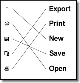
Really badly done icons
The first four buttons on the toolbar
above represent:
- Send
- Send without carriage returns
- Send with quotes
- Send with CIS quotes
The mistake? The foregrounds and backgrounds are reversed. The repeated
(but background) image is used in the foreground and overwhelms the important,
different images in the background. It's almost as if this is a Sunday
comics section, and you're challenging your users to find the differences
between the pictures.
6. Create the user's path...
Dialog boxes and windows
Dialog boxes and windows move a user through a task.
As a designer, you will probably not have much to say
about the tasks or flows, but you can help your clients
design better dialog boxes and windows.
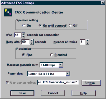 |
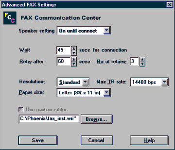 |
| This dialog
box looks complicated and difficult
to parse |
This dialog
box is much easier to read |
What's the difference
between the two dialog boxes? The fields in the dialog
box on the right have been aligned, making them easier
to scan and making the relationships between
fields easier to understand.
7. Define the fields...
These "buttons" are just labels
Do NOT make your field labels look like buttons. Users will try to press them and assume that your buttons don't work.
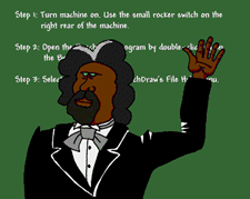
Note: Many of the examples in this section
of 14 Steps came from the now defunct Isys Information Architects
Hall of Shame website.
8. Brainstorm the icons...
The Five Most Important Things About Icons:
- Pick shapes first, then color; color is
secondary.
Use muted colors for situations in which people look at the icons
every day; use bright colors for icons that are seen and used only
occasionally.
- Create families of icons.
Don't create icons one at a time, as they come up in the application.
Icons created on a piecemeal basis look like they were thrown
together at the last minute. Create all of the icons at once
for the whole application. That way they will all have a similar
look and feel. Try and use symbols or picture that relate
to the industry the application fits into. For example, use checkbooks,
coins, bills, and money in a banking application. Use kitchen
utensils and appliances in a cooking application. You get the
idea.
- Test the icons on other people (outside
the team).
You are too close to the project to be objective about your icon
designs. Let people who are not working on the same project look
at them and let you know what they think. Studies show that
a "matching" test works very well for testing icons.
Use the "matching" test for your icons.
-
Use visual figures of speech.
If you've ever used the term "not bad" to mean something
is good, then you've used a figure of speech known as a litotes (LIE-ta-tees).
A litotes describes something by stating its opposite. For example,
since a chain represents captivity, a broken
chain represents freedom. Any image inside a circle with a
slash through it is a litotes. Another method of
representing an idea is a synecdoche (si-NEK-da-kee).
A synecdoche is a picture that represents a whole,
such as a chili pepper representing a Mexican restaurant.
Finally, you can always use hyperbole (hy-PER-bolee),
as in traffic signs that show an impossibly steep
hill to represent an upgrade.

Litotes, synecdoche, and hyperbole.
|
- Use idioms rather
than metaphors.
All idioms must be learned. Good idioms only need to be learned once.
Designing icons can be one of the most difficult parts of any interface
design. For example, how do you express the idea of compiling code
in a metaphorical picture 16 pixels square? Why not use simple geometric
shapes as icons? Once the users have learned the idioms used, they
work just as well as metaphors.
Brainstorming icons
We have found that a great way to design your icon
families is to play a game called "Iconary," which
uses the rules from the game Pictionary, only with
icons as the goal.
9. Define the shortcuts...
Look in these areas:
-
Keyboard shortcuts for
touch typists.
Touch typists don't want to take their
hand off of the keyboard to make mouse clicks,
it breaks their work flow. Put in as many keyboard
shortcuts as you can.
-
Pop-up menus for expert
users.
Expert users will want to use pop-up
menus (usually found by right-clicking the mouse
on the application's main window or field) rather
than searching for functions through toolbars or
main menus.
-
Adaptive technologies
for extraordinary environments.
In what type of environment will this
application be used? In some circumstances, the
environment will play a crucial part in how the
application runs. For example, the trading floor
of a stock market is a relatively noisy place to
work with distractions going on all around. You
may want to build in sound effects or bright animations
into the application in order to get the user's
attention. However, the same application may not
be suited for use in a quiet or subdued atmosphere
such as a library or boardroom.
10. Define the pushbuttons...
Good button design is critical:
In the following graphic, can you tell from the on-screen
buttons whether this individual is in or out?
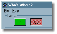
In the office or out?
Judging by the green (OK) color and the 3D raised
surface look of the button, I'd say that this person
is in the office. But I'd be wrong. This individual
is actually out today. This is a badly designed button.
Fancy or non-typical buttons may not work:
In
the following graphic, can you tell which are buttons
and which are screen furniture?
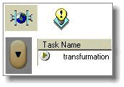
Buttons or labels?
Actually, the two pictures at the top are supposed
to be labels, and the two items at the bottom are
the only "live" parts of the application.
Illogical labels combined with badly designed buttons
will cause anger among users.
Make buttons look like buttons!
Unless
you are designing a video game or other such application,
users are going to expect push buttons to look like
push buttons. On the graphic below, Save and Cancel
are actually push buttons. Most users assumed they
were menu items, and were surprised when they clicked
on them.
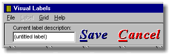
Pressing Altl-S or Alt-C had
no effect on this window. You were required to know
that you had to press Save or Cancel to
to perform any action.
And what's THIS?
In
the graphic below, the file cabinets and musical notes
on the right side of the window are buttons. But who
knew that? They look like buttons that are already
pressed down. Users came to the conclusion that the
buttons were "stuck" and that there was some
type of error in the application.
Are these buttons stuck down?
11. Create the radio buttons,
check boxes, and lists...
Scrollable lists
Text boxes with scroll bars are a good idea for longer
lists. Users can scroll down the list to find the information
they need. However, users do NOT want to scroll both
horizontally AND vertically through a list to get the
information they need.
Can't see enough of the items on either list to make a choice
If the information on a list doesn't fit in the text
box, either reformat the information or resize the
list box. Don't make users scroll in multiple directions.
Radio buttons and checkboxes
Don't
put radio buttons or checkboxes on raised panels. It
makes the radio button or checkbox look like a pushbutton,
and it's unnecessary and distracting.
Are these pushbuttons, radio buttons, or checkboxes?
Radio buttons are good for mutually exclusive choices.
If you don't have enough room on a window for the number
of radio button choices, use a combo box instead. They
serve the same function.
Checkboxes are good for situations where the user
can select more than one thing at a time. Checkboxes
are also used to answer "yes/no" questions.
However, keep the question simple to avoid confusing
the user.
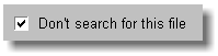
Does this mean "Search for this file" or "Don't search
for this file"?
12. Define the tables, graphs,
and spreadsheets...
Table and graphs
If the application uses graphs and charts, give
your users the ability to toggle between listed spreadsheet
data and a graphical representation of the data.
They'll thank you for it.
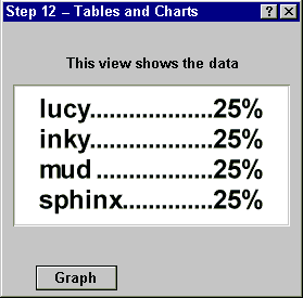 |
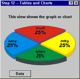 |
Users can click the Graph button to switch to the graph version... |
and the Data button to go back to the table version |
Data Points
Give your users the ability to see what the value
is for any given point on a chart or graph. For example,
in the graphic below, if you rest the mouse on any
given point on the line, a pop-up window shows you
the value at that point.
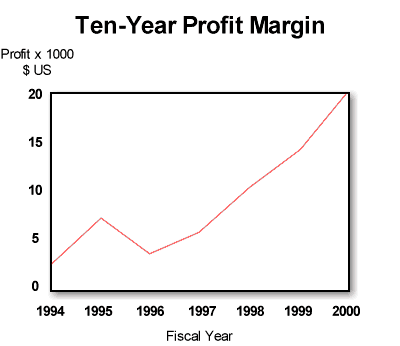
Give your users as much help as possible (hold your pointer over the points to see the underlying values)
This is really rather easy for a computer to do,
and it will eliminate eye strain on the part of your
users. Again, they'll thank you.
Type
Use monospaced typefaces where ever text (and
especially numbers) must line up in columns. Note that the numerals in most modern typefaces are monospaced, no matter whether the rest of the face is monospaced or proportional.
13. Write the messages and online help...
Type Choices
Graphic designers are often asked to come up with
the proper choice of type for a given application.
As graphic designers, they have an eye for what works
and what doesn't work.
When in doubt, call in a graphic designer
In the example above, someone should have consulted
a graphic designer before forging ahead with the project.
A
common mistake many people make is to use upper-case
characters in labels and buttons in an attempt to make
them more noticeable. However, all upper-case type looks
like you're shouting and generally leaves users feeling
chastised.
These radio button labels look like they're shouting at you
Back
in pre-computer days, underlined text meant "italicize
this text" to the typesetter who received a manuscript.
These days, it essentially means the same thing with
one minor addition--an internet user who sees underlined
text automatically thinks "hyperlink" and will
attempt to click the text and follow the link (if it
is pertinent to what the user is trying to accomplish).
Hyperlinks or not?
In the example above, the underlined text entries are not hyperlinks.
And the internet addresses visible below the underlined text (which
really should have been underlined and linked) are not hyperlinks,
either. This is a very confusing situation.
14. Look at what you've done and set up for the next
release...
Why think about the next release?
Especially look at what you would change--and save--about
your teams.
One thing to remember about teams and the individuals
on a team: Although there has been an assumption that
people are more or less interchangeable in jobs at
say, McDonald's, they definitely are not interchangeable
in high-tech design jobs.
The 1988 article "A field study of the software
design process for large systems" in Communications
of the ACM reports that the most successful teams
had one or more very experienced members, but not just
in their functional roles--also in their team roles.
We quote:
"The constant need to share and integrate information
suggests that just having smart people is not enough...
Individual talent operates within the framework of
these larger social and organizational processes [of
coordinating and managing changes in large projects].
The influence of exceptional designers was exercised
through their impact on their project members and their
ability to create a shared vision to organize the team's
work."
In other words, the team designs. Thank you for your
time and attention.
|
