|
You are here: Home ~ Desktop UIs ~ Palette - Pushbutton
Palette
A specialized, non-modal, movable dialog
box containing mouse-accessed tools.
Good for:
Quickly accessing related operations
that are primarily done with a mouse or pointing
device—for example, drawing circles, erasing, and
filling areas with color.
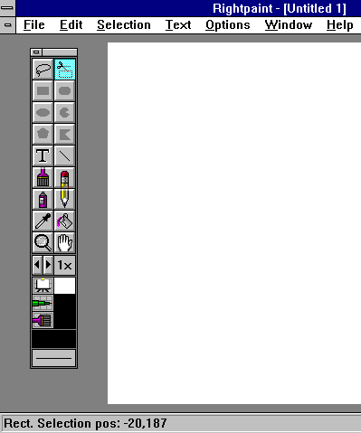
Fig. 34. Palette
from RightPaint by ICOM. Note the clever in-context
draw
and erase
buttons—the pencil point and the eraser.
Not good for:
Operations that are done more efficiently
from the keyboard.
Design guidelines:
Palettes usually float in the window,
often at one side. They can normally be repositioned
to move them out of the user’s way. Otherwise, they
are functionally the same as toolbars. (For more
design hints, see Toolbar.)
Palettes usually require many pictorial
labels for the buttons. See Iconic Label for detailed
design information.
Hidden functionality
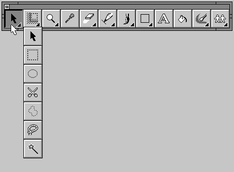
Fig.
35. A set of pick tools dragged out of the
CorelDraw "pick" palette button.
Note the triangular indicators on the buttons that have additional settings
or options.
If you let users change palette button
settings by holding down or doubleclicking on a button
(Fig. 35), make sure that users know the feature
exists. Alex Leavens tells a story on himself:
In my icon editor, ICE/Works, there is
a series of tools you can adjust the settings of,
such as the Pencil tool. You do this by double-clicking
on the tool, which brings up a dialog box where you
adjust the tool’s features. However, if you never
double-click on a tool, you probably don’t know this
feature is available. In earlier versions of the
program, I didn’t have a menu method of accessing
these tool setting features. As a result, people
kept asking me to put in features that already existed.
Finally, I got wise, and put in menu entries for
these features, too, so people just browsing the
menu structures could find them. (1994, 59)
If you want users to fly along in your
application, make everything visible and make it
visible in more than one way. As Jared Spool of User
Interface Engineering has said, "The more different
ways you can get the most important functionality
to your users, the more likely they’ll find it to
use" (Spool 1995).
Grouping buttons
Horton (1994, 132) suggests grouping
palette buttons (or icons in general) into meaningful
categories and subcategories. He offers some guidelines,
based on experience:
-
Involve users from the start. Ask
them to help you pick the categories and subcategories.
Let them suggest names for the buttons. (See Appendix
A for information about sorting tests.)
-
Group by task. Create categories
based on user tasks rather than the software’s
architecture.
-
Be practical. Don’t be pedantic.
If a button appears to fit into more than one
group, duplicate it.
Usability tests:
Collect usage information on menu items,
palette buttons, and toolbar buttons:
Note: When half the users often
access the dialog boxes or menus and half never access
them, consider creating dialog boxes or menus that
can be turned into palettes by tearing them off.
See also:
Iconic Label; Toolbar; Tooltip.

Pointer
A picture on the desktop that shows the
mouse’s location. (Think of the pointer as an icon
for mouse movement.)
Good for:
Indicating where the current keyboard
input focus is (Fig. 36).
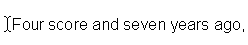
Fig.
36. Text pointer in a document.
Providing feedback on the current mode
(Fig. 37).

Fig. 37.
Wait pointer.
Design guidelines:
Pointers have two feedback functions:
Changing the shape "has the great
advantage that it cannot be overlooked by the user;
the visual indication appears exactly where the user’s
attention is focused" (Zetie 1995, 177).
Pointers have three basic styles, matching
the three basic modes:
-
Arrow pointer for general control
mode. (No other mode is in effect.)
-
Specialized pointers for action modes—for
example, the I-beam pointer for text-editing
mode, an eraser pointer for erasure mode, and
so on.
-
Watch or hourglass pointer for system-busy
or "wait" mode (for waits of less than
5 seconds).
The development platforms and kits offer
standard pointers for system-busy, general control,
and many common action modes. Use these pointers
whenever possible instead of creating your own. For
cross-platform comparisons, see Marcus (1995, 224)
and Fowler and Stanwick (1995, 70-75).
Hot spots
Pointers have two components: a visual
representation (arrow, question mark, and so on)
and a hot spot. The hot spot is an area inside the
pointer that marks the exact location on the desktop
that will be affected by the user's next mouse action
(Microsoft 1995a, 31).
If you design your own pointers, place
the hot spot in one of these two locations:

Fig.
38. The hotspot is on the fish’s nose.
-
At the upper left corner of the image.
If you create an atypical pointer (a dinosaur
or a banana, for example), point the head or
top of
the image to the upper left and put the hotspot
in the image’s head or topmost point (Fig. 38).
-
Where the user would typically expect
it. For example, the hot spot for a cross-hair
pointer is logically at the intersection of the
two lines (IBM 1992, 378).
In short, the hot spot should "feel" obvious.
Put the hot spot at the tip of an arrow, not at the
blunt end. Put the hot spot on the vertical member
of an I-beam pointer, not off to one side or at the
bottom or top.
Note that "wait" and "do not" pointers
may have default hot spots, but these hot spots do
not have any effect.
Designing pointers
Following are recommendations for pointer
images:
-
Make sure the pointer is visible at
all times, contrasts well with the background,
and is big enough to locate and see easily. If
there is more than one window or dialog box on
the screen, make sure the pointer is on top of
all of them.
-
Display only one pointer on the screen
at a time. (You can have both a cursor and a pointer,
however.)
-
The shape of the pointer should give
some hint as to its purpose (much as an icon does).
-
The shape should be easy to see and
recognize. Users may be unable to understand the
pointer if the image is too small and the details
are too fine or if the image is not familiar enough
(see Fig. 39).
-
Avoid visual clutter. A pointer is
a small element on a large screen. If you cram
too much detail into a tiny space, the users won't
be able to figure out what they are looking at.
A watch is fine for a wait pointer, but if you
include a sweep second hand, day and date function,
and a moon-phase indicator, there is probably too
much clutter for a successful pointer. See Fig.
40.
-
Reuse images. If you use a picture
of a pencil to indicate the drawing tool on a palette,
use the same picture for the pointer.
-
Once an image is defined, do not use
the same image for more than one purpose.
-
Do not create new shapes for already
defined standard functions. Use your platform’s
standard pointers whenever possible.
-
Maintain the pointer’s size in all
screen locations and while it is moving. When
you define a number of pointers with different
shapes,
keep their sizes similar.
-
Do not make the pointer or cursor
so large that it obscures screen objects. Note
that you can remove the pointer once the user
has started working with the object. For example,
Microsoft’s
IntelliType Manager lets users set an option
that makes the pointer disappear as soon as the
user
starts typing. It reappears when he or she touches
the mouse.
-
If you create animated pointers,
make sure that they don’t distract the user or
restrict his or her ability to interact with
the application.
On client-server systems, animation can be a
problem if it causes a lot of network traffic.
Fig.
39. Good and bad "wait" pointers.
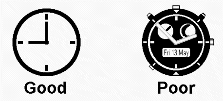
Fig.
40. Clutter in a pointer.
Too much feedback
If the window contains many different
modal areas and the pointer changes as the mouse
crosses each area, the pointer will seem to flash
when the user travels across the screen quickly.
Microsoft suggests adding a timer to the pointer
so that the shape changes only if the user pauses
for a set period of time (Microsoft 1995a, 394).
Warping the pointer: arguments for and against
"Warping the pointer" means automatically
changing the location of the pointer based on some
system action—for example, whenever the user opens
a new dialog box, putting the pointer on the dialog
box’s default button.
The Motif guidelines argue against this
behavior: "Warping the pointer is confusing to users,
and reduces their sense of control. Also, warping
the pointer can cause problems for users of absolute
location pointing devices (like graphics tablets).
Graphics tablets map pointer device locations to
absolute screen locations; so, if the pointer is
warped, the pointer loses synchronization with the
pointing device, making some screen locations impossible
to reach" (OSF 1993, 2-10).
Reducing users' control of their systems
is something to be avoided. On the other hand, having
the pointer jump into the current dialog box can
be a time-saver for users who prefer to avoid the
mouse (touch typists, for example). The key is to
ask your users which they prefer¾ let
them try warped and unwarped pointers and select
the interaction they like better. If the results
are mixed, let users turn the warping on and off.
Usability tests:
When you create pointers, make sure that
users recognize the shapes (for example, "pencil")
and uses ("drawing"). You can run paper
and pencil tests in the early design phases.
Make sure that the pointers stand out
from the backgrounds, don’t flash, and are sized
consistently, even when you change the shapes. Give
users navigational tasks and watch for problems and
difficulties.
If you warp the pointer, test user reactions.
See also:
Cursor; Iconic
Label (for help picking
the right image); Progress
Indicator (for situations
in which the user must wait).
Progress Indicator
Pointers and messages used to offer feedback
for ongoing processes.
Good for:
Indicating delays of more than five seconds
(Fig. 41).

Fig.
41. Typical wait pointers.
Showing progress toward a goal (Fig.
42).
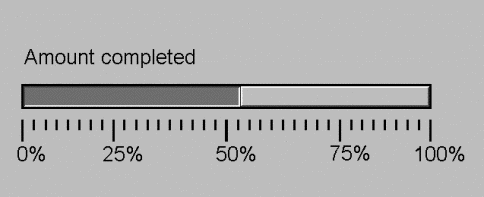
Fig.
42. Progress-indicator bar.
By adding a pushbutton, letting users
stop or pause the operation and regain control of
their systems.
Not good for:
Delays of less than five seconds. Use
system-busy pointers for delays of one to five seconds.
Design guidelines:
Research indicates that, while people
can adapt to working with slower response times,
they are generally dissatisfied with software response
times of more than two seconds (Schneiderman 1992,
288).
The reason is that humans can hold information
in short-term memory for no more than 10 to 15 seconds
at a time. As response time stretches beyond 10 to
15 seconds, remembering what you were trying to do
becomes increasingly difficult, possibly because
the set of steps in short-term memory has been disrupted
and must be reloaded (Galitz 1994, 432). .
However, acceptable response times differ
by the type of task:
-
Typing, cursor motion, or mouse selection:
50-150 milliseconds
-
Simple tasks such as scrolling or
browsing: less than 1 second
-
Data entry and data searches: 1-4
seconds
-
Complex tasks such as calculations,
saving documents or records, and logging on or
initialization: 8-30 seconds (Schneiderman 1992,
297; Galitz 1993, 50).
Whenever a process takes more than one
second, show a wait pointer (Fig. 41). Wait pointers
are good from one to five seconds. After five seconds,
however, users think that the system is hung and
will try to cancel the operation. If the process
normally takes more than five seconds, add an elapsed-time
message, a percent-complete message, or a progress-indicator
bar (Galitz 1994, 433-434).
Elapsed-Time Messages
When the user needs to know exactly how
long a process will take ("Do I have time for a cup
of coffee?"), add an elapsed-time message. For example:
Expected
backup time: 20:10 minutes
Elapsed time: 08:48 minutes
Or:
Time
remaining: 11 minutes
These messages can appear in the status
bar or in their own message dialog boxes.
Percent-complete messages
If other methods of showing
progress are too slow, too memory-intensive, or too
complicated for a particular application, use a simple
percent-complete message, updated every few seconds.
For example:
20%
complete
These messages can appear in the status
bar or in their own message dialog boxes.
Records-processed messages
An alternative to the percent-complete
message when the total number of records is unknown
is "number of records processed." In large
databases or high-volume network transactions, you
can’t calculate a percentage because you don’t know
how many records are in the set (not without wasting
a lot of time looking for end-of-file markers). But
you can at least provide an incremental frequency
count so that users know that the system is working.
Progress-indicator bar
A progress-indicator bar is a long rectangular
bar (horizontal or vertical) that starts out empty
but is filled as the operation proceeds (Fig. 42).
Using a color or shade of gray, fill
a horizontal bar from left to right. Fill a vertical
bar from bottom to top (like a thermometer or like
pouring water in a glass).
For readability, avoid putting text (other
than a percentage) inside the bar.
Status bar or dialog box?
Progress indicators usually appear in
their own message dialog boxes, but they can appear
in the status bar. To decide between the two locations,
consider how modal the process is. If it is running
in the background, it rarely takes much time, or
it is not very important, then use the status bar.
Printing in background, for example, can be effectively
tracked using the status bar.
If, on the other hand, the process requires
regular attention, uses many system resources, or
prevents users from accessing other parts of your
application, you probably want to use a dialog box.
Installation programs, for example, require dialog
boxes.
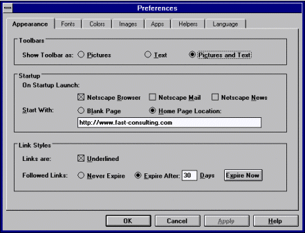
Titles
According to the Bellcore Design Guide
(1994, 5–9), the rules for a progress-indicator dialog-box
title are:
Common User Access |
parent window name - action or
situation |
Motif |
action or situation only |
Windows |
application name |
Interrupting a process
As a designer, one of the most polite
things you can do is to let users break out of a
time-consuming process:
-
To interrupt the process, use Pause
and Resume buttons.
-
To end the process and return the
window or data to its original state, use a Cancel
button.
-
To stop at the current point in the
process, but retain any changes that may have
been made so far, use a Stop button (Bellcore
1994,
5–139; Marcus 1995, 227).
When it really takes a long time
If an operation is very time-consuming,
try these suggestions:
-
Consider breaking the operation into
subtasks and providing progress indicators (plus
interruption pushbuttons, if possible) for each
subtask (Galitz 1997, 556).
-
Support multi-tasking: Do not block
access to other applications on the desktop and
try not to block access to other processes within
your own application. Note: If you allow
multi-tasking within your application, you might
want to indicate that a process is running in
background using your platform’s "background processing" pointer—for
example, an arrow pointer with a small hourglass
to the right (Microsoft 1995a, 30).
-
When you allow multi-tasking or background
operations, display a notification message when
the operation is finished.
Usability tests:
During high-fidelity prototyping or acceptance
testing, listen for comments indicating that the
participants think the system has hung (the progress
indicators appeared too slowly) or that nothing happened
(the progress indicators came and went too quickly).
The timings you chose for the appearance of the system-busy
pointer and the progress indicators may be wrong.
For very long operations, watch for "the
waiting dance"—users start tapping their fingers,
humming tunelessly, rolling the mouse back and forth.
Also listen for statements like, "Ah, the computer’s
back.... I don’t remember what I was doing." The
dance and the memory failure both indicate that the
wait was too long. Try breaking the process into
subtasks or allow multi-tasking.
See also:
Pointer; Status
Bar.
Pushbutton
A control that starts an action or opens
or closes a dialog box.
Good for:
Starting frequent or critical actions.
Pushbuttons show users what actions they can take
(Fig. 43).
.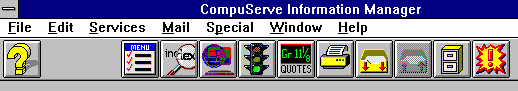
Fig.
43. A set of pushbuttons from the Compuserve
Information Manager toolbar.
Navigating between windows and dialog
boxes (Fig. 44 and Fig. 45).
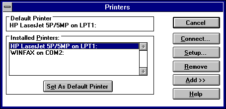
Fig.
44. Internal navigation: The buttons on the
right close this dialog box and open others
(except for Remove and for Add>>, which opens
an expanding panel).
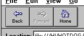
Fig.
45. External navigation: These Netscape pushbuttons
let users move from one Internet location to another— from one side of the world to the other, in some cases.
Not good for:
Design guidelines:
Pushbuttons are used for small numbers
of commands or actions. They are attached to a specific
dialog box or section of a window. When pushbuttons
are used on palettes and toolbars, they usually have
pictorial labels. See Iconic Label for more information
about these types of labels.
Labeling pushbuttons
In general, a word label should be either
a verb describing the action (Save) or a noun that
matches the title of the dialog box or window that
the pushbutton opens (Paragraph Format).
In The Cognitive Walkthrough Method,
Nielsen and Mack say that users often follow a "label-following" strategy.
They will select a button or menu option if the label
matches the description they have in mind for the
task (1994, 112).
For instance, a user who wants to print
a document is more likely to select a pushbutton
with the label "Print" or "Document" (or
a picture of a printer or document) than one with
the label "More" or "Output."
Keyboard shortcuts
Most of the platform guidelines suggest
adding mnemonics to pushbuttons. See Keyboard Shortcuts:
Mnemonic and Accelerator for details.
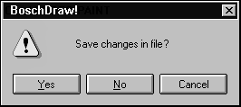
Fig. 46. Mnemonics on
pushbuttons.
However, do not add a mnemonic to OK
or Cancel. OK always uses Enter and Cancel always
uses Esc for their keyboard shortcuts.
Also make sure that users can navigate
between buttons with tabs, especially in intensive
data-entry applications. Data-entry operators are
generally touch-typists who prefer the keyboard to
the mouse.
Action indicators
When a pushbutton starts an action, use
no punctuation or special characters:
Act up
When a pushbutton opens a dialog box
that requires user input, use an ellipsis after the
button name:
Open …
To indicate that the dialog box expands,
label the pushbutton with two right angle-brackets
on the right side of the word:
Expand >>
To indicate that the dialog box contracts,
label the pushbutton with two left angle-brackets
on the left:
<< Contract
See Dialog Box, Expanding, for more information
about expanding dialog boxes.
Default pushbutton
Choose one pushbutton on the dialog box
or window as the default—if the user presses Enter,
that pushbutton is invoked. Make the most important
or common action the default. For example, Print
would be the natural default on a Print dialog box
(Weinschenk, Jamar, and Yeo 1997, 192-193). Do not
use a potentially destructive option (Delete, for
example) as a default, even if it is the most common
or important action, unless you test it very
carefully with users.
Indicate the default pushbutton using
your platform’s guidelines. For example, the Windows
95 guidelines require a bold outline (Fig. 47) around
the button (Microsoft 1995, 184). After the pushbutton
has been pressed once, Microsoft also adds a broken-line
border inside the box.
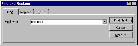
Fig.
47. "Find Next" is the default button in this
dialog box.
Changing the default
You can change the default button as
the user interacts with the window. If the user picks
a button that isn’t the default, this button can
become the default until the user selects another
pushbutton or until she selects an entry field, a
radio button, or other component, at which point
the default returns to the original pushbutton.
No default pushbutton
Some applications or sections of applications
use Enter for other purposes. If the entire window
uses Enter for other purposes—for example, a form-based
data-entry application in which users move between
fields using Enter—then do not define a default button.
If part of the window uses Enter for other purposes—multiline
text fields, for example—then temporarily remove
the default outline from the pushbutton. Once the
user has moved out of the component, you can restore
the default aspect to the button (Microsoft 1995,
184).
Capitalization
The Windows 3.1 style guide calls for
headline-style capitalization for labels of more
than one word. The Windows 95 and OS/2 guidelines
call for sentence-style capitalization for labels.
Note that, for menus, pushbuttons, and tabs, Windows
95 requires headline-style capitalization (Microsoft
1995, 387-388). See Label for more information.
Sizing pushbuttons
In general, use the same size for every
pushbutton in a related group of pushbuttons. For
example, if the button labels are OK,
Cancel, and Find
Flights…, make all three pushbuttons
as wide as Find
Fonts….
If there are many buttons and their sizes
vary dramatically—for example, OK,
Set, Fly vs. Cancel,
Find Flights…, and Register
Flights…—create two sizes. This
strategy gives you approximately the right size for
all buttons without creating too many sizes, which
tends to be distracting (Weinschenk, Jamar, and Yeo
1997, 184-185).
Internationalization and pushbutton sizes
If you are going to internationalize
your application (or even if you think it might change
often for some reason), put the labels in resources
files. Let the buttons resize themselves dynamically—labels
will expand by 30 to 200 percent when translated
from English into nearly any other natural language.
See Label for more information.
When you can, create or use buttons that
resize themselves dynamically. For buttons that cannot
be resized automatically, keep their dimension data
in a separate resource file. Then the dimensions
can be modified as needed without forcing you to
recompile the program (VanDevender 1993, 5).
Watch the vertical letter size
Another potential pitfall is vertical
letter size (Fig. 48). In many languages, the accents
on uppercase letters rise above than the usual ascender
line and descenders fall below the usual descender
line. Make sure that you leave enough vertical room
to accommodate non-Roman lettering systems (Apple
Computer 1992, 24).
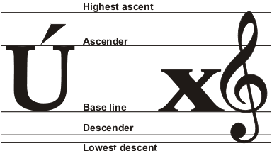
Fig.
48. Vertical font boundaries.
Positioning pushbuttons
The rules for locating pushbuttons and
other controls are:
-
Pushbuttons that affect only part
of the dialog box should be located inside that
part, at the bottom or right side (in countries
where text is read from left to right).
-
Put pushbuttons that affect the entire
dialog box (OK, Cancel) at the bottom or right
side of the dialog box.
-
Whenever possible, place buttons in
this order: affirmative buttons used to save any
changes and leave the dialog box (OK); negative
buttons to cancel changes and leave the window
(Cancel); buttons unique to that window (Weinschenk
and Yao 1995, 11). For a set of horizontal buttons,
OK is at the left and the unique buttons are at
the right. For a set of vertical buttons, OK is
at the top and the unique buttons are at the bottom.
-
Whether the pushbuttons appear at
the bottom or the right depends on the flow of
movement through the dialog box. For example,
if users will move horizontally through entry
areas,
put the buttons to the right. If they will move
vertically, but the buttons on the bottom. See
Fig. 49 and Fig. 50. Or, alternatively, just
pick one scheme—at the right or at the bottom—and
stick with it for every dialog box in the application.
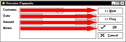
Fig.
49. When the general movement is horizontal,
put the pushbuttons to the right.
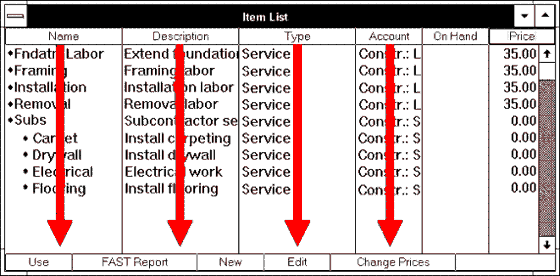
Fig.
50. When the general movement is vertical,
put the pushbuttons at the top or bottom.
Alignment
If you have a set of vertically arranged
pushbuttons, left-align them (make sure they’re all
the same width). See Fig. 49.
For horizontally arranged pushbuttons,
the various platforms have different alignment rules:
What if you develop for more than one
platform? Here Bogo Vatovec’s approach (1997):
Our application is being developed for
Motif and Windows 95/NT environments. Both style
guides are very different so it is really difficult
to follow both. We took the King Solomon’s approach
by agreeing that a GUI running in Motif must not
break explicit Motif guidelines. If it doesn’t, we
choose between NT and Motif, using the ones that
are better. Therefore, we do not break any explicit
rules but still try to find the best of both. In
cases when we really disagree with an explicit rule,
we vote. In general, we are more inclined to follow
Windows 95 guidelines as there are more and more
users using Windows 95 and Motif is slowly becoming
old.
Rules for grouping
Galitz suggests grouping pushbuttons
as follows (1997 331-332):
-
Order pushbuttons logically—for example,
by frequency of use, sequence of use, or importance.
-
Keep related buttons grouped together.
However, to avoid activating potentially destructive
buttons by mistake, separate them from frequently
selected buttons. (Mouse slips are fairly common.)
-
Always put the same buttons that
appear on different windows in the same locations.
For
example, don’t put OK and Search in that order
on one dialog box, then Search and OK on another.
-
For mutually exclusive options, do
not use one pushbutton with a label that toggles.
Instead, use two pushbuttons with labels clearly
describing the two actions. (See Check Box for
a discussion of this problem.)
What if your platform is the Internet
and your buttons represent different hierarchical
levels? Here is one solution:
The standard we've adopted is that the
buttons are arranged in order of application hierarchy.
Therefore, the button on the far left represents "Home" or
the highest level back and the button on the far
right represents the next level down. (Left side
equals going backward and right side equals going
forward.) (Ruby 1997)
Number pads
Note that there are two types of number
pads: telephone and calculator. Telephone pads have
1, 2, and 3 at the top and 0 at the bottom. Calculator
pads have 7, 8, and 9 at the top and 0 at the bottom.
Occasionally you see an application in
which the developer picked the wrong order (and no
one noticed the error, so it went out to customers
that way). Don’t let this happen to you!
Positioning in tabbed dialog boxes
Usability experts have noticed that users
are often unclear about when changes to settings
in a tabbed dialog box take effect (Robinson 1996,
1). For example:
-
Do the changes take effect when you
move from tab to tab, when you click OK, the next
time you start the program, when you click Apply,
or when you close the tabbed dialog box?
-
If you take some action on particular
page, such as adding a group of users to a network,
are the new users saved when you click the Add
button or are they saved when you click OK?
Use a consistent method for saving changes
to the settings in all tabbed dialog boxs in a product.
Avoid doing an auto-save in one tab dialog (changes
in one tab are saved when you click on another tab)
and manual save (clicking on the OK button) in others.
Also, researchers find that users are
most satisfied with explicit information about effects.
For example, adding an explicit Apply Settings button
means that users no longer have to guess that clicking
OK or switching tabs applies their changes. Although
the Apply button might add an extra interaction,
it eliminates unnecessary cognition. The idea, as
ever, is to let users think about their tasks,
not yours.
Saving the page versus the dialog box
Fig.
51. The pushbuttons are placed outside the
tabs to indicate that they affect the entire dialog
box.
Another source of confusion is what OK,
Cancel, or Apply actually affect—the entire dialog
box or just the current page? Make effects obvious
by positioning your pushbuttons inside or outside
the page as needed:
-
Place pushbuttons that affect all
the pages outside the margins of the tab page (Fig.
51).
-
Place pushbuttons that affect only
the page inside the page margins (Wilson, 1997a).
Indicating unavailability
To indicate that a pushbutton is unavailable,
the platform guidelines say to gray out the label
and make sure that the button is unresponsive to
user input except for a help request. Help
should always be available.
However, note that usability expert Jared
Spool says that users hate grayed-out buttons and
menu items because they never know how to ungray
them. He also offers a solution—anticipate and solve
the problem for the user. Don’t leave it to the user
to figure out what he or she is supposed to do.
In some recent testing, we found that
users often tried to click on buttons before they
selected the objects those buttons were supposed
to help with. We found that by changing the greyed
out button to an error message, our users succeeded
more often.
But in most cases, we could go a step
further. We could eliminate an error message by replacing
it with a dialog box. Here's an example:
Suppose you have a collection of data
elements and a Print Description button. Normally,
the button would be grayed out until one or more
elements were selected. In our first change, we never
grayed out the button. Instead, upon pressing the
button with nothing selected, the user would get
a message explaining that they need to select something
first.
However, in our second change, we displayed
a list box filled with the relevant data elements
and a prompt to choose the ones they wanted to print.
This way, whether they select the elements first
or not, the function still works.
We've found this strategy to work frequently.
(It ends the old object-action vs. action-object
debate.) Users tell us the software seems more intuitive.
(Spool 1997)
Be consistent
Consistency is, unfortunately, not as
easy to come by as one might hope. It can mean:
-
Using common buttons the same way
everyone else does
-
Matching the user’s idea about how
GUIs, in general, work
-
Matching the user’s conceptual model
of the business task
-
Using the same button for the same
function and different buttons for different functions
across all parts of the application.
The difficulty is that these definitions
can cancel each other out. Following are discussions
of each definition.
Follow industry standards
Table 4 shows the industry consensus
on a few of the most common buttons. See the Bellcore
Design Guide for Multiplatform Graphical User Interfaces (1994,
5-138–5-141) for additional buttons.
Table
4. Industry Consensus on Common Buttons |
Button |
Usage |
Wrong
Usage |
Apply |
Make changes but leave the window
or dialog box open.
The Apply button lets a user see
the effect of a choice and undo it or add to
it if desired. |
Do not also close the dialog box.
Use OK instead.
Do not use as a synonym for Save.
Apply is associated with software settings,
while Save is associated with the more serious
matter of saving actual work. |
Cancel |
Cancel any unapplied user settings
and close the dialog box.
In message boxes with Yes, No,
Cancel responses, Cancel should stop the current
activity and return to the immediate past state
of the software. |
Do not use:
- To close dialog boxes in which
the user made no changes or could not have
made changes (for example, a view-only dialog
box). Use Close instead.
- As a synonym for Quit (or Quit
as a synonym for Cancel), since Quit or Exit
mean "Leave the application."
- To cancel multiple levels of
dialog boxes. The user may forget the changes
she made in lower levels and cancel them
all, mistakenly believing that she is canceling
only her most recent changes. Do usability
testing to find a better way to apply and
cancel hidden settings.
|
Close |
Close a dialog box when the user:
- has applied changes with an
Apply button and now wants to leave the dialog
box
- has made no changes
- can’t make changes (the dialog
box is view-only).
|
Do not use to cancel unapplied
changes. Use Cancel instead. |
OK |
Confirm a user’s setting and close
the dialog box. |
Do not use for:
- Operations that cancel user
settings. OK must apply the changes.
- Operations that accept the user
settings but don’t close the dialog box.
Use Apply instead.
|
Just to prove that developers often ignore
or don’t know that there is a consensus, Fig. 52,
Fig. 53, and Fig. 54 show some examples of button
mistakes.
Fig.
52. This Apply button in Microsoft Word applies the changes but also closes
the window.
ig.
53. This OK button in Netscape 2.0 saves changes
to the preferences in memory, but not on disk.
In most applications, settings are saved automatically,
without even confirmation
messages.
Netscape, however, required that users explicitly save their preferences on
a drop-down menu.
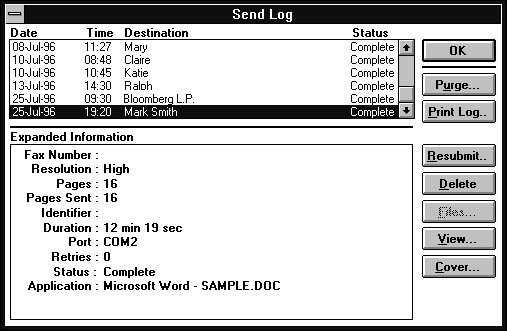
Fig.
54. This OK button from WinFax LITE 3.0 doesn’t
save anything (there is nothing to save). It simply
closes the window. The frightening Purge button
appears where the relatively harmless Close or
Cancel normally appears.
Match the user’s idea about how GUIs work
These scenarios demonstrate three kinds
of mismatches between developers’ and users’ ideas
about how GUIs work:
The user doesn’t see it. The user
opens a properties dialog box with three standard
buttons—Apply, Cancel, and Help. She makes a change
and applies it with Apply. The Cancel button’s label
changes to Close. She doesn’t notice that the label
has changed, but even if she had, she doesn’t know
that Cancel means that she can now reverse the setting
only by redoing the selection and pressing Apply
again.
The user doesn’t know which button
to pick. A print-parameters dialog box contains
OK, Apply, and Close buttons. The user makes a
selection, then pauses. He doesn’t know that OK
is Apply+Close and that either OK or Apply will
save his selection.
The user doesn’t know what Cancel
will cancel. The user opens a font-selection
dialog box containing Apply, OK, and Cancel. She
selects a typeface and presses Apply. Then she
selects italic. She pauses. She doesn’t want italic
after all, but will Cancel cancel both changes
or only the change made after the Apply but before
the Cancel?
The developers who write the underlying
code know what is going to happen when the users
press one of these buttons. However, the users don’t.
They also aren’t interested in the rules, even the
ones just promulgated here. They just want to do
their jobs and not think about the software.
To avoid any confusion, usability experts
suggest that you be very explicit. Instead
of OK, use "[action] & Close"—for example, "Set & Close."
Table 5 presents some other pushbuttons
that users don’t know how to use, plus summaries
of suggestions from usability experts.
Table
5. Not-Yet-Standard Pushbuttons |
Button |
Usage |
Design
Notes |
Reset,
Defaults |
There are two possible definitions:
- Cancel any changes to the dialog
box that have not been applied in this session
and restore the settings to their last saved
state.
- Cancel all changes since the
software was installed and return to the
factory settings.
Do careful usability testing to
find out which is more appropriate for your
users and your application. |
Depending on which definition you
choose, make sure that you use Reset the same
way throughout your application. |
VCR
Navigation Buttons 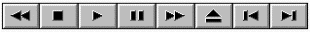 |
Do not use for:
- Book-oriented applications.
Use a page-turning model instead.
- Scrolling through lists and
files. Use scroll bars or slide bars instead.
Note: Unless your customers are
videophiles or audiophiles, restrict your use
of VCR-style buttons to the most common ones—stop
(■),
play (►),
fast forward (►►) and
rewind (◄◄). |
| |
Use to:
- Move through video or audio
segments.
- Move from scene to scene through
multimedia and CD-ROM applications.
|
Undo,
Redo |
Use to reverse changes to data
(deletions, drag and drops, etc.).
Whenever possible, make multiple
levels of undo (and redo) available. "The
biggest problem I’ve seen with undo is that
users don’t always notice problems right away,
or if they do, they may attempt to correct
the problem themselves before trying undo.
With a single level of undo, they’re out of
luck" (Snyder 1996).
Undo is valuable because it lets
users explore safely. Safe exploration leads
to higher levels of user satisfaction as well
as expertise. |
Undo may not be necessary for changes
to operational modes. For example, changing
from normal font to italic font probably doesn’t
require an undo.
On the other hand, users may have
trouble guessing which activities can be undone
(what the rules are). Letting them undo any
type of change is much easier to understand. |
Match the user’s conceptual model
Some pushbutton labels will be obvious.
Others will depend on detailed audience analysis
and usability testing. For example, on one of the
usability news lists, a writer commented that using
the standard Commit and Close might be misunderstood
by the stated audience, currency traders:
I have sympathy for the consistency appeal
but would also suggest that the best practice is
to use meaningful terms, especially where the user
community is fairly narrow. For your users, the action
following completion of the form may be to commit
the contract (and hence their company) to a legally
binding securities trade, the consequences of which
run into large amounts of money. In this situation,
I suspect the case for the more common application
of consistency standards demanding Close or Cancel
might be outweighed by
a) the need to preserve high awareness
of the consequences of selecting the buttons
b) the specific task-related meaning
associated with the terms (e.g., Close might mean
closing a position—exercising the option—and Cancel
might mean issuing a cancelling instruction to the
exchange).
You should probably stick to what you
have used or perhaps even go further and say "Commit
trade," etc. (Choudhury 1996)
Use the same buttons for the same functions
The meta-rule: Use the same labels for
the same function across all parts of your application
and different buttons for different functions. However,
what if you have two functions that are similar but
not exactly alike? Should you differentiate the two
options or lump them together under the same label?
To answer these questions, you need to
look at the task. For example, an application had
a "Go" option on one window and a "Run" option
on another. In application terms, "Go" meant "go
to the mainframe and retrieve the record I asked
you for." "Run" meant "run this
calculation." However, as far as the users were
concerned, "go" and "run" meant
the same thing—"wait for some information to
come back from somewhere over the network." Having
two different labels for the same operation (in the
users’ minds) was confusing.
On the other hand, sometimes the difference
is important, as Janet Borggren (1995) explained
in an online thread about "save" vs. "commit":
The type of saving must be related to
the type of work being performed. If you get this
right, it appears so natural that you don’t have
to think about it.
For example, you may not have noticed
that Windows supports both implicit and explicit
saves. Word and Excel make you save explicitly, which
gives you the power to decide when you have a draft
worth saving. It’s great to be able to say, ‘This
is a workable schedule, I’ll save it now and then
continue to work on it to see if I can make it better.
If not, I’ll go back to my first draft.’
However, File Manager doesn’t make you
click Save after you move a file—the action takes
place immediately. This is perfect because my logical
unit of work corresponds to one action (moving a
file), not a series of actions (creating a schedule,
which involves many actions). Think how much you
would hate it if you had a Commit button in File
Manager or automatic saving in Word.
To summarize, when two processes have
a significant business difference, you may
need different labels. If two processes have a technical difference
but only a small business difference, consider using
the same label.
Usability tests:
Use "matching" tests: Create
two columns, one with labels, the other with descriptions
of actions, and ask users to match the labels to
the descriptions. Change the labels until most users
match most of the test items correctly (define "most" during
your test plan).
On prototypes, ask the users to do or
find an item and see whether they pick the right
button. For unsuccessful choices, ask them what label
they would use. Change the labels between tests until
most users pick the right button.
See also:
Radio Buttons, Check
Boxes.
|