|
You are here: Home ~ Desktop UIs ~ Online H elp elp
Online Help, Context-Sensitive
Help that appears automatically when
the user presses F1, Shift-F1, or clicks a help icon.
The user doesn’t have to go to the help menu. (Reference
help, on the other hand, usually does require loading
from a menu.)
According to the Microsoft Windows 95
specifications, context-sensitive help is "What’s
This?" help. What’s This? help is actually expanded
tooltips (a good idea, according to some usability
experts—see Tooltip). In fact, tooltips and What’s
This? help are functionally interchangeable.
In other environments, context-sensitive
help is simply help for individual screen components.
Good for:
Finding out what a screen component is
or does (Fig. 25).
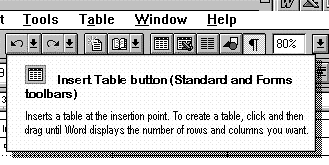
Fig.
25. "What’s This?" help.
Checking the field-edit rules or finding
out what the acceptable entries are (Fig. 26).
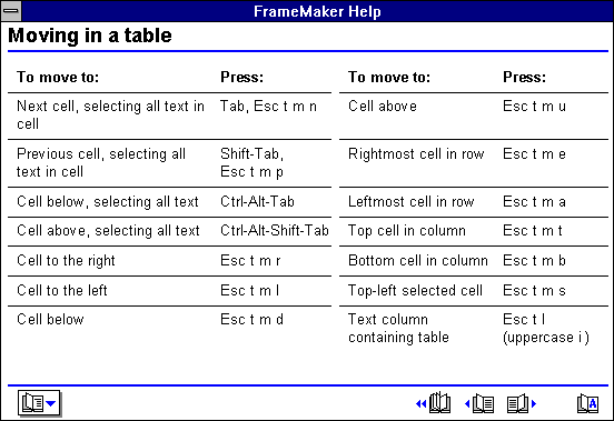
Fig.
26. Quick reference box from Framemaker 3.0.
Not good for:
How-to and procedural information. Use
procedural help instead.
Background and overview information.
Use reference-style help or printed documentation
instead.
Design guidelines:
Problems with context-sensitive help
Don’t rely too heavily on context-sensitive
help. It has these limitations:
-
Neither tooltips nor What’s This?
help (so far) let users link to online help windows
if they need more information. And they are likely
to need to: Usability experts say that most users
want to know "How do I do this?" rather
than "What is this?" Of course, you can
write whatever you want in What’s This? panels—for
example, you can explain how to do something
instead of just saying what the component is.
-
If your specification calls for context-sensitive
help only (every screen component must have
its own context-sensitive help panel), where do
you put the overviews? How do you tell users how
to do operations that cross window boundaries?
How can you do any task-oriented or goal-oriented
help? You can’t, at least not without a kludge—for
example, deciding that the parent window’s context-sensitive
help will be a task overview.
-
Most readers will not be able to
imagine a context-only help system, but they
do exist.
If someone in your organization starts to argue
for context-only help, remind them that users
need at least three types of information—descriptive,
procedural, and background—and will be unhappy
if you give them only one.
-
Some items don’t need any help. If
your OK and Cancel buttons behave consistently,
for example, a user doesn’t need to know much
about them. Writing about self-evident components
gets
silly.
When do you need it?
You probably need context-sensitive help
less often than you might think. First of all, most
help is procedural, and secondly, mass-market applications
usually don’t have to worry about field edits and
business rules. (Tax and accounting software are
exceptions.)
If you have a database application, you
probably do need context-sensitive help for the fields.
Nevertheless, think about using more descriptive
labels or automatic (but unobtrusive) tooltip or
status-bar messages instead of help. Even the best
online help is hidden, whereas labels, tooltips,
and status-bar messages are either visible or readily
made visible. Also, using combo boxes or drop-down
lists for as many entry areas as possible helps users
avoid errors and precludes the necessity for help.
For applications with extensive business
rules and data-entry requirements—for example, real-estate
or insurance contracts—consider using artificial-intelligence
techniques rather than help. In other words, if the
person entering the information picks one type of
contract, the system fills in most of the boilerplate
automatically and carefully checks the variable information.
You’d still include a help system, but it would explain
the underlying business rules.
Accessing context-sensitive help

Fig. 27. The What's This
Help icon in the Windows environment.
On Windows systems, pressing F1 usually
opens the help system at the contents page and Shift-F1
opens context-sensitive help. The Help icon usually
behaves the same as Shift-F1. On Windows 95 systems,
both Shift-F1 and the Help icon open What’s This?
help.
Many users don’t use or don’t notice
the Help icon and many don’t know that Shift-F1 is
supposed to bring up context-sensitive help. In fact,
they often go straight to the help menu and select
the Search option. However, this is a reasonable
strategy since many systems don’t have extensive
or consistent component-level help—when the user
asks for component-level help, she often gets higher-level
help anyway.
Note that you can’t count on training
or marketing materials to let users know help is
available. In a system the authors worked on, more
than 1,000 panels of context-sensitive online help
were accessible with a right-mouse-key click. Two
years into the project, we discovered that most of
the company’s employees didn’t know there was context-sensitive
help. Although we believed that end-users knew about
it, none of us was sure that they did.
Usability tests:
Mechanical issues
See if the test participants try to use
the context-sensitive help. If they do, determine
first whether the interface, rather than the help,
needs to be fixed.
Also see how users access help—do they
press F1 or Shift-F1, access the Help menu, press
the help icon, or none of the above? If they don’t
know they can get context-sensitive help, you might
want to add instructions to your training classes
and "Getting Started" manuals.
Do users get what they expect? For example,
if a user presses Shift-F1 in a dialog box, is she
looking for help on the box or on a component in
the box? Is she puzzled if she gets help sometimes
on the box and sometimes on a component? If inconsistency
seems to be a problem, you might want to develop
rules about which child components get their own
help panels, and then retest on users.
Business issues
Use a talk-aloud protocol to find out
what domain or business-rule questions the test participants
have about the application. Include the identified
topics in the online help.
Also find out what task information the
user needs. Tasks with more than one step or that
require more context should go into procedural help,
but short tasks (for example, "To check a word,
highlight it and press the spell-checker button")
can stay in the context-sensitive help.
See also:
Online Help, Procedural; Online Help, Reference; Status Bar; Tooltips.
For information about hypertext, see Online Help, Reference

Online Help, Procedural
Any help that contains procedures and
how-to information (the second part of the help triumvirate
of description, procedure, and background).
Good for:
Quickly learning a procedure.
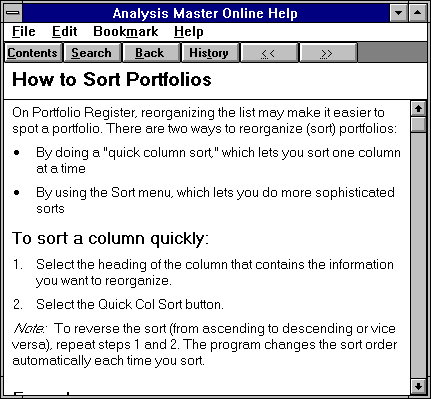
Fig.
28. This help window explains how to sort a
list.
Not good for:
-
Naming or describing screen components.
Use context-sensitive help, tooltips, and status-bar
descriptions instead.
-
Background and overview information.
Use reference-style help or printed documentation
instead.
Design guidelines:
There are two styles of procedural help,
active (Fig. 29) and passive (Fig. 28).
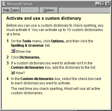
Fig.
29. This active help window shows you how the
procedure is done.
Note the "Show me" button.
This button probably saves at least a page of text.
Usability experts and technical communicators
have found that active help is far more effective
(and more interesting to create) than passive help.
The Windows 95 development platform comes with tools
that make developing active help relatively easy.
See Boggan, Farkas, and Welinske, Developing online
help for Windows 95, for details (1996).
Making exploration safe
John Carroll (1992), Carl Zetie (1995)
and other experts on documentation point out that
human beings learn by exploration. A successful interface
allows safe exploration through feedback, affordances,
and error recovery.
Good screen design shows users the main
path. Good help catches explorers before they fall
over cliffs and puts them back on track.
You will know that you have succeeded
if a significant number of novice users become experts—it
means that your interface made it easy and safe to
explore.
What procedural help looks like
In Windows 3.x, procedural help often
appears as "cue cards"—pop-ups that appear
automatically when the user accesses a dialog box
or other task-oriented component. It also appears
in standard help windows.
In Windows 95, procedural help often
appears in secondary help windows. These windows
are smaller (often because they replace text with "Show
me," "How?" and other interactive
buttons), and contain highly structured text. (See "How
to Write a Procedure" below).
In other environments, procedural help
is differentiated from reference topics not by window
type but by title ("How To" or "Example")
and by having numbered steps.
Size of help panels
Procedural help panels should contain
only as much information as fits on an index card.
If the user has to scroll or page down, the help
topic is too big.
This may seem severe, if not impossible.
However, development companies have found that if
a procedure is hard to document, it is probably too
complicated and should be re-engineered.
Also, users generally read only as much
as they need to find out how to do the next step
(User Interface Engineering 1996, 6). The implications:
How to write procedures
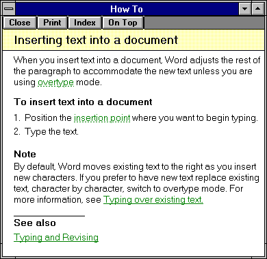
Fig.
30. Task-oriented help from Microsoft Word.
Title, introduction, step number, action,
and feedback are required. Also helpful are examples,
warnings, and notes. Table 3 provides descriptions
of each part, in the order in which they should appear.
Table
3. Parts of a Procedure |
Title |
"How To" is always a good start
for task-oriented help (Fig. 30). Note: The
Windows 95 guidelines suggest "To [do
whatever]" as the procedure’s title and introduction. |
Introduction |
Provide easily scannable one-line
introductions or headings. Users read the instructions
faster and make fewer mistakes if you describe
the goal or endpoint. For example:
To
process a work order:
|
Warnings |
Put warnings and cautions before the
step. Note: If the program or equipment
could be redesigned so that the warning is
no longer needed, you should change it.
Always check with your legal department
about requirements for warnings. |
Step
numbers |
Number steps if there are more
than one. Don't number a one-step operation.
Use 5 to 7 steps (or less) per
procedure. |
Action |
One action per step. "One
action" is what the user would define as a
complete action, and this varies with experience.
For example, a novice user might see "Type
your login name and press [Return]" as two
actions. An experienced user would see it as
a single action.
Start the step either with an imperative
verb (Press
F1) or with a trigger word
such as To, If, or When:
To
start the motor, turn the key.
If
you want to save the file, select Save.
If you want to quit without saving, select Cancel.
|
Feedback,
Error Recovery |
Include feedback statements:
5.
Select OK. You're returned to the main menu.
The feedback ("You're returned
to the main menu") helps the reader orient
herself in the operation and acts as error
recovery information. |
Examples |
Use examples and counter-examples.
Example:
Ms.
Marks has been a customer for 8 years and has
had one warning notice in that time. Her payment
history is good.
Counter-example:
Mr.
Jones has been a customer for 1 year and has
had two warning notices. His payment history
is not good.
|
Notes
and tips |
A note can either be embedded in
the step or fall below it. Notes contain "nice
to know" information. |
Coaches and cue cards
Scott Boggan and his co-authors describe "coach
help" as sequences of help topics that walk
users through the steps that make up a task (Boggan,
Farkas, Welinske 1996, 97). Users work with the application’s
regular interface (as opposed to wizards, which provide
a simplified interface—see Wizard). Also, coaches,
unlike tutorials, are a productivity tool—instead
of working on canned examples as they would in a
tutorial, users work on their own tasks (Boggan,
Farkas, Welinske 1996, 100).
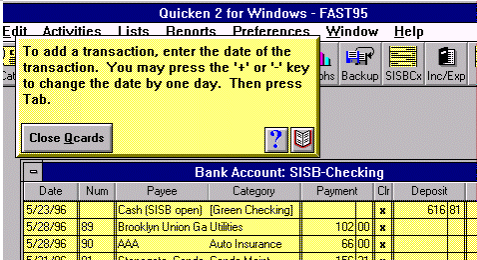
Fig.
31. A cue card (called "QCard") from
Quicken 2 for Windows.
The helpfulness of coaches depends on
how well their authors have identified their users’ goals.
User Interface Engineering tested coaches, done as
cue cards (Fig. 31), in four different programs and
found that there was often a mismatch between what
users needed and what the cue cards gave them. For
example, one application told users how to open a
file, but the users never read it because they already
knew how to open files. Another cue card told users
how to import a file, but missed the obvious (in
retrospect) next step: how to view the imported records
(User Interface Engineering 1996, 6). Mismatches
like these can be resolved with early usability testing
of interface and help prototypes.
Note: Make sure that users can turn off
automatic cue cards. Novice users often feel put-upon;
experienced users find them irrelevant and interfering.
Usability tests:
Use a talk-aloud protocol to find out
what task-oriented questions the test participants
have about the application. Include the identified
topics in the online help.
Also see Appendix A, "Usability
Tests," in this book; Managing Your Documentation
Projects (Hackos 1994, chapter 20); and Human
Factors for Technical Communicators (Coe 1996)
for types of usability tests appropriate for online
help.
See also:
Online Help,
Context-Sensitive; Online
Help, Reference (especially for information about hypertext).
Online Help, Reference
Any help that contains background or "nice
to know" information (the third part of the
help triumvirate of description, procedure, and background).
Reference help is often the paper documentation or
actual reference books in electronic form.
Good for:
Finding out what is going on behind the
scenes (Fig. 32). Learning more about the business
context.
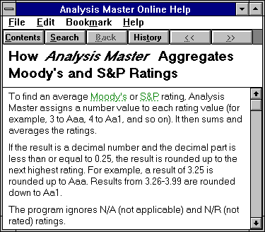
Fig.
32. Reference help explains what’s happening
behind the scenes.
Accessing technical information quickly.
Examples:
Not good for:
Procedural or context-sensitive information.
Design guidelines:
Reference help should be used only as
a backup for printed documentation. Users generally
don’t like to read long sections of text online.
However, having the reference text online has two
advantages:
-
Users can often search the entire
text for answers to questions rather than be
forced to depend on the paper document’s index
(although a professionally done index can be
an extremely
valuable tool).
-
The online book is always handy,
whereas a printed book may stray from the user’s
shelf (although online books may disappear from
disk
drives and networks).
Just make sure that users can print out
desired sections of online manuals—text is often
studied on commuter transportation and in other venues.
Rule of thumb
Put online what is done online, put on
paper what is done off-line (away from the computer).
For example, setting up a computer or
installing a piece of software is definitely an off-line
project. Until the computer or software is set up,
the user can’t access any online instructions. (A
possibly apochryphal story says that Apple Computer
once started their online setup instructions with, "Remove
the computer from the packing box....")
But detailed domain information probably
also falls into the off-line category. The concepts
behind certain types of accounting practices or new
structured programming techniques, for example, are
best studied off-line. However, online help can and
should state which of two formulas the program uses
for an accounting procedure. It can and should include
code samples that programmers can copy into their
own applications.
Technical communicators have developed
a variety of analysis and development techniques
for task-oriented online help, including chunking,
minimalist documents, and Information Mapping. Get
professional help.
How to write command-reference help
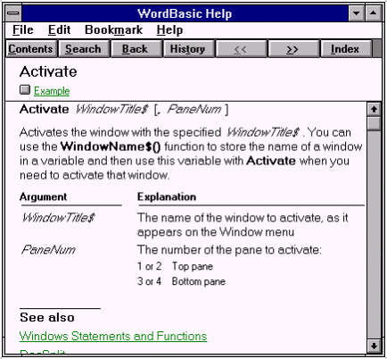
Fig. 33. Word
Basic help in an "API documentation" style
(from Microsoft Word for Windows 6).
In general, use the same format as the
development system or environment with which your
users are familiar. For example, if you’re documenting
an API for C++ programs, match the style of the printed
C++ documentation.
However, if there is no good model or
if you feel the model is insufficient, Developing
Online Help for Windows contains a useful section
on command topics (Boggan, Farkas, Welinske 1993,
56-61).
Hint: Include code samples that users
can copy into their own programs and adjust for their
own purposes.
Hypertext guidelines
Hypertext is good for jumping to another
piece of information (site, page, paragraph, etc.).
In help systems, hyperlinks are indicated with underlines
and sometimes also with a color change. Color is
good as a secondary signal, but keep in mind that
colored lettering has less contrast than black and
white lettering. For best visibility, the colored
words should be a larger point size or bolded. (Your
choices may be constrained by your help development
system, however.)
In Web browsers, text links are usually
indicated with underlines. Graphics can be used to
create hyperlink pushbuttons. However, the linking
methodology is the same—the graphic file’s name is
surrounded with a cross-reference instruction.
In either case, since underlines now
mean "link," don’t use underlines for anything but links.
If you use an underline for highlighting (instead
of italics, for example), users who try to select
it, unsuccessfully, will think the "link" is
broken.
Note that HTML (Web-based) help does
not, so far, support pop-up information, definitions,
or notes. Instead, links take users to a completely
new page, frame, or browser instance. Then he has
to get back somehow. As HTML help matures, pop-ups
will no doubt be added to the toolkits.
Usability tests:
See Appendix A in this book, as well
as Managing Your Documentation Projects (Hackos
1994, chapter 20) for types of usability tests appropriate
for online help. See also Human Factors for Technical
Communicators (Coe, 1996).
Hypertext testing
Test that users recognize the underline
and color change (if any) as indicating a hyperlink.
Test that users can find their way back
to their starting points. Hypertext systems such
as Web browsers or online help systems have navigation
buttons (Home, Back, History, and so on). See if
users use those buttons without prompting, and what
other strategies they devise to move through the
document (use a "talk aloud" protocol).
Test help strategies: In many help systems,
links can bring up either entirely different pages
or short definition boxes that stay up only as long
as the user continues to press the mouse button.
The link indicators may or may not look different.
Your technical writers can develop a layout strategy
that prevents surprises—for example, they may define
a rule that "any link in the body of the text
is a definition; any link in a See Also section jumps
to another topic."
See also:
Online Help, Context-Sensitive; Online Help, Procedural; Status Bar; Tooltips; Wizard
|