You are here: Home ~ Web UIs ~ Pattern: Too Many Graphic Elements to Show Them All
Pattern: Too Many Graphic Elements to Show Them All
This pattern was written to solve a telephony problem, but it can be adapted to any situation in which a visual is overwhelmed with datapoints. Please let us know about your "too many of these" problems and how you solved them (see the input form at the end), and we'll publish them here.
Problem:
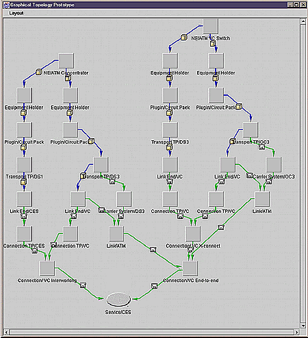
A screenshot of a network analysis topological view.
If your application displays graphics with an enormous number of elements, loading them all at once can cause many types of problems. How can users display a complex data-driven graphic without overwhelming their systems?
Context
Telecommunications and networking
applications use three types of network maps or views:
A geographic view, in which various entities (switches, trunk groups, T1 lines, etc.) are shown in their approximate geographical locations. Links between entities represent actual pieces of equipment such as circuits, trunk groups, or T1s.
A topological (or logical)
view, in which entities are shown in terms of their relationships to one
another (the relationships are usually contains,
includes, manages, and supports ). Links between entities represent relationships, not actual equipment.
A schematic (diagram), which is a graphical representation of a circuit layout record. It shows end-to-end connections and may be considered a subset of the topological view. There are no links of either kind in this view.
Small hand-built graphics cause no access problems, since they usually contain no more than a few dozen items. However, with autoload, database interface, and auto-discovery processes, the number of entities on a graphic may jump to thousands, even millions, per map.
Also, to accurately show certain equipment topologies, the system may have to handle enormous numbers of elements. In a telephony network graphic, for example, each port can have up to 64 thousand attached connection TPs (CTPs) and each of these can be attached to up to 64 thousand cross-connects.
Forces
Some graphics are necessarily very large and very complex.
Users expect to see all the information they asked to see, whether or not the request makes sense from a systems point of view.
Users don't want the graphics to be confusing, and too much detail often creates confusion.
No one will stand for systems crashing because retrieval takes too many resources.
In an interactive system, no one will wait minutes or hours for a picture to load.
When users first open a progressive-disclosure view, they see only the most important elements and relationships; the less important ones are hidden.
To see more, the users double-click the element or click an "open" indicator on it. When opened, the element shows more relationships and more elements, down to the bottom of the graphic or to some particular level. The number of levels opened at one time can be subject to rules--for example, "open down to the CTPs" or "open all to show the connections between two switches."
Advantages
This is a familiar telephony view of a network.
How contraction and expansion work should be fairly obvious, once the user tries them.
Disadvantages
This method does not necessarily solve the "too many" problem.
When you get to deep levels in an equipment view, you may still have too many items, and it doesn't matter whether you're looking at the list graphically or textually.
When users can click on an element, they might expect to see more information about the object ("open the object") rather than an expanded view of the network.
Unless there is a "find" option ("find this entity name wherever it is in the current graphic"), looking for a particular piece of equipment is likely to be very tedious. First you have to open this, then this, then this, and so on.
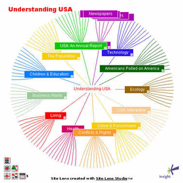
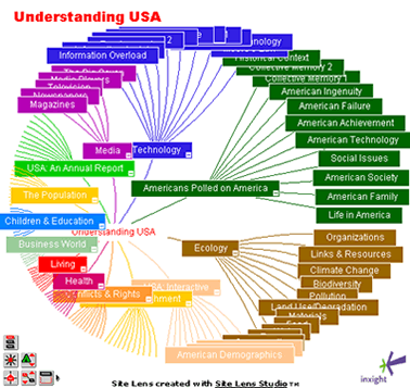
Use a fish-eye lens
A fish-eye lens magnifies whatever is under the pointer (see the Inxight StarTree demos on http://www.inxight.com/products/sdks/st/). As the user moves the pointer or clicks an item, the area under the pointer expands. The items that are out of focus are reduced or indicated only by the ends of branches. The selected item or part of the tree expands and the rest contracts. The tree itself adjusts to fit the available space.
The starting point: click on "Americans Polled on America"
The center moves left and the "Americans Polled" area expands.
Advantages
Users get an overall view of the structure.
The entire set of items is visible, no matter where you focus the lens. The lens doesn't obscure the rest of the information--the graphics that are out of focus get smaller but don't disappear.
Disadvantages
The lens is an unfamiliar look for some domains, but it might still be helpful.
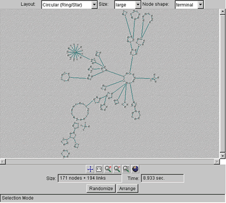
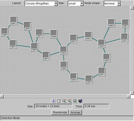
Have small, medium, and large options
Users can sometimes scope graphics by zooming in and out. The large version of a network shows the entire network; the small version shows a subset (these pictures are from an ILOG example--see http://www.ilog.com/products/jviews/graphlayout/layout.cfm). Users can use the drop-down to change the scale of the window.
Large version of a ring shows all of the network
Small version of a ring shows a subset of the entire network
Advantages
The small size provides an overview of the entire network.
The user can zoom at will from the overview to details.
Disadvantages
If the zoom levels are preset, the smallest size might not be small enough and the largest size might not be large enough.
When the graphic is small, the user may not be able to see enough detail to choose his or her area of interest.
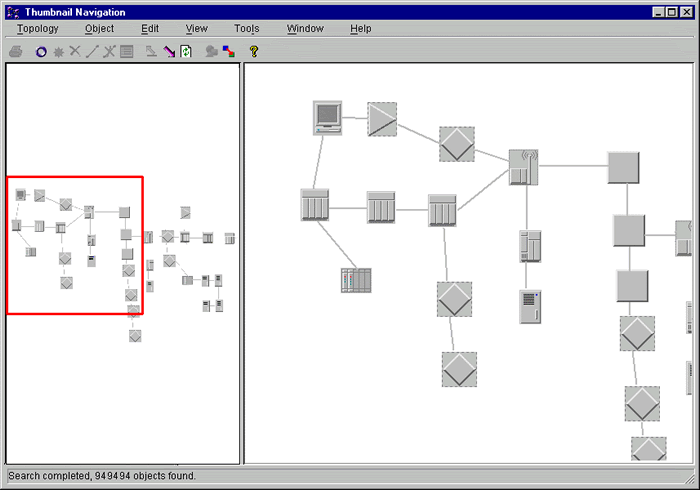
Use overviews
Provide an overview in a thumbnail or a navigation frame. A small version of the entire graphic or map appears in a window. The user finds the piece of the thumbnail she wanted to study, often by moving a rectangle in the thumbnail or navigation frame, then clicks to select. The selected section appears at the center of the larger view.
Overview in a thumbnail view
Users can move around on the map itself, and the rectangle in the thumbnail follows their movements, or they can hold and drag the rectangle to change the view in the main window (see http://www.ilog.com/products/jtgo/demos.cfm for more ILOG demos).
Navigation thumbnail at the top left copies and controls the map view
Overview in a floating window
In a navigation frame or panel, when the user moves the red rectangle over the thumbnail, the view changes in the main panel:
Navigation frame on the left provides the overview
Advantages
The thumbnail provides an overview of the entire graphic.
Navigation in a large graphic is quick and easy.
Disadvantages
The user may not be able to see enough detail to choose his or her area of interest.
The navigation panel may look too similar to a tool palette; if the window needs both a palette and a navigation panel, space might get tight.
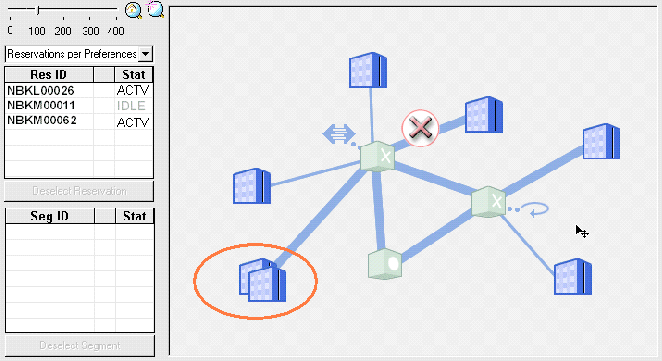
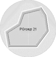
Use container icons
Container icons are useful in these circumstances:
If there is more than a set number of items connected to a single element. In this case, you can have the elements automatically contract into one super-element (the circled area in the picture below ).
If elements overlap or are so close to one another that they would be visually inseparable. In this case, you could define a rule that says, "if these network elements are in the same location, show me one `aggregate' icon; don't show me a mess of icons."
If there are just too many elements of a certain type. A rule might be "If there are more than 100 of entity X, show the aggregate icon here instead." Another: "Always aggregate this type of entity."
Multiple buildings are collapsed into one "superbuilding" image
The element can be set up to show the individual elements, a text list of elements, or nothing, when the user selects it.
Aggregated network icon from ILOG
Advantages
The containers reduce clutter.
The containers look significantly different from standard elements and thereby indicate that their contents are different (but not in what way).
Disadvantages
Unless there is a "find" option ("find this entity name wherever it is in the current graphic"), looking for a particular piece of hidden equipment is likely to be very tedious, perhaps impossible.
The user will probably want to be able to open the aggregate, either graphically or as a text list.
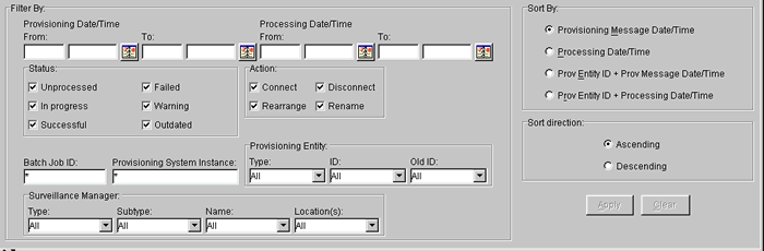
Start with a filter
You can require the user to fill out a filter and click Apply before the system tries to display any records. Although the picture below is an example of a complex embedded filter on a text window, the same method could be used on a graphic window.
Complex filter at the top of the window constrains the list to a manageable number of records
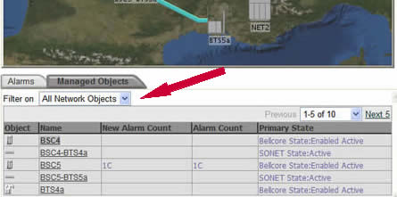
Simple drop-down filter on a map view
Advantages
It makes it easy to restrict the scope of what appears on the window.
The filter is right on the window. The user doesn't have to fill out a filter window first, then click Apply, then wait for the 'real' window to show up.
The filter can be hidden via the View menu or by dragging the sash up or down.
Disadvantages
It uses up space that should be dedicated to the "real" information (rather than to software apparatus). Although the filter can be hidden, the user may never discover that possibility.
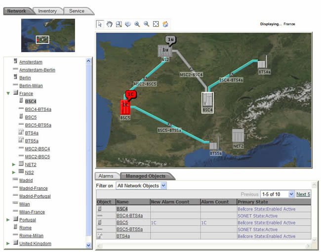
Scope the view based on user interest
Users working in different areas of the telephony workflow are likely to look for different information on the same topology graphic. For example:
Inventory technicians can see whether existing equipment is currently linked, unlinked, pending, in test, or alarmed.
Provisioning technicians can set up and track provisioning flows graphically.
Data collection technicians can see where the data are coming from and whether there are alarms on the equipment.
Performance and traffic engineers can see the current configurations and view the results of what-if scenarios.
Service assurance technicians can see the connections between and the effects of alarmed equipment on a particular service or network.
If the design teams collect actual needs through site visits and usability tests, they may be able to constrain views automatically to support the different tasks or queries, such as
Trace this problem.
Where are we in the provisioning process?
Where is this performance bottleneck occurring?
Find this entity.
Here are two possible scenarios:
Trigger
Action
Result
A new customer service is defined and provisioned.
The performance engineer wants to make sure that the topology is complete and opens the graphical topology browser.
The new service appears in Service view. The engineer asks for all unlinked entities. If there are none, the topology is probably complete.
An alarm comes in on a switch.
The technician thinks the alarm doesn't make sense from what she knows about the network. She opens the graphical topology browser.
The graphical topology appears in Equipment view, with the alarmed object centered on the window. Depending on local rules, only one or two levels may appear above and below it.
The technician clicks "Show Path" and the entire set of relationships between the alarmed object and the NE appears, highlighted. All unrelated elements are hidden.
Save views between sessions
If the system saves each user's choices between sessions, whatever difficulties he or she may have had scoping the view the first time should not reappear when he or she opens the window the second time.
Progressive disclosure and containers work together to hide too much detail, yet let users see the detail when they want to.
The examples shown in progressive disclosure are familiar telephony-style graphics and probably match the technician's conceptual model of a network. The only possible problem is that users might not recognize that elements have been hidden. It must be blindingly obvious that the graphic can be expanded.
When there are too many elements of the same type to show at once, contracting them into special container icons both reduces clutter and provides a visual indication that these elements can be exploded into their constituent parts.
Users need both overviews and details. The fish-eye lens provides both at the same time and the overview options let them see both overview and details at the same time. The option to switch between small and large (or to zoom in and out) is easy to program.
Scoping by a known and well-defined area of interest is always a good approach. In addition, saving views between sessions supports individual users' needs.
Hiding elements based on rules has to be handled carefully because the developer's and end-user's ideas of what the right scope is may not match. However, using rules can be very efficient and effective as long users can override the defaults.
Starting with a filter allows the users to constrain the views themselves. The only problem is that some users might not understand how to use filters and hide the wrong things.
The Find option is the user's last resort. No matter what the constraints are or who set them, a Find can always let users find the element or elements they want.
Your Comments and Questions
Please write to us and we'll add your comments to this page.